
Project Duration
6 weeks
My Role
Sole UX/UI Designer
Tools
Figma, Adobe Photoshop

Wayfarer
A comprehensive, AI-based research tool for users to discover new destinations for their next vacation
Wayfarer
A comprehensive, AI-based research tool for users to discover new destinations for their next vacation
Introduction
For my first introduction to UI/UX, I was tasked with redesigning the website for Wayfarer. Wayfarer is a comprehensive, AI-based research tool for users to discover new destinations for their next vacation. The purpose of the project was to create an experience that is easy to use, accessible for all devices, and aligns with the Wayfarer brand. Throughout this process of designing the Wayfarer platform, I focused not only on what I would want as a real user, but what others might expect from this platform. By constantly improving the design through iterations, I believe that I created the best representation of Wayfarer and one that provides the best experience for the user.
The Process
Finding Visual Inspiration
The first exercise in this course involved taking a step back from the digital world and explore real life for inspiration. While we might not consider the real world as a tool for us when it relates to designing, there are endless resources available to us outside. The main goal was to take inspiration from everything that we see or interact with apart from the digital landscape.
For my submission, I showcased some images (both real life photos and digital images) that inspire me artistically and help me think about specific aspects when designing. For each photo, I provided a reasoning why I felt inspired from those photos as well as how my brain interpreted them from a design viewpoint.
Digital Inspiration

One of my favorite movie posters to look at is the poster for the 1975 thriller film Jaws. Without even knowing what the movie is about, the poster easily shows that the main antagonist is a great white shark. The use of the shark inconspicuously below the swimmer allows the audience to interpret that the swimmer does not expect the shark attack. In addition, the use of the large, all capital lettered red “JAWS” text makes excellent use of the white space, provides excellent contrast to the white and blues, and is a subtle hint to the color of blood (which is red if you did not know).
This is a screenshot that I took from one of my favorite iPhone apps, the fitness tracking app. As someone who strives for a healthier lifestyle, the native fitness app from Apple when paired with the apple watch, is a wonderful experience. The bright colors associated with the key elements of Move, Exercise, and Stand help the user make the key association between each goal and its respective action. By looking at the watch and keeping up with the colors, you can work towards your goals for each activity. In addition to the literal use cases for each activity, the contrast of the colors against the dark background (or light background if you are not using dark mode) is a nice touch to the design of the app.
Visual Inspiration

This is a photo of a small water feature found within a shopping mall in Dallas, Texas. While exploring a new town, I decided to check out a local shopping mall to see what it offered. I took this photo because I really liked how the natural sunlight shined down on the greenery and bright blues of the installation. In a mall covered in dull colors like baize, gray, and brown, the bright and popping colors immediately captivated my attention towards this minor and unimportant feature.
This is a photo I took of a natural waterfall while hiking in the Great Smoky Mountains of Tennessee. Natural waterfalls, and water features in general, are one of my favorite things to photograph. The earthy tones of the rocks and surrounding trees complement the bright colors of the water as it streams down. The picture also allows you to feel the textures of the hard, wet rocks and the kinetic energy of the flowing water. It inspires me to design with visual textures and elements that offer the same kinetic energy as natural, flowing water.
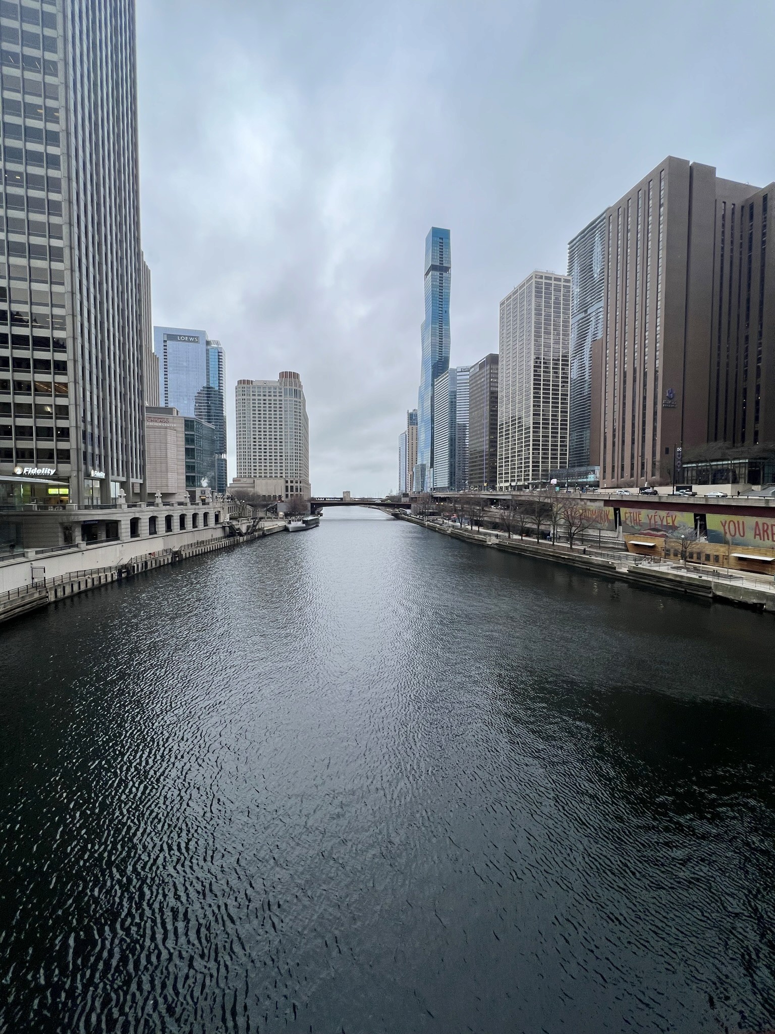
This is a photo I took while exploring the city of Chicago. One of my favorite features of the city was the river flowing directly through the downtown area. It provided unique views from the city towards Lake Michigan. I was inspired by this view to take the photo due to the way the buildings lined up on the sides of the shot. Although the business of the image comes from the elements on the sides of the photo, the river flowing forward draws your attention first. This detail inspired my belief that the focal point of a design does not need to be busy and full of detail to draw the attention of the user.
Designing a Homepage
This unit was the first step towards the full redesign of the future Wayfarer platform. I learned about the principles of UI design, how useful grids can be, and common aspects of a homepage. After gathering research from other websites and sketching out some layouts, I created my first low fidelity wireframe of the Wayfarer homepage.
Initial Wireframe - Homepage Design
This is my first iteration of what I wanted for the homepage design. It includes some common elements seen in various other websites, but organized in a way that I felt was beneficial. The main components of the homepage includes:
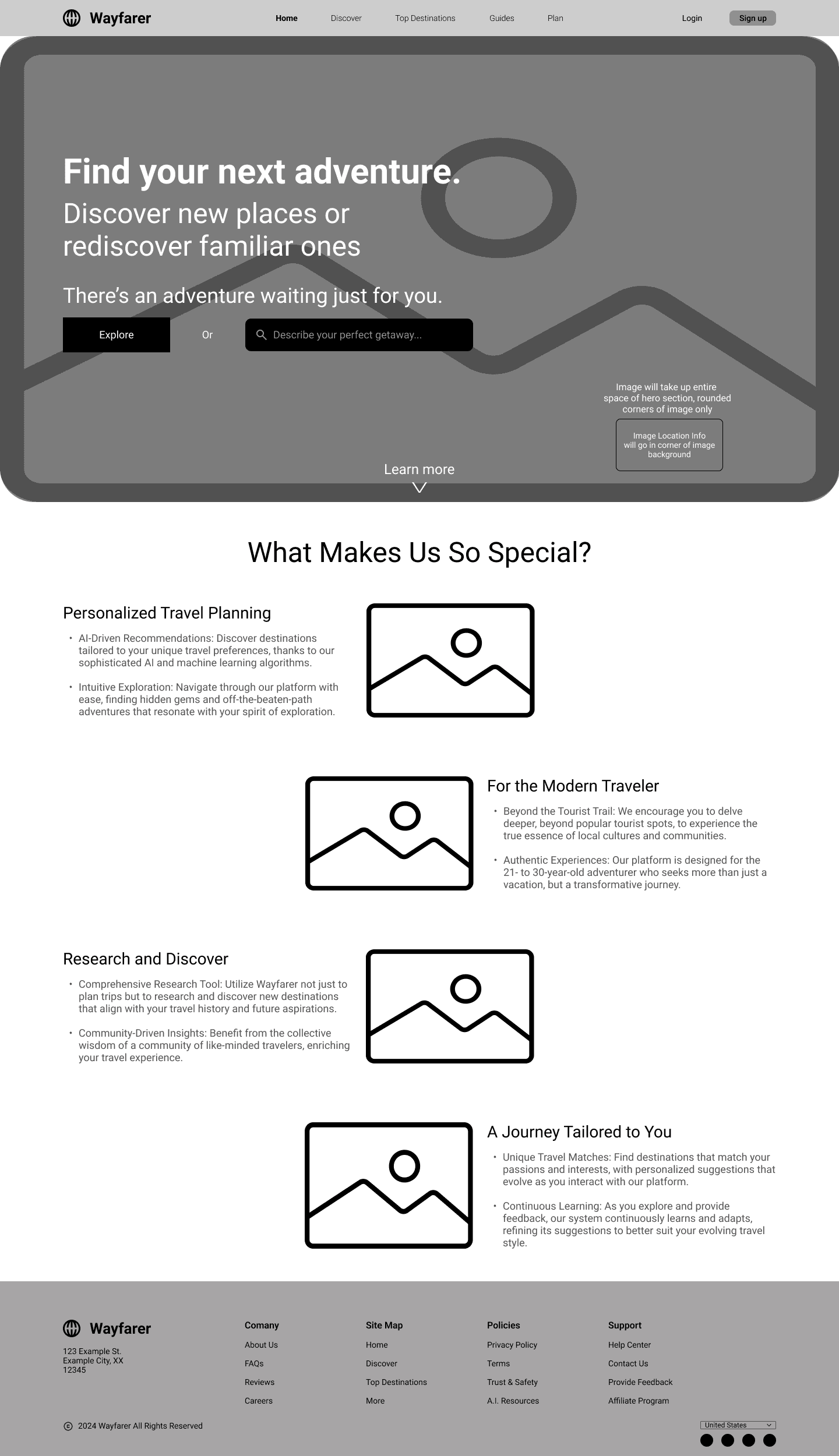
- A Navigation Bar
My initial design included the logo, website sections, a login button, and a sign up button.
- Hero Section
I wanted to include a full section image as the background with the other key elements overlayed on top. I used the provided headings and subheadings for the text in this section. For the CTA, I initially went with a button as well as a search to provide dual functionality.
- Product Benefits
Of the 3 options provided to us, I originally felt that the product benefits section would be the most useful and beneficial for the user. That is why I went with that section for the homepage design. I wanted to include small images or graphics depicting the related text (the benefit of the site) alongside the actual written text. I also wanted the options to be vertically aligned and the text to alternate as the user scrolls down the page.
- Footer
For the footer, I wanted to include the logo again, information about the company, copyright information, a site map, location selector, and social media links.
Adding Images, Icons, Color, & Typography
The next step in my design process was to incorporate images, icons, color, and typography to my layout. In addition, I made some changes to the layout based on provided feedback.
Images
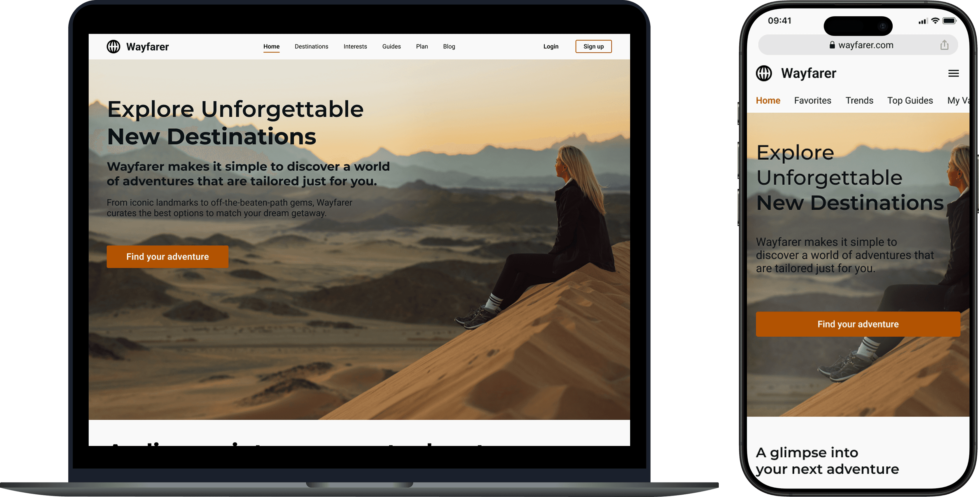
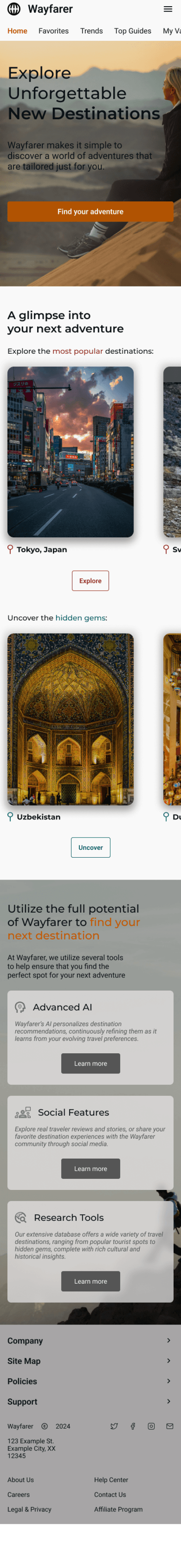
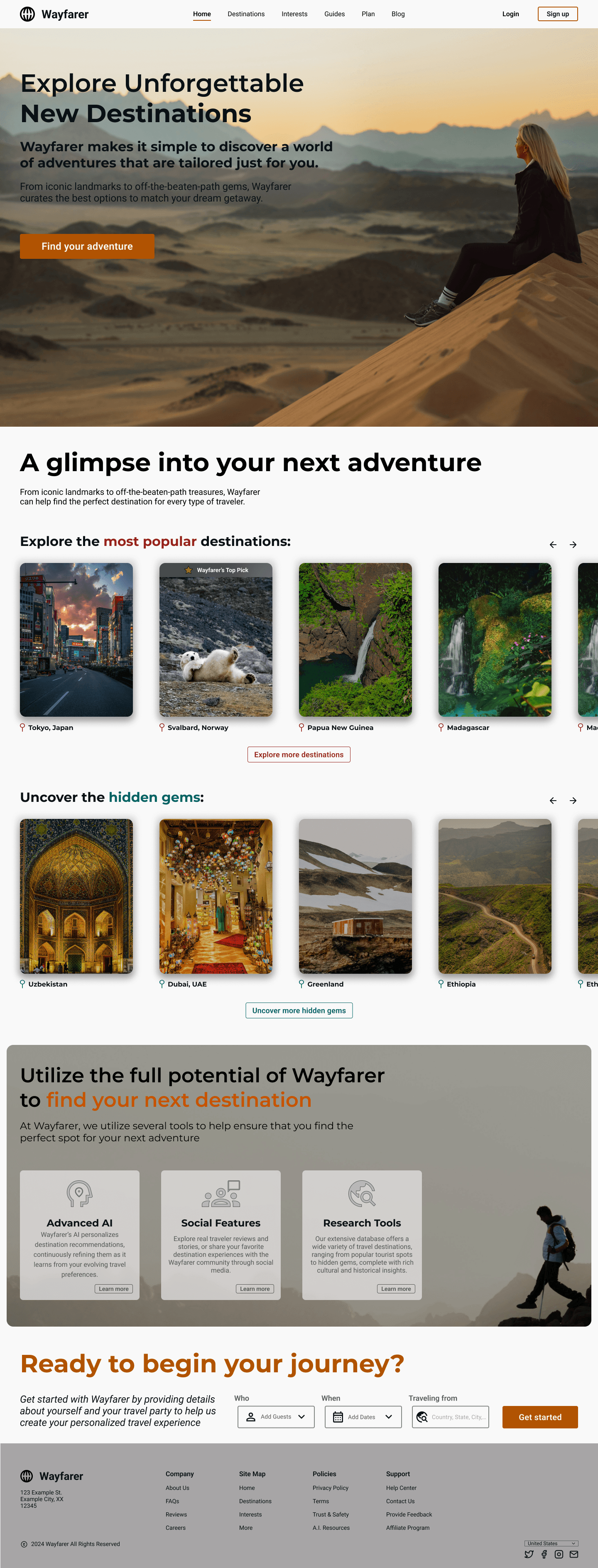
I wanted to include images related to travel throughout the design to get the user thinking about travel and adventure. Since the homepage is the first impression of the site on the user, I wanted a prominent photo spanning the whole section. The photo would encapsulate what the brand meant to me and what I wanted the user to understand.

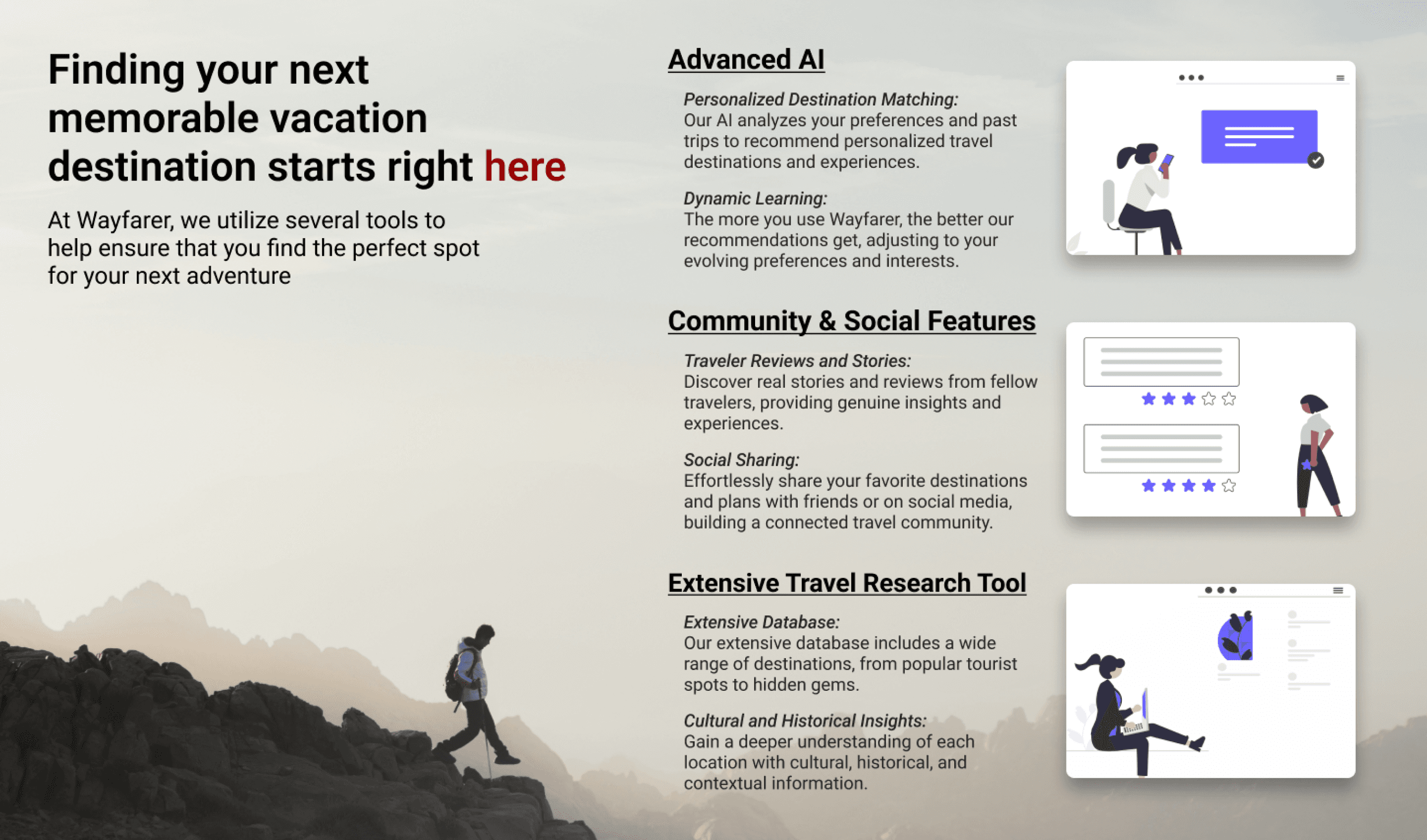
Icons & Elements
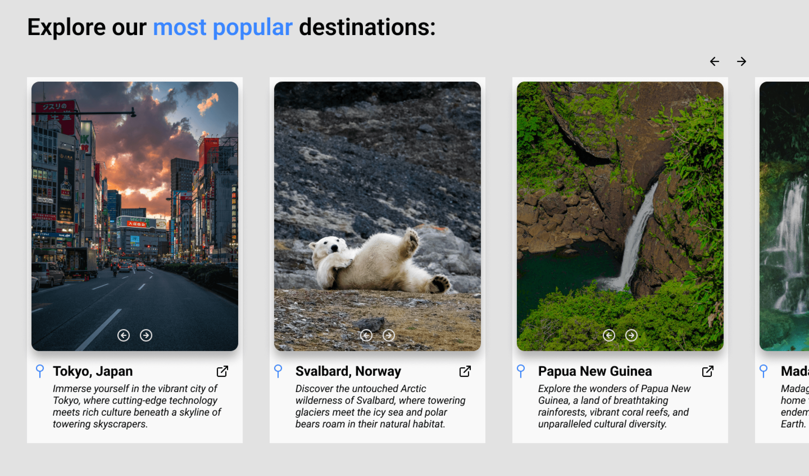
Following the change to the hero section, the next decision was to fill out my destinations section. For this I used images depicting locations and icons such as the pin drop icon for location, as well as other navigational icons. I also designed cards to display the destination images with the appropriately attached information.
In addition, I decided to replace the Product Benefits section with a Product Features section highlighting the features that Wayfarer offers. I felt this was more appropriate to highlight on the homepage for the user to see.
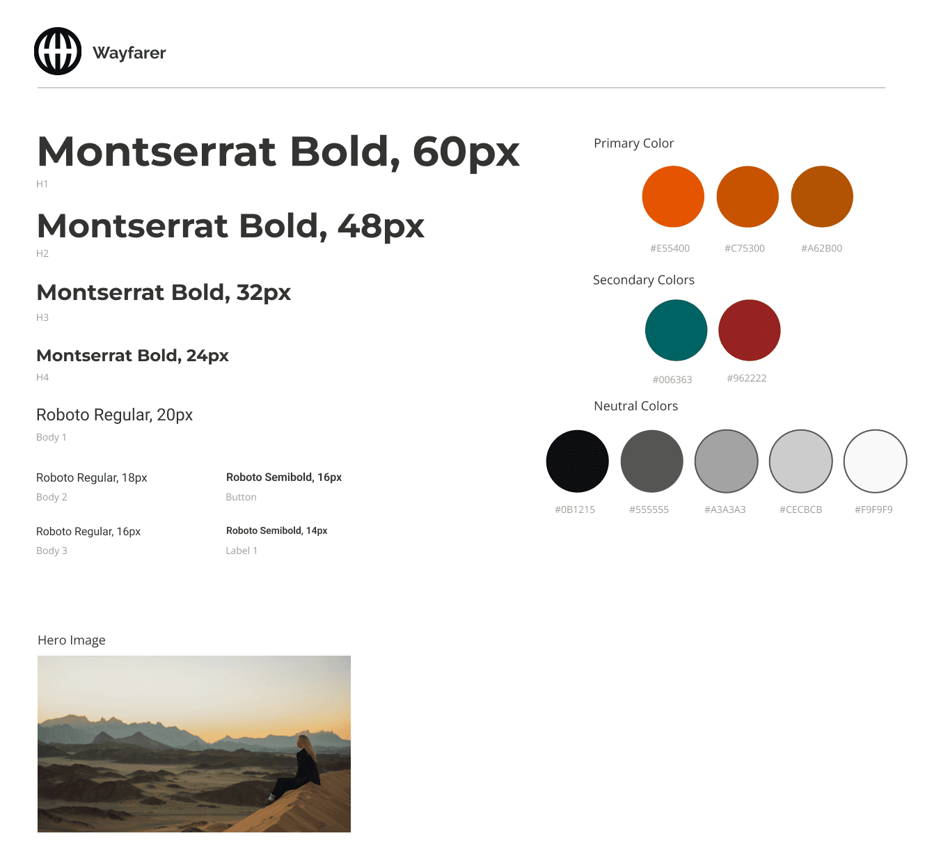
Color & Typography
The next focus was on both color and typography. For color, the primary color specifically, I wanted something that embodied adventure and excitement. This led me to picking the color orange as my primary color for the brand. To complement the orange primary color, I chose a shade of red and a shade of blue as secondary colors. Finally, I picked various shades of black, white, and gray for the neutral colors.
For the font used throughout the platform, the heading font I envisioned was something bold to grab the users attention. After browsing various fonts, I settled on Montserrat as my primary font. I needed a more rounded and softer font to complement Montserrat as my body text font. This is why I chose the font Roboto. It is a nice and smooth font that makes it easy to read the body text. These fonts along with my color choices filled out my style tile for the website.
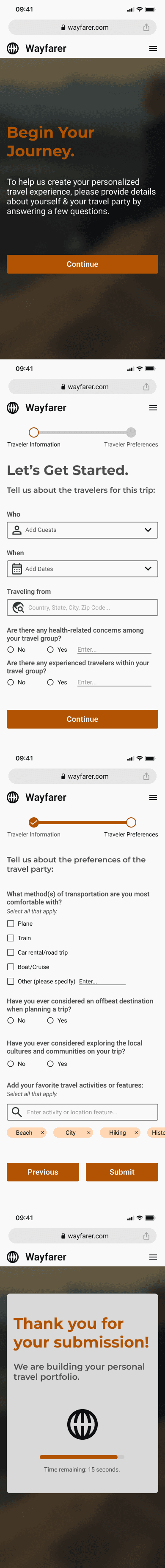
Creating a Multi-Step Form
Since the purpose of the Wayfarer website is to create a personalized list of travel destinations, we must first collect information from the users to create the list. Forms are crucial for receiving required information from a user to further an action. Whether it is to create an account or to provide details about yourself, the form can be a key piece to the function of the website so the design must be perfect.
The first iteration of my form included questions I felt were necessary to the website. I organized the questions across 3 pages to make it easier for the user. To know which section of the form the user is on, I designed a stepper at the top of the form to keep track. I also utilized different input fields such as text input, dropdowns, and checkboxes. I wanted to make sure that each question had a purpose and that the method of answering the question was simple and straightforward to not overwhelm the user.
Responsive Designs
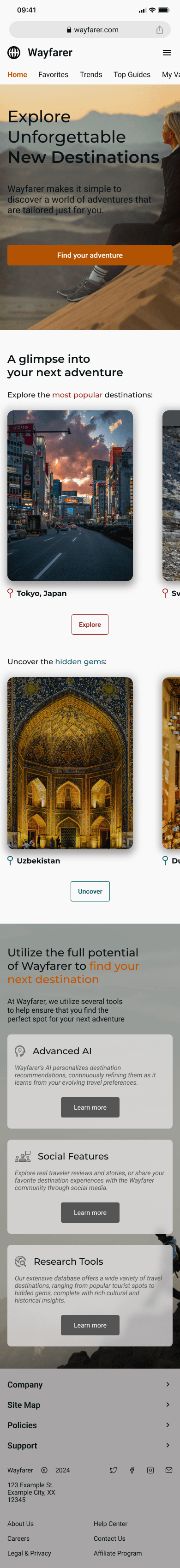
One of the most important aspects of having a platform is accessibility for all users. Not every user will be able to access the platform on a desktop computer. Some users can only access the platform through a mobile device such as a phone or tablet. As designers, we also have to consider every device form factor that a user will be using to access our platform. My initial design for mobile involved taking the elements from the desktop site and resizing to fit a mobile device.
The first version of my mobile layout included almost everything from the desktop layout. The reason for this was because I felt everything was needed even in a smaller form factor. I also felt that my elements scaled down nicely and allowed me to keep them in for mobile. Mobile devices also involve different interaction methods as you can utilize touch input on the screen. This allowed me to remove some navigation buttons for the destination section and allow the user to scroll with their finger.
The Final Challenge
After 6 weeks of learning, designing, and iterating, I have reached the end of my course and my time as a Wayfarer employee. Every week I took notes of the feedback given to me about my designs and made the changes I needed to make the platform the best it can be. With every iteration came new ideas and ways to improve. The iteration process was something I enjoyed because I had to be critical of my own design and constantly push myself to be better at designing.
In addition to improving upon my desktop and mobile layouts, I also had to improve my multi step form and create a mobile version of the form. I removed all of the unnecessary questions and made changes to the input methods. I also scaled the question sizes down for the mobile layout so that the mobile user can still understand what is being asked on screen without taking away too much from the original design.
Desktop Wireframes

Mobile Wireframes
View Full Wireframes
Conclusion
Key Takeaways
The Wayfarer project was a foundational experience that allowed me to dive into the principles and practice of UI/UX design. Throughout the project, I explored the full design process at an introductory level, including understanding user needs, creating wireframes, and structuring interfaces to prioritize clarity and usability. Working on Wayfarer helped me develop my visual design skills, improve layout and navigation decisions, and think critically about how users interact with digital products.
Reflection
I learned the importance of considering the user’s perspective in every design choice, how even small layout or navigation decisions impact usability, and the value of iterating on designs to achieve clearer, more intuitive interfaces. I also gained confidence in translating conceptual ideas into tangible wireframes and early prototypes.
The Next Steps
This project reinforced that design is a process of exploration and problem-solving, even at a basic level. It highlighted my strengths in visual organization and user-focused thinking, while also showing areas for growth, including refining interaction flows and exploring more advanced design tools and prototyping techniques.
Project Duration
6 weeks
My Role
Sole UX/UI Designer
Tools
Figma, Adobe Photoshop
Wayfarer
A comprehensive, AI-based research tool for users to discover new destinations for their next vacation
Wayfarer
A comprehensive, AI-based research tool for users to discover new destinations for their next vacation
Introduction
For my first introduction to UI/UX, I was tasked with redesigning the website for Wayfarer. Wayfarer is a comprehensive, AI-based research tool for users to discover new destinations for their next vacation. The purpose of the project was to create an experience that is easy to use, accessible for all devices, and aligns with the Wayfarer brand. Throughout this process of designing the Wayfarer platform, I focused not only on what I would want as a real user, but what others might expect from this platform. By constantly improving the design through iterations, I believe that I created the best representation of Wayfarer and one that provides the best experience for the user.
The Process
Finding Visual Inspiration
The first exercise in this course involved taking a step back from the digital world and explore real life for inspiration. While we might not consider the real world as a tool for us when it relates to designing, there are endless resources available to us outside. The main goal was to take inspiration from everything that we see or interact with apart from the digital landscape.
For my submission, I showcased some images (both real life photos and digital images) that inspire me artistically and help me think about specific aspects when designing. For each photo, I provided a reasoning why I felt inspired from those photos as well as how my brain interpreted them from a design viewpoint.
Digital Inspiration
One of my favorite movie posters to look at is the poster for the 1975 thriller film Jaws. Without even knowing what the movie is about, the poster easily shows that the main antagonist is a great white shark. The use of the shark inconspicuously below the swimmer allows the audience to interpret that the swimmer does not expect the shark attack. In addition, the use of the large, all capital lettered red “JAWS” text makes excellent use of the white space, provides excellent contrast to the white and blues, and is a subtle hint to the color of blood (which is red if you did not know).
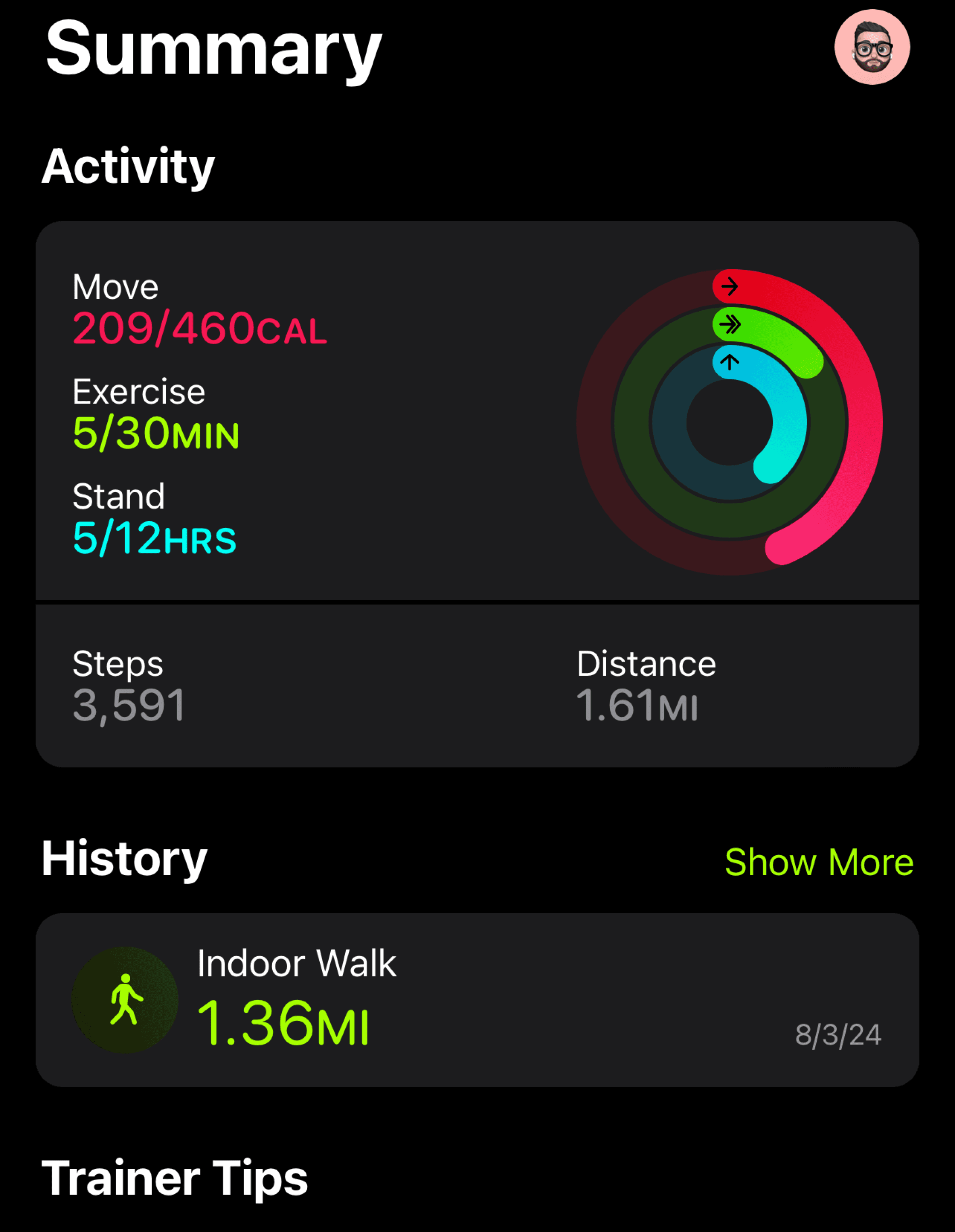
This is a screenshot that I took from one of my favorite iPhone apps, the fitness tracking app. As someone who strives for a healthier lifestyle, the native fitness app from Apple when paired with the apple watch, is a wonderful experience. The bright colors associated with the key elements of Move, Exercise, and Stand help the user make the key association between each goal and its respective action. By looking at the watch and keeping up with the colors, you can work towards your goals for each activity. In addition to the literal use cases for each activity, the contrast of the colors against the dark background (or light background if you are not using dark mode) is a nice touch to the design of the app.
Visual Inspiration
This is a photo of a small water feature found within a shopping mall in Dallas, Texas. While exploring a new town, I decided to check out a local shopping mall to see what it offered. I took this photo because I really liked how the natural sunlight shined down on the greenery and bright blues of the installation. In a mall covered in dull colors like baize, gray, and brown, the bright and popping colors immediately captivated my attention towards this minor and unimportant feature.
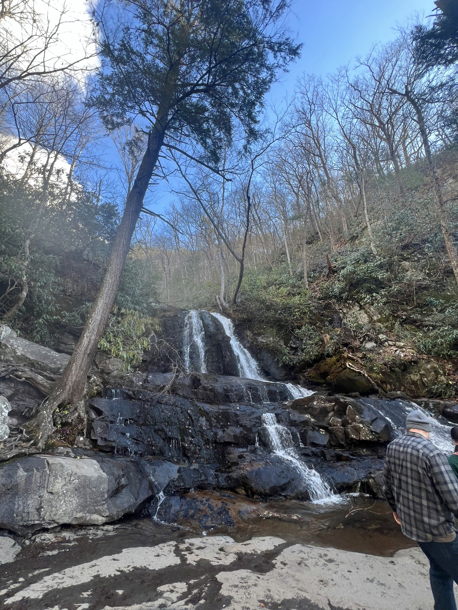
This is a photo I took of a natural waterfall while hiking in the Great Smoky Mountains of Tennessee. Natural waterfalls, and water features in general, are one of my favorite things to photograph. The earthy tones of the rocks and surrounding trees complement the bright colors of the water as it streams down. The picture also allows you to feel the textures of the hard, wet rocks and the kinetic energy of the flowing water. It inspires me to design with visual textures and elements that offer the same kinetic energy as natural, flowing water.
This is a photo I took while exploring the city of Chicago. One of my favorite features of the city was the river flowing directly through the downtown area. It provided unique views from the city towards Lake Michigan. I was inspired by this view to take the photo due to the way the buildings lined up on the sides of the shot. Although the business of the image comes from the elements on the sides of the photo, the river flowing forward draws your attention first. This detail inspired my belief that the focal point of a design does not need to be busy and full of detail to draw the attention of the user.
Designing a Homepage
This unit was the first step towards the full redesign of the future Wayfarer platform. I learned about the principles of UI design, how useful grids can be, and common aspects of a homepage. After gathering research from other websites and sketching out some layouts, I created my first low fidelity wireframe of the Wayfarer homepage.
Initial Wireframe - Homepage Design
This is my first iteration of what I wanted for the homepage design. It includes some common elements seen in various other websites, but organized in a way that I felt was beneficial. The main components of the homepage includes:
- A Navigation Bar
My initial design included the logo, website sections, a login button, and a sign up button.
- Hero Section
I wanted to include a full section image as the background with the other key elements overlayed on top. I used the provided headings and subheadings for the text in this section. For the CTA, I initially went with a button as well as a search to provide dual functionality.
- Product Benefits
Of the 3 options provided to us, I originally felt that the product benefits section would be the most useful and beneficial for the user. That is why I went with that section for the homepage design. I wanted to include small images or graphics depicting the related text (the benefit of the site) alongside the actual written text. I also wanted the options to be vertically aligned and the text to alternate as the user scrolls down the page.
- Footer
For the footer, I wanted to include the logo again, information about the company, copyright information, a site map, location selector, and social media links.
Adding Images, Icons, Color, & Typography
The next step in my design process was to incorporate images, icons, color, and typography to my layout. In addition, I made some changes to the layout based on provided feedback.
Images
I wanted to include images related to travel throughout the design to get the user thinking about travel and adventure. Since the homepage is the first impression of the site on the user, I wanted a prominent photo spanning the whole section. The photo would encapsulate what the brand meant to me and what I wanted the user to understand.
Icons & Elements
Following the change to the hero section, the next decision was to fill out my destinations section. For this I used images depicting locations and icons such as the pin drop icon for location, as well as other navigational icons. I also designed cards to display the destination images with the appropriately attached information.
In addition, I decided to replace the Product Benefits section with a Product Features section highlighting the features that Wayfarer offers. I felt this was more appropriate to highlight on the homepage for the user to see.
Color & Typography
The next focus was on both color and typography. For color, the primary color specifically, I wanted something that embodied adventure and excitement. This led me to picking the color orange as my primary color for the brand. To complement the orange primary color, I chose a shade of red and a shade of blue as secondary colors. Finally, I picked various shades of black, white, and gray for the neutral colors.
For the font used throughout the platform, the heading font I envisioned was something bold to grab the users attention. After browsing various fonts, I settled on Montserrat as my primary font. I needed a more rounded and softer font to complement Montserrat as my body text font. This is why I chose the font Roboto. It is a nice and smooth font that makes it easy to read the body text. These fonts along with my color choices filled out my style tile for the website.
Creating a Multi-Step Form
Since the purpose of the Wayfarer website is to create a personalized list of travel destinations, we must first collect information from the users to create the list. Forms are crucial for receiving required information from a user to further an action. Whether it is to create an account or to provide details about yourself, the form can be a key piece to the function of the website so the design must be perfect.
The first iteration of my form included questions I felt were necessary to the website. I organized the questions across 3 pages to make it easier for the user. To know which section of the form the user is on, I designed a stepper at the top of the form to keep track. I also utilized different input fields such as text input, dropdowns, and checkboxes. I wanted to make sure that each question had a purpose and that the method of answering the question was simple and straightforward to not overwhelm the user.
Responsive Designs
One of the most important aspects of having a platform is accessibility for all users. Not every user will be able to access the platform on a desktop computer. Some users can only access the platform through a mobile device such as a phone or tablet. As designers, we also have to consider every device form factor that a user will be using to access our platform. My initial design for mobile involved taking the elements from the desktop site and resizing to fit a mobile device.
The first version of my mobile layout included almost everything from the desktop layout. The reason for this was because I felt everything was needed even in a smaller form factor. I also felt that my elements scaled down nicely and allowed me to keep them in for mobile. Mobile devices also involve different interaction methods as you can utilize touch input on the screen. This allowed me to remove some navigation buttons for the destination section and allow the user to scroll with their finger.
The Final Challenge
After 6 weeks of learning, designing, and iterating, I have reached the end of my course and my time as a Wayfarer employee. Every week I took notes of the feedback given to me about my designs and made the changes I needed to make the platform the best it can be. With every iteration came new ideas and ways to improve. The iteration process was something I enjoyed because I had to be critical of my own design and constantly push myself to be better at designing.
In addition to improving upon my desktop and mobile layouts, I also had to improve my multi step form and create a mobile version of the form. I removed all of the unnecessary questions and made changes to the input methods. I also scaled the question sizes down for the mobile layout so that the mobile user can still understand what is being asked on screen without taking away too much from the original design.
Desktop Wireframes
Mobile Wireframes
View Full Wireframes
Conclusion
Key Takeaways
The Wayfarer project was a foundational experience that allowed me to dive into the principles and practice of UI/UX design. Throughout the project, I explored the full design process at an introductory level, including understanding user needs, creating wireframes, and structuring interfaces to prioritize clarity and usability. Working on Wayfarer helped me develop my visual design skills, improve layout and navigation decisions, and think critically about how users interact with digital products.
Reflection
I learned the importance of considering the user’s perspective in every design choice, how even small layout or navigation decisions impact usability, and the value of iterating on designs to achieve clearer, more intuitive interfaces. I also gained confidence in translating conceptual ideas into tangible wireframes and early prototypes.
The Next Steps
This project reinforced that design is a process of exploration and problem-solving, even at a basic level. It highlighted my strengths in visual organization and user-focused thinking, while also showing areas for growth, including refining interaction flows and exploring more advanced design tools and prototyping techniques.
Project Duration
6 weeks
My Role
Sole UX/UI Designer
Tools
Figma, Adobe Photoshop
Wayfarer
A comprehensive, AI-based research tool for users to discover new destinations for their next vacation
Project Duration
6 weeks
My Role
Sole UX/UI Designer
Tools
Figma, Adobe Photoshop
Wayfarer
A comprehensive, AI-based research tool for users to discover new destinations for their next vacation
Project Duration
6 weeks
My Role
Sole UX/UI Designer
Tools
Figma, Adobe Photoshop
Wayfarer
A comprehensive, AI-based research tool for users to discover new destinations for their next vacation
Project Duration
6 weeks
My Role
Sole UX/UI Designer
Tools
Figma, Adobe Photoshop
Wayfarer
A comprehensive, AI-based research tool for users to discover new destinations for their next vacation
Project Duration
6 weeks
My Role
Sole UX/UI Designer
Tools
Figma, Adobe Photoshop
Introduction
For my first introduction to UI/UX, I was tasked with redesigning the website for Wayfarer. Wayfarer is a comprehensive, AI-based research tool for users to discover new destinations for their next vacation. The purpose of the project was to create an experience that is easy to use, accessible for all devices, and aligns with the Wayfarer brand. Throughout this process of designing the Wayfarer platform, I focused not only on what I would want as a real user, but what others might expect from this platform. By constantly improving the design through iterations, I believe that I created the best representation of Wayfarer and one that provides the best experience for the user.
The Process
Finding Visual Inspiration
The first exercise in this course involved taking a step back from the digital world and explore real life for inspiration. While we might not consider the real world as a tool for us when it relates to designing, there are endless resources available to us outside. The main goal was to take inspiration from everything that we see or interact with apart from the digital landscape.
For my submission, I showcased some images (both real life photos and digital images) that inspire me artistically and help me think about specific aspects when designing. For each photo, I provided a reasoning why I felt inspired from those photos as well as how my brain interpreted them from a design viewpoint.
Digital Inspiration
One of my favorite movie posters to look at is the poster for the 1975 thriller film Jaws. Without even knowing what the movie is about, the poster easily shows that the main antagonist is a great white shark. The use of the shark inconspicuously below the swimmer allows the audience to interpret that the swimmer does not expect the shark attack. In addition, the use of the large, all capital lettered red “JAWS” text makes excellent use of the white space, provides excellent contrast to the white and blues, and is a subtle hint to the color of blood (which is red if you did not know).
This is a screenshot that I took from one of my favorite iPhone apps, the fitness tracking app. As someone who strives for a healthier lifestyle, the native fitness app from Apple when paired with the apple watch, is a wonderful experience. The bright colors associated with the key elements of Move, Exercise, and Stand help the user make the key association between each goal and its respective action. By looking at the watch and keeping up with the colors, you can work towards your goals for each activity. In addition to the literal use cases for each activity, the contrast of the colors against the dark background (or light background if you are not using dark mode) is a nice touch to the design of the app.
Visual Inspiration
This is a photo of a small water feature found within a shopping mall in Dallas, Texas. While exploring a new town, I decided to check out a local shopping mall to see what it offered. I took this photo because I really liked how the natural sunlight shined down on the greenery and bright blues of the installation. In a mall covered in dull colors like baize, gray, and brown, the bright and popping colors immediately captivated my attention towards this minor and unimportant feature.
This is a photo I took of a natural waterfall while hiking in the Great Smoky Mountains of Tennessee. Natural waterfalls, and water features in general, are one of my favorite things to photograph. The earthy tones of the rocks and surrounding trees complement the bright colors of the water as it streams down. The picture also allows you to feel the textures of the hard, wet rocks and the kinetic energy of the flowing water. It inspires me to design with visual textures and elements that offer the same kinetic energy as natural, flowing water.
This is a photo I took while exploring the city of Chicago. One of my favorite features of the city was the river flowing directly through the downtown area. It provided unique views from the city towards Lake Michigan. I was inspired by this view to take the photo due to the way the buildings lined up on the sides of the shot. Although the business of the image comes from the elements on the sides of the photo, the river flowing forward draws your attention first. This detail inspired my belief that the focal point of a design does not need to be busy and full of detail to draw the attention of the user.
Designing a Homepage
This unit was the first step towards the full redesign of the future Wayfarer platform. I learned about the principles of UI design, how useful grids can be, and common aspects of a homepage. After gathering research from other websites and sketching out some layouts, I created my first low fidelity wireframe of the Wayfarer homepage.
Initial Wireframe - Homepage Design
This is my first iteration of what I wanted for the homepage design. It includes some common elements seen in various other websites, but organized in a way that I felt was beneficial. The main components of the homepage includes:
- A Navigation Bar
My initial design included the logo, website sections, a login button, and a sign up button.
- Hero Section
I wanted to include a full section image as the background with the other key elements overlayed on top. I used the provided headings and subheadings for the text in this section. For the CTA, I initially went with a button as well as a search to provide dual functionality.
- Product Benefits
Of the 3 options provided to us, I originally felt that the product benefits section would be the most useful and beneficial for the user. That is why I went with that section for the homepage design. I wanted to include small images or graphics depicting the related text (the benefit of the site) alongside the actual written text. I also wanted the options to be vertically aligned and the text to alternate as the user scrolls down the page.
- Footer
For the footer, I wanted to include the logo again, information about the company, copyright information, a site map, location selector, and social media links.
Adding Images, Icons, Color, & Typography
The next step in my design process was to incorporate images, icons, color, and typography to my layout. In addition, I made some changes to the layout based on provided feedback.
Images
I wanted to include images related to travel throughout the design to get the user thinking about travel and adventure. Since the homepage is the first impression of the site on the user, I wanted a prominent photo spanning the whole section. The photo would encapsulate what the brand meant to me and what I wanted the user to understand.
Icons & Elements
Following the change to the hero section, the next decision was to fill out my destinations section. For this I used images depicting locations and icons such as the pin drop icon for location, as well as other navigational icons. I also designed cards to display the destination images with the appropriately attached information.
In addition, I decided to replace the Product Benefits section with a Product Features section highlighting the features that Wayfarer offers. I felt this was more appropriate to highlight on the homepage for the user to see.
Color & Typography
The next focus was on both color and typography. For color, the primary color specifically, I wanted something that embodied adventure and excitement. This led me to picking the color orange as my primary color for the brand. To complement the orange primary color, I chose a shade of red and a shade of blue as secondary colors. Finally, I picked various shades of black, white, and gray for the neutral colors.
For the font used throughout the platform, the heading font I envisioned was something bold to grab the users attention. After browsing various fonts, I settled on Montserrat as my primary font. I needed a more rounded and softer font to complement Montserrat as my body text font. This is why I chose the font Roboto. It is a nice and smooth font that makes it easy to read the body text. These fonts along with my color choices filled out my style tile for the website.
Creating a Multi-Step Form
Since the purpose of the Wayfarer website is to create a personalized list of travel destinations, we must first collect information from the users to create the list. Forms are crucial for receiving required information from a user to further an action. Whether it is to create an account or to provide details about yourself, the form can be a key piece to the function of the website so the design must be perfect.
The first iteration of my form included questions I felt were necessary to the website. I organized the questions across 3 pages to make it easier for the user. To know which section of the form the user is on, I designed a stepper at the top of the form to keep track. I also utilized different input fields such as text input, dropdowns, and checkboxes. I wanted to make sure that each question had a purpose and that the method of answering the question was simple and straightforward to not overwhelm the user.
Responsive Designs
One of the most important aspects of having a platform is accessibility for all users. Not every user will be able to access the platform on a desktop computer. Some users can only access the platform through a mobile device such as a phone or tablet. As designers, we also have to consider every device form factor that a user will be using to access our platform. My initial design for mobile involved taking the elements from the desktop site and resizing to fit a mobile device.
The first version of my mobile layout included almost everything from the desktop layout. The reason for this was because I felt everything was needed even in a smaller form factor. I also felt that my elements scaled down nicely and allowed me to keep them in for mobile. Mobile devices also involve different interaction methods as you can utilize touch input on the screen. This allowed me to remove some navigation buttons for the destination section and allow the user to scroll with their finger.
The Final Challenge
After 6 weeks of learning, designing, and iterating, I have reached the end of my course and my time as a Wayfarer employee. Every week I took notes of the feedback given to me about my designs and made the changes I needed to make the platform the best it can be. With every iteration came new ideas and ways to improve. The iteration process was something I enjoyed because I had to be critical of my own design and constantly push myself to be better at designing.
In addition to improving upon my desktop and mobile layouts, I also had to improve my multi step form and create a mobile version of the form. I removed all of the unnecessary questions and made changes to the input methods. I also scaled the question sizes down for the mobile layout so that the mobile user can still understand what is being asked on screen without taking away too much from the original design.
Desktop Wireframes
Mobile Wireframes
View Full Wireframes
Conclusion
Key Takeaways
The Wayfarer project was a foundational experience that allowed me to dive into the principles and practice of UI/UX design. Throughout the project, I explored the full design process at an introductory level, including understanding user needs, creating wireframes, and structuring interfaces to prioritize clarity and usability. Working on Wayfarer helped me develop my visual design skills, improve layout and navigation decisions, and think critically about how users interact with digital products.
Reflection
I learned the importance of considering the user’s perspective in every design choice, how even small layout or navigation decisions impact usability, and the value of iterating on designs to achieve clearer, more intuitive interfaces. I also gained confidence in translating conceptual ideas into tangible wireframes and early prototypes.
The Next Steps
This project reinforced that design is a process of exploration and problem-solving, even at a basic level. It highlighted my strengths in visual organization and user-focused thinking, while also showing areas for growth, including refining interaction flows and exploring more advanced design tools and prototyping techniques.
Brendan Stern
Designed & engineered by me
Brendan Stern
Designed & engineered by me
Brendan Stern
Designed & engineered by me