

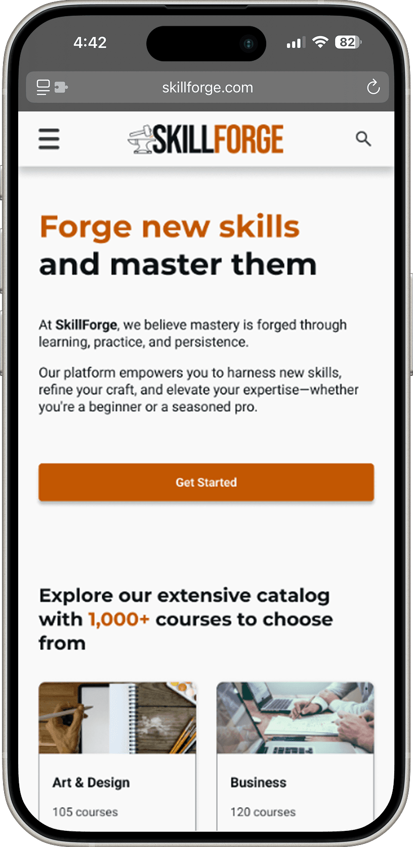
A dynamic online platform helps users discover, learn, and track new skills or grow their existing skills through professionally guided courses and personalized progress tracking.


A dynamic online platform helps users discover, learn, and track new skills or grow their existing skills through professionally guided courses and personalized progress tracking.
Project Duration
12 weeks
My Role
End-to-End UX/UI Designer
Tools
Figma, Adobe Photoshop
Introduction
Learning a new skill can be a difficult and daunting process. Whether it is finding what new skill you want to learn, the learning process itself, or even applying the newly learned skill in a social setting, there are many possible areas of frustration for individuals.
The Problem
The learning process can feel overwhelming and boring, often leading people to give up. I’ve experienced this myself and believe there’s a better way to make skill-building more engaging and accessible for everyone.
The Solution
Create an intuitive and engaging platform that simplifies the learning process, keeps users motivated, and adapts to different learning styles.
By making learning more enjoyable, structured, and accessible, users should stay committed and make real progress without feeling overwhelmed.
Research
Goal
Many users lose motivation when learning a new skill due to frustration or lack of clarity. I set out to understand these challenges to design a more supportive experience. Through research, I explored users' motivations, learning methods, prior experience, and emotional journey. These insights uncovered ways to boost motivation, tackle obstacles, and make skill-building more engaging and rewarding.
Objectives
Uncover user motivations and challenges in learning new skills.
Understand their learning journey, strategies, and emotional experiences.
Identify factors that support or hinder progress and motivation.
Research & Analysis Methods
Primary Research - User Interviews
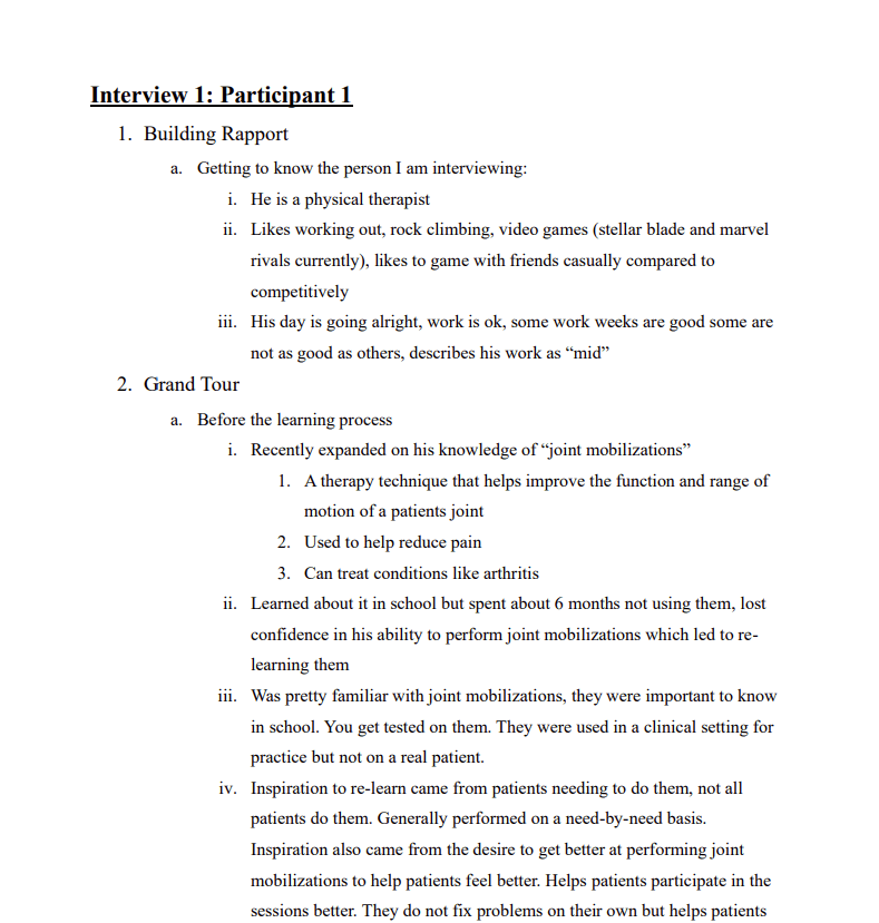
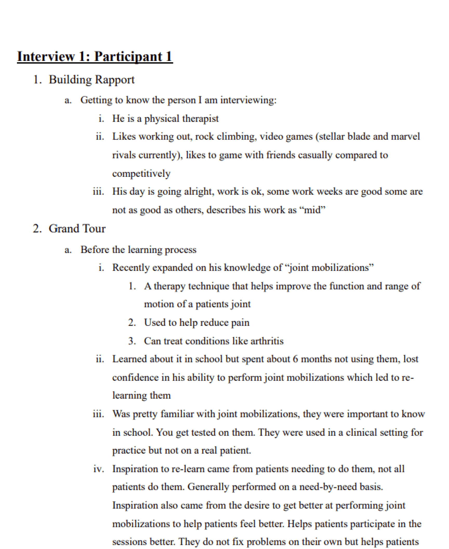
I was able to conduct an interview with 4 different participants
The interviews consisted of questions about their personal journeys related to the learning of their skill.
My goal was to be able to understand people’s experiences when learning a new skill to identify their challenges, needs, motivations, and opportunities for improvement.

Full Interview Report
Secondary Research - Competitive Analysis
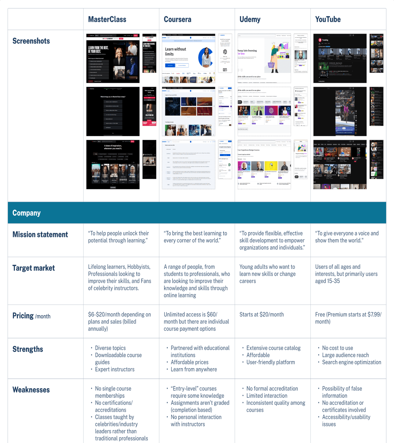
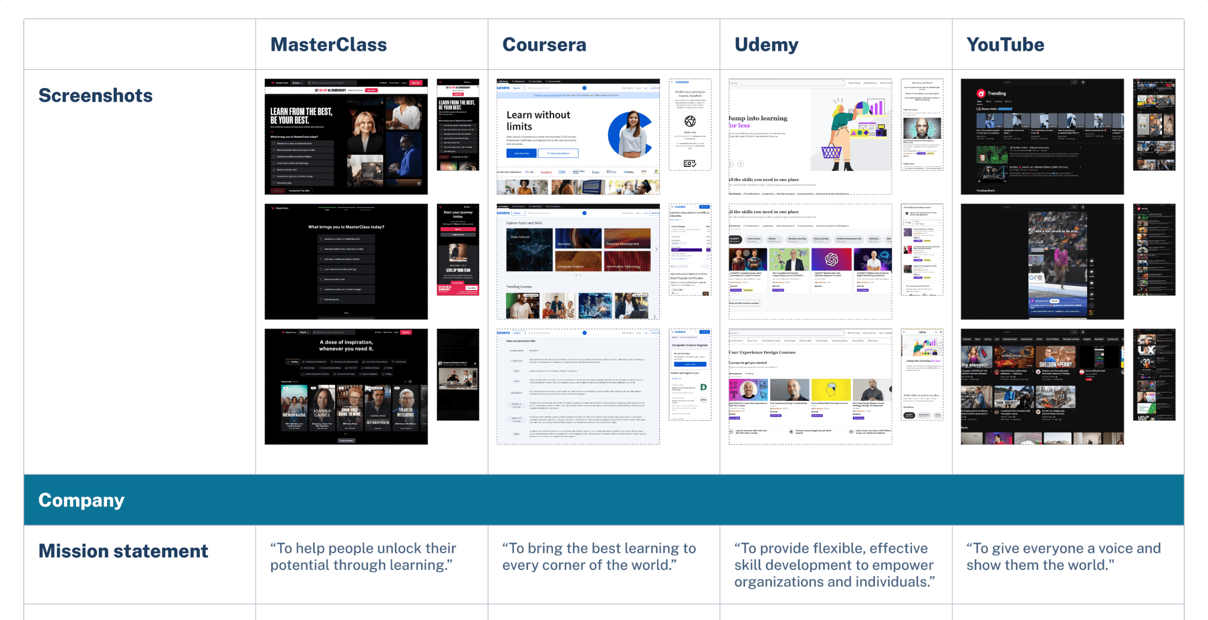
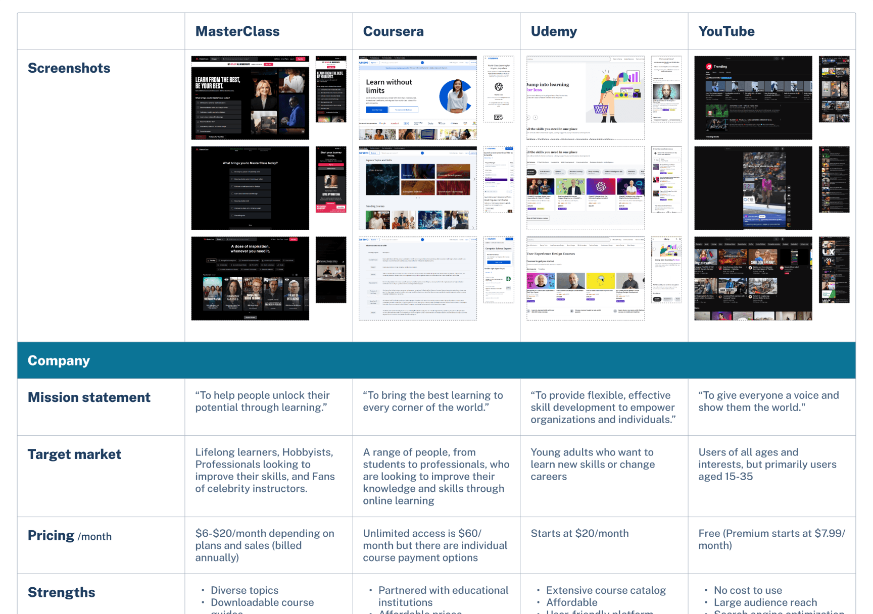
I conducted a competitive analysis of 4 different platforms (consisting of 3 direct and 1 indirect competitors) to understand their strengths, weaknesses, and strategies for their services.
I looked at MasterClass, Coursera, Udemy, and YouTube to understand what they offered as direct and indirect competitors to my skill learning platform.

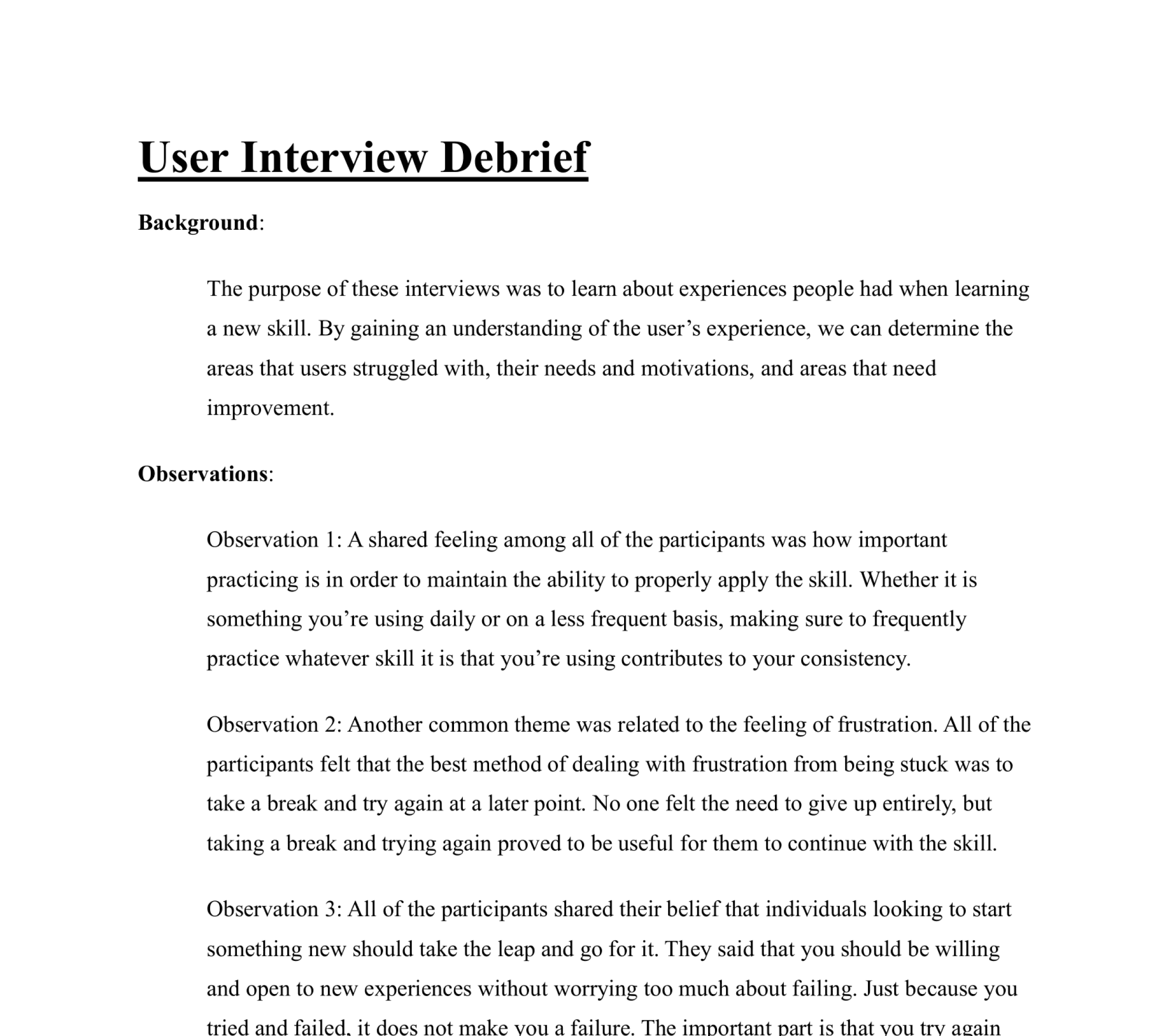
Research Analysis - Interview Debrief
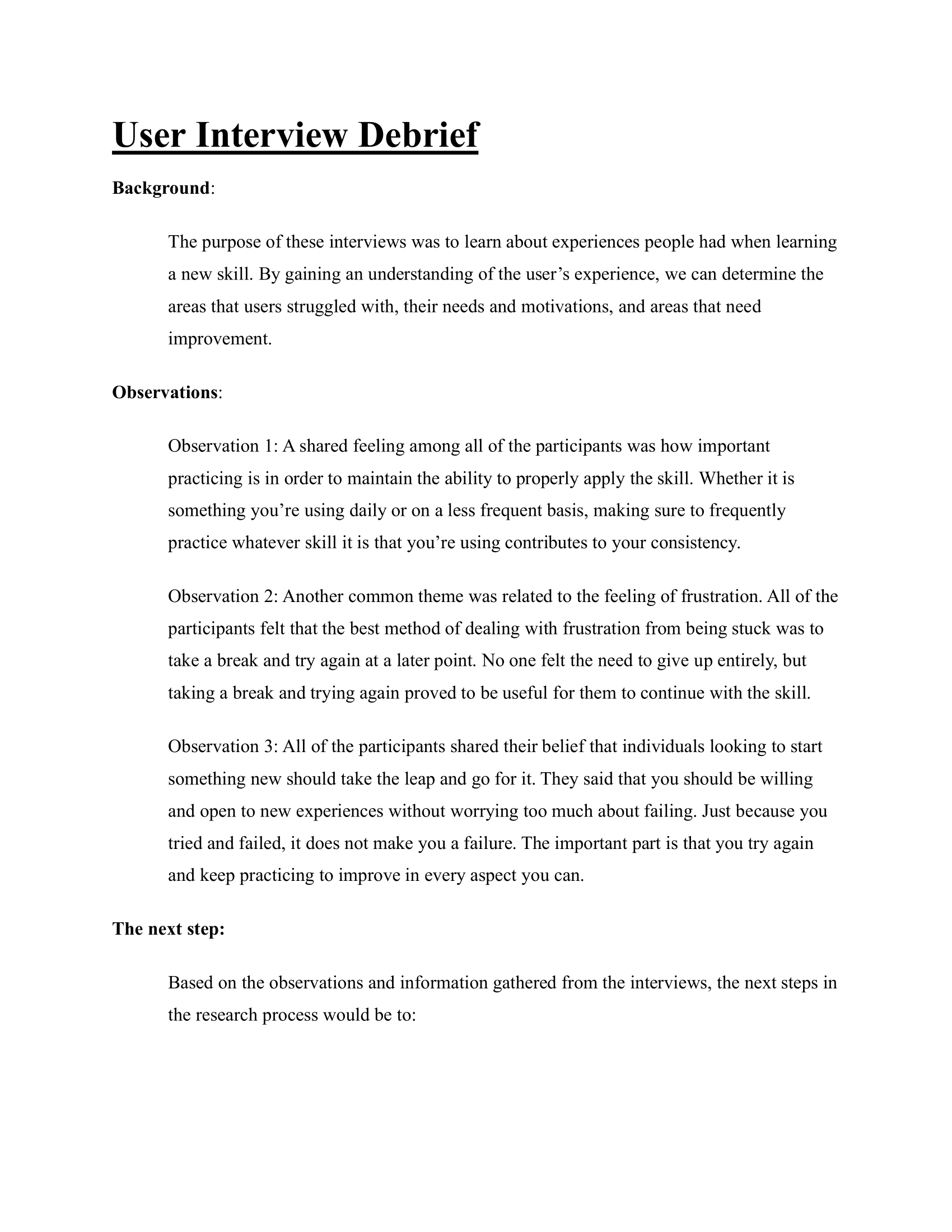
Observation 1
All participants agreed that regular practice is essential for maintaining and applying a skill effectively, whether used daily or infrequently, as it ensures consistency.
Observation 2
Participants commonly experienced frustration but found that taking a break and trying again later was the best way to overcome it. No one felt the need to give up entirely, making this approach effective for continuing with the skill.
Observation 3
Participants agreed that anyone starting something new should take the leap without fear of failure. Trying and failing doesn’t make you a failure—what matters is persevering, practicing, and improving.

Full Debrief
Define
Affinity Mapping
Some common themes I uncovered include:
Motivation: Driven by helping others, personal growth, and career advancement.
Learning Methods: Includes videos, note-taking, and hands-on experience.
End Goals: Career growth, student improvement, and personal hobbies.
Beliefs: Emphasizes open-mindedness, lifelong learning, and taking initiative.
Purposes: Learning is essential for career success and practical application.
Self-Reflections: Gains confidence through progress, learning from mistakes, and wishing for an earlier start.
Overcoming Frustrations: Tackles setbacks with persistence, breaks, and practice.


POV Statements & HMW Questions
Using the data I compiled in my affinity map, I created some point-of-view (POV) statements and “how might we” questions.
POV Statements
1.
I’d like to explore ways to help users who are learning a new skill work on retaining their knowledge by practicing frequently.
2.
I’d like to explore ways to help users who are learning a new skill set defined goals for themselves before learning so that they can work towards achieving those goals.
3.
I’d like to explore ways to help users who are learning a new skill organize all of the tools they need to effectively learn the skill.
4.
I’d like to explore ways to help users who are learning new skills stay motivated.
5.
I’d like to explore ways to help users who are learning a new skill accurately measure their progress so that they can see the progression throughout the process.
6.
I’d like to explore ways to help users who are learning a new skill with help from professionals or experts.
HMW Questions
1.
How might we help users learning a new skill practice their skill to help retain what they have learned?
2.
How might we help users define goals they can work towards for the skill that they are learning?
3.
How might we gather and provide the user with all of the needed tools to succeed?
4.
How might we keep users motivated while learning their new skill?
5.
How might we complement the learning process with rewards or positive feedback?
6.
How might we help users learning a new skill keep track of their progress towards mastering the skill?
7.
How might we provide users with access to professional support and feedback for their skill?
User Personas
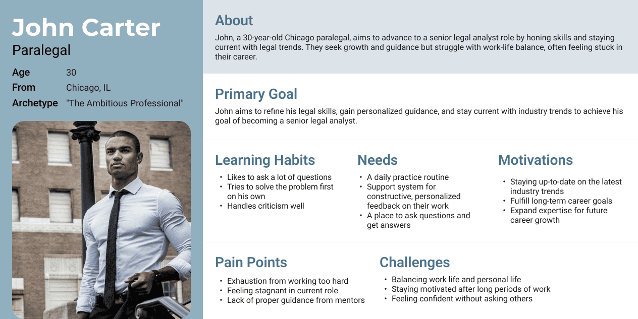
Based on my research, I created 3 user personas that best reflect my findings and help me understand my user's goals, motivations, needs, and frustrations. Here is one of the personas:

View All Personas
User Flows
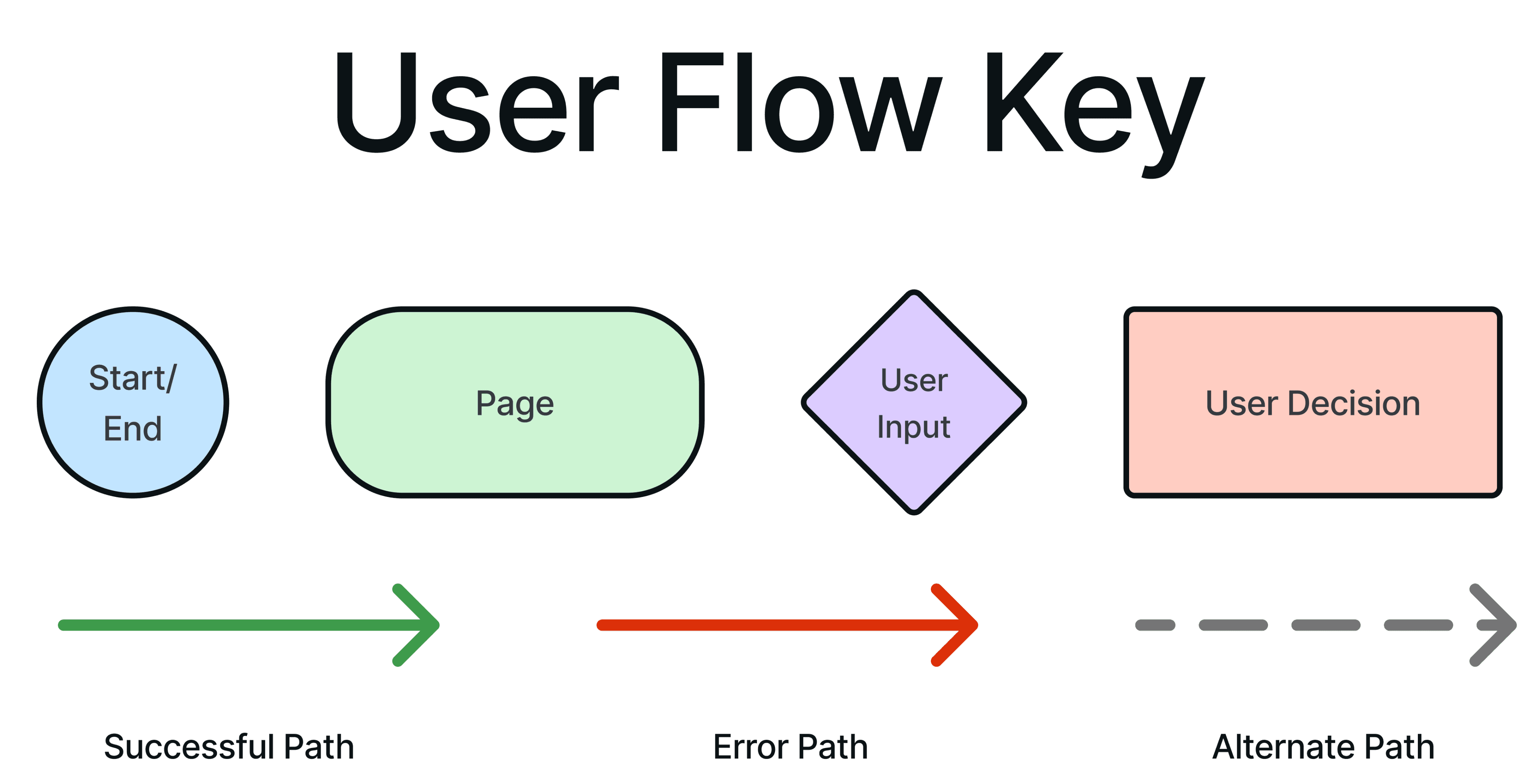
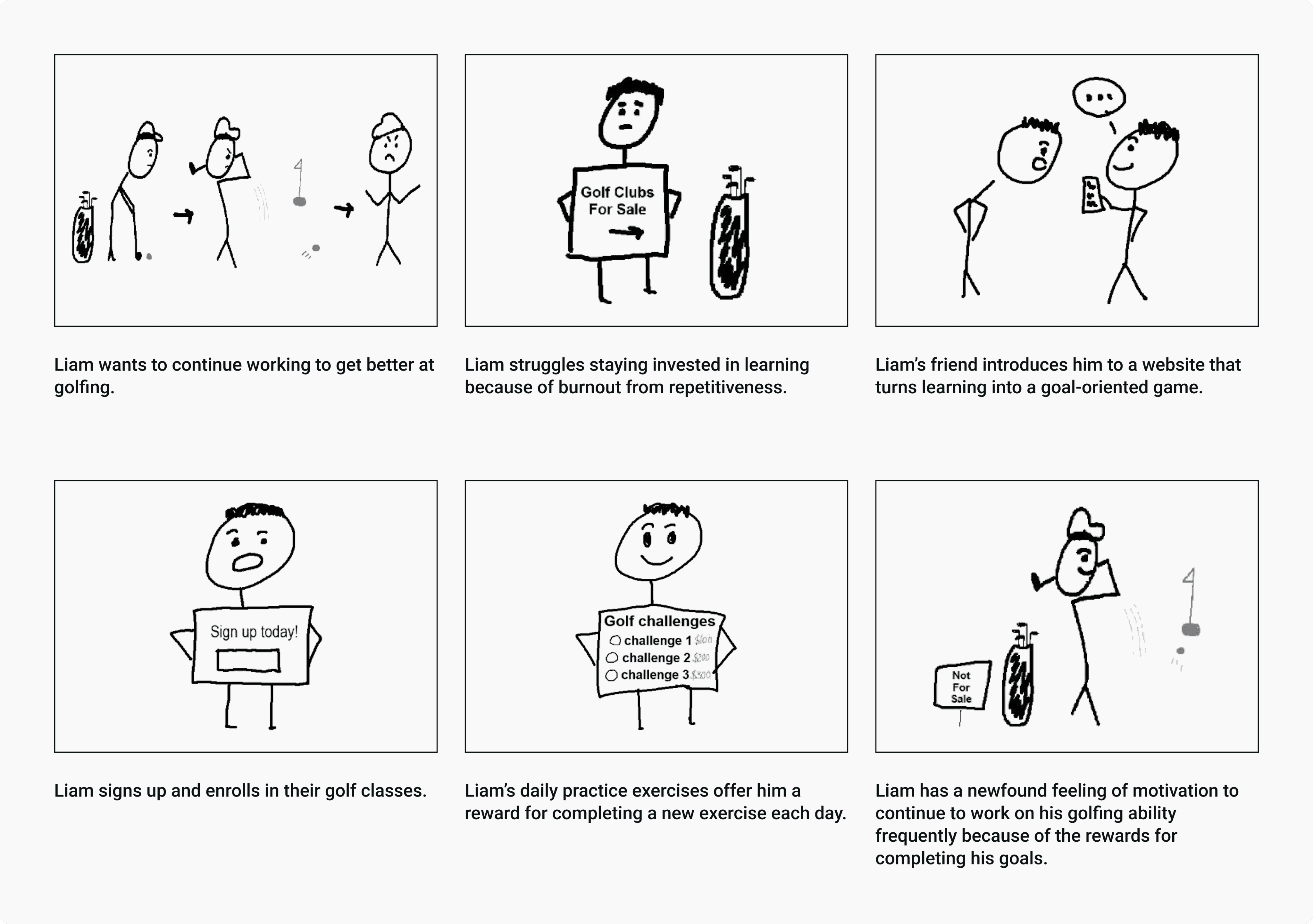
Liam wants to improve his golf skills by learning from professionals. After careful consideration, he decides to enroll in golf learning classes.


View All User Flows
Task Flows
Task: Find a specific course page
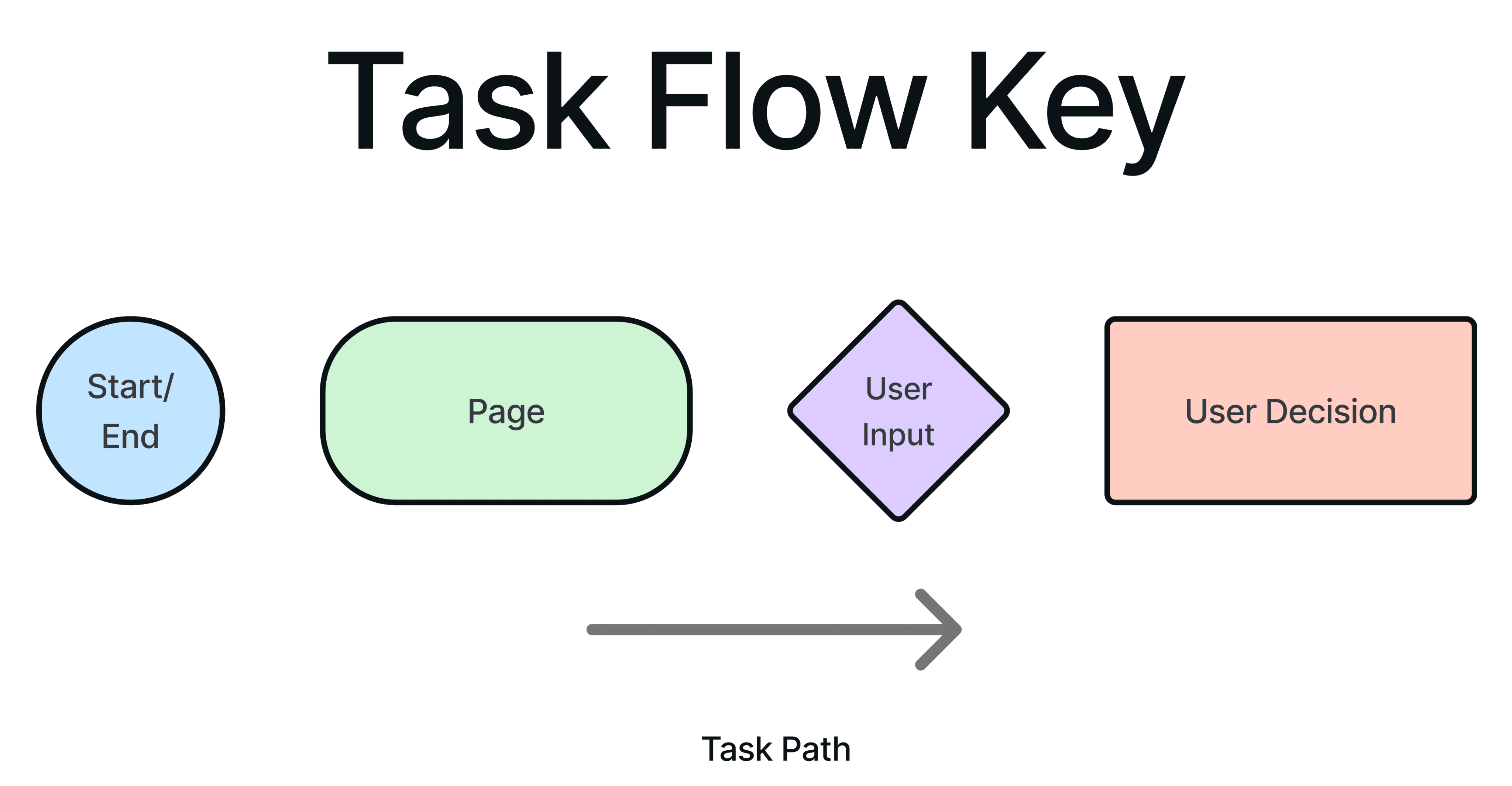


Task: Enroll in a course


Task: Submit a new forum post


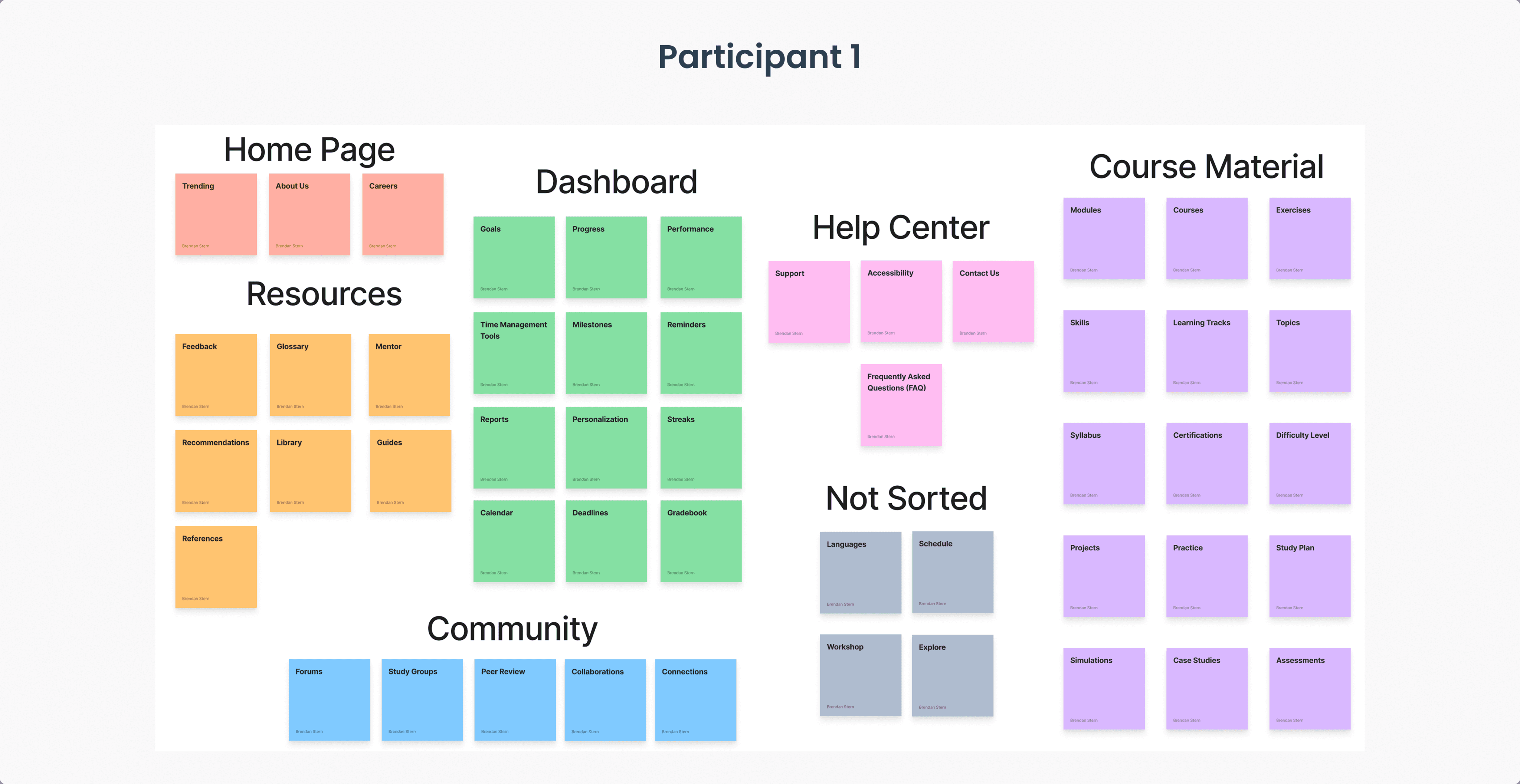
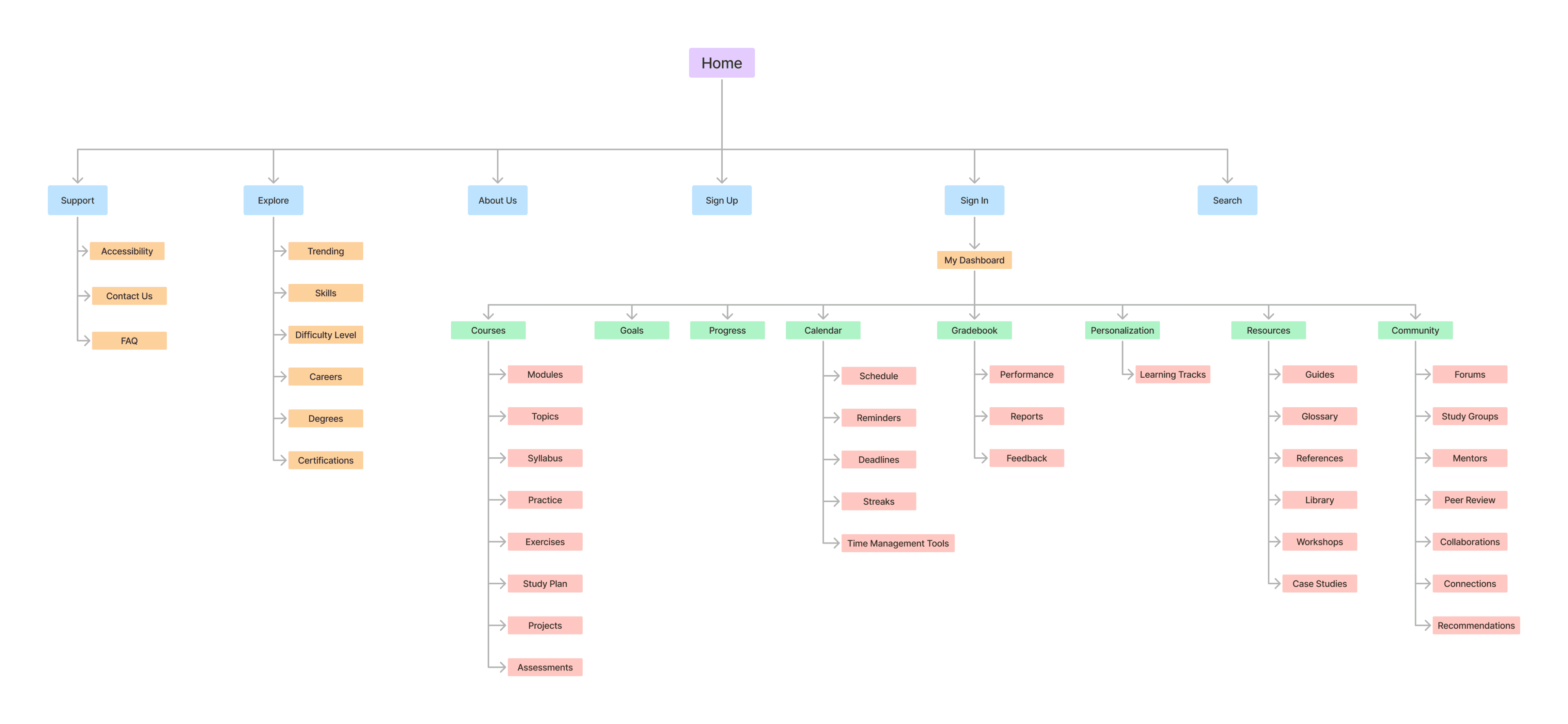
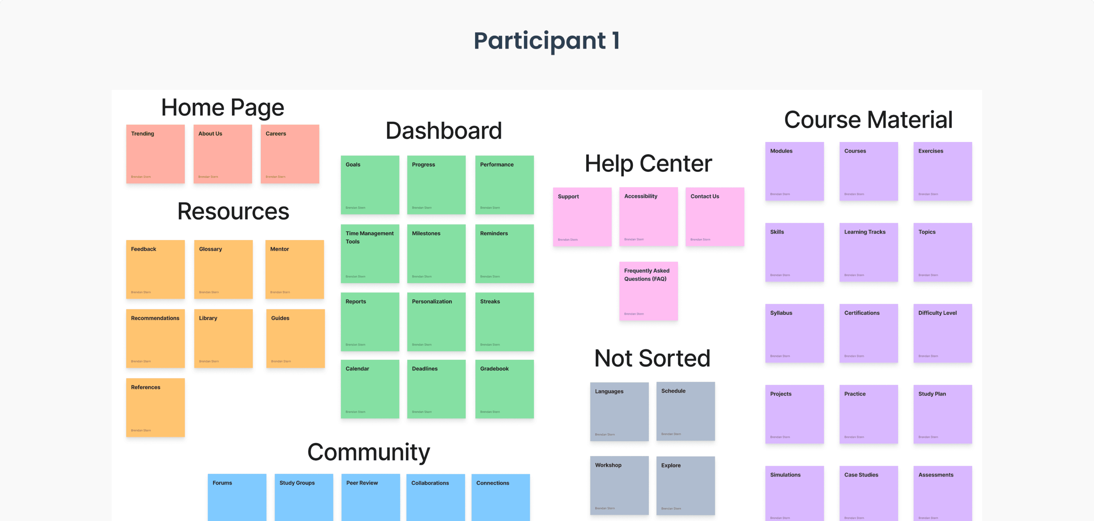
Card Sorting & Site Map
User Story: John, a paralegal enrolled in professional law courses, is learning more to advance his career. He hopes that the feedback he receives on his assignments will help him understand the content more.
Card Sorting

Sitemap

Design
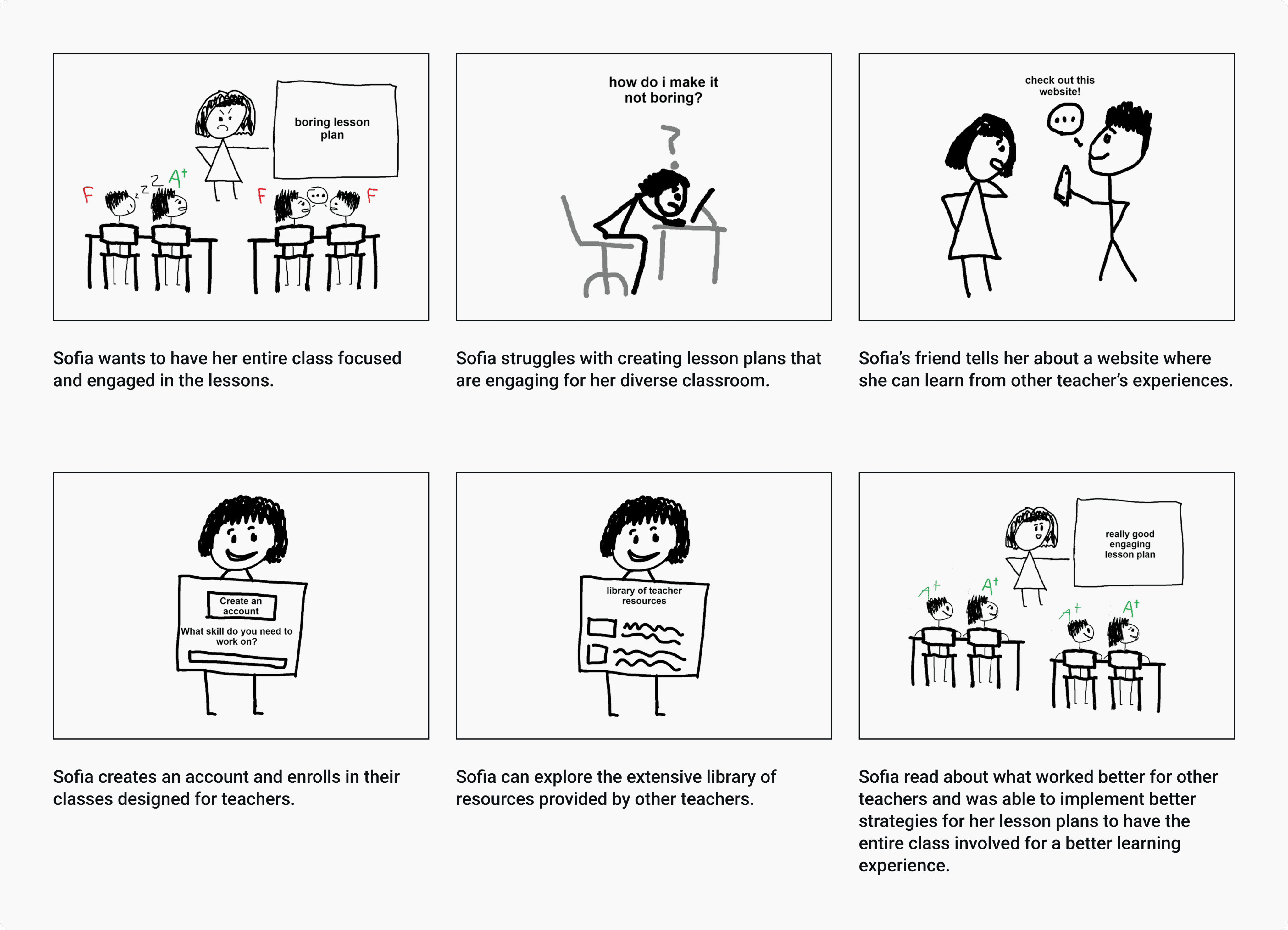
Storyboards


Color Palette
The colors I chose for the website are colors that are based on psychological associations with the name SkillForge and the idea of “forging new skills” on the platform.
Primary Color:
#C25702
#C27502
The primary color, orange, represents energy and motivation, which are key elements for learning.
Orange symbolizes the heat you experience in a real forge with fire, emphasizing the brands goal of helping you “forge” new skills.
Secondary Color:
#2C3E50
#255584
For the secondary color, I chose a shade of blue that is almost metallic, symbolizing the metal being heated in a forge. Blue as a color also represents feelings of trustworthiness and caring, which are two things that are important to the brand.
Tertiary Color:
#A30000
#98E788
#436DD7
My tertiary colors are reserved for different states and elements throughout the designs. Such as the green color for labels, the red color for error states, and the blue for link hover states.
Neutral Color:
#F9F9F9
#F0F0F2
#E0E0E0
#BFBFBF
#888888
#3B3B3B
#0B1215
Lastly, for my neutral colors, I wanted to include colors other than true white (#FFFFFF) and true black (#000000) as a way to stand out more from the typical colors used. I wanted similar colors to help provide balance, contrast, and readability to the platform.
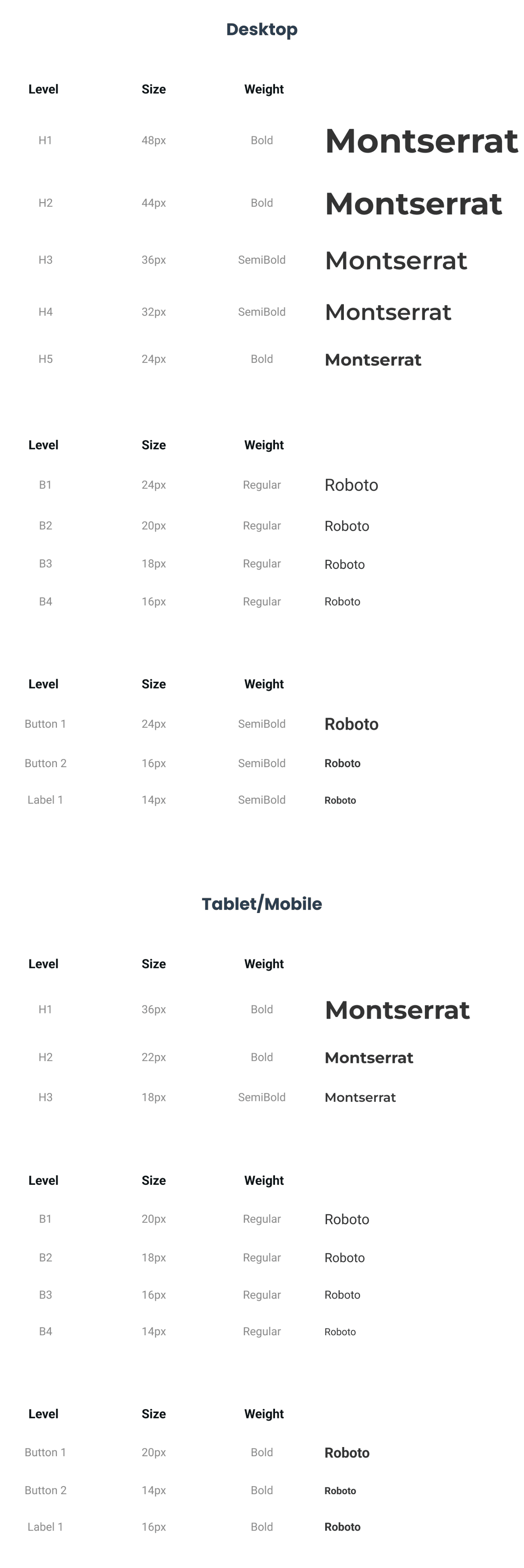
Typefaces

Brand Identity


The design process for my logo started off with brainstorming elements related to a “forge” to match the name of the brand.
I decided on an anvil with a hammer as the main focus piece of the logo. I wanted to incorporate the colors I picked in my color palette exercise. Since a hammer typically produces sparks when hitting the anvil, I figured I could use the orange color I picked to represent the sparks.
The hammer and anvil are symbols for users forging their new skills on the platform similarly to a blacksmith forging new tools. The sword is another representation of something that is forged and refined like a potential skill.
Prototype
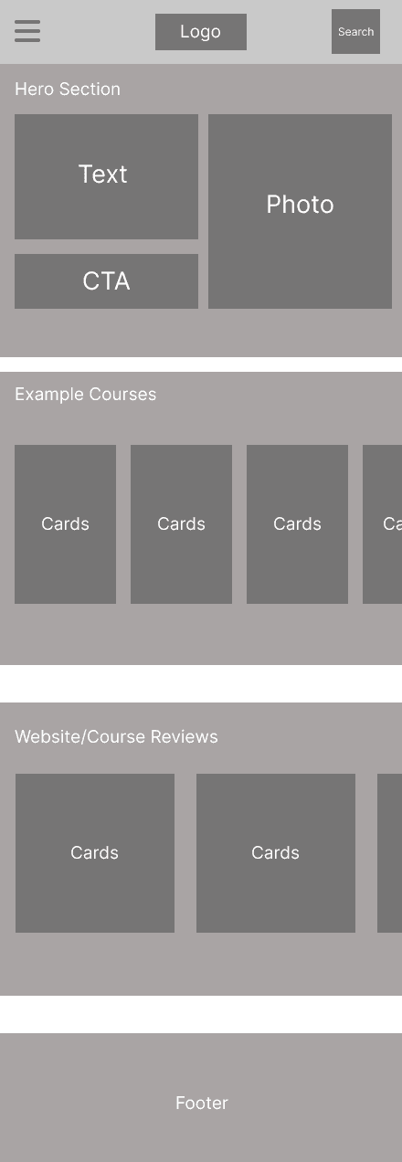
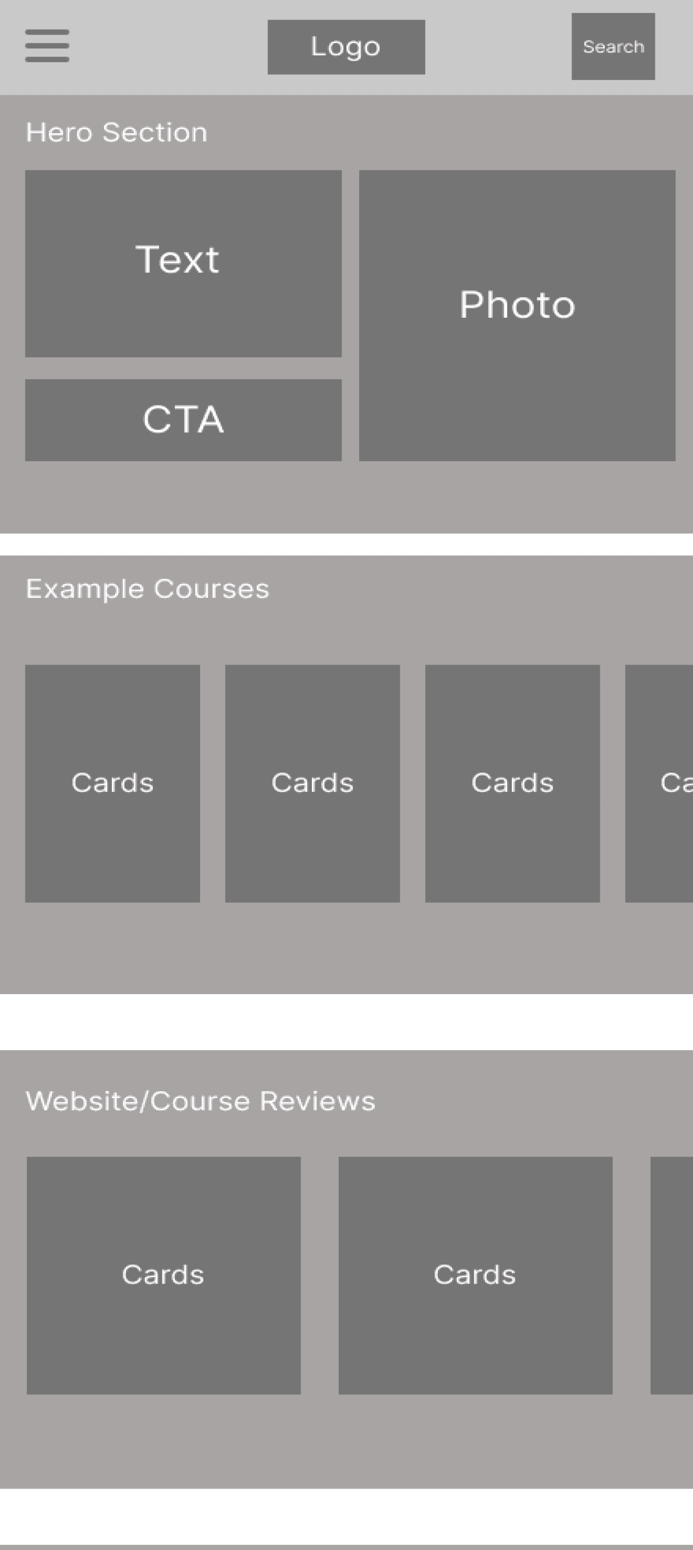
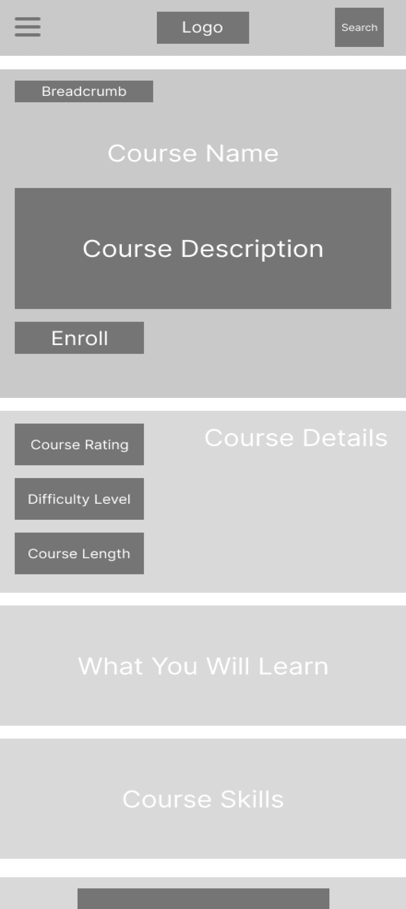
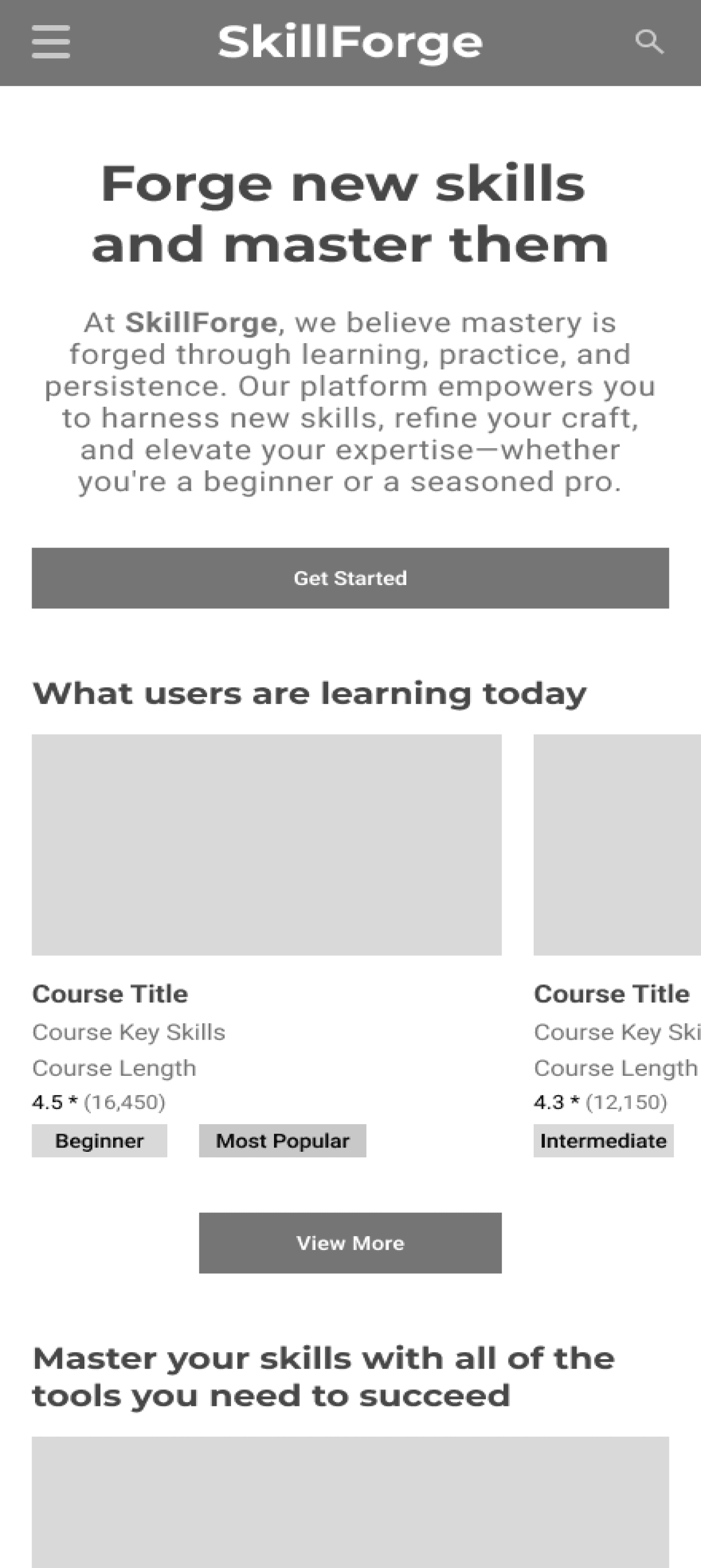
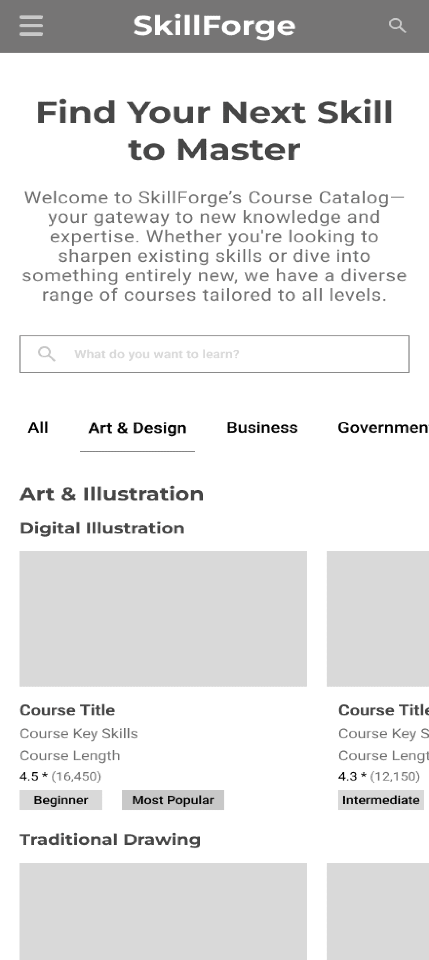
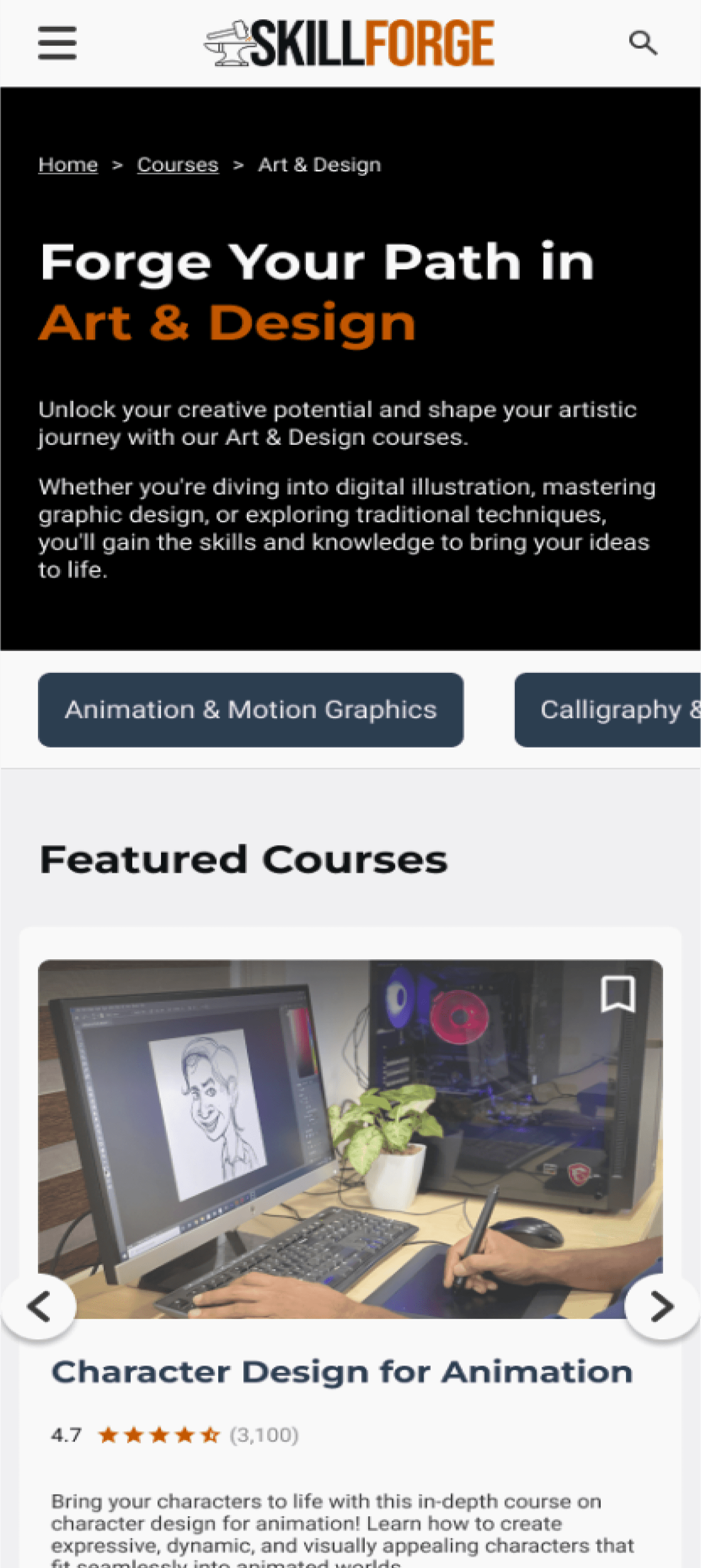
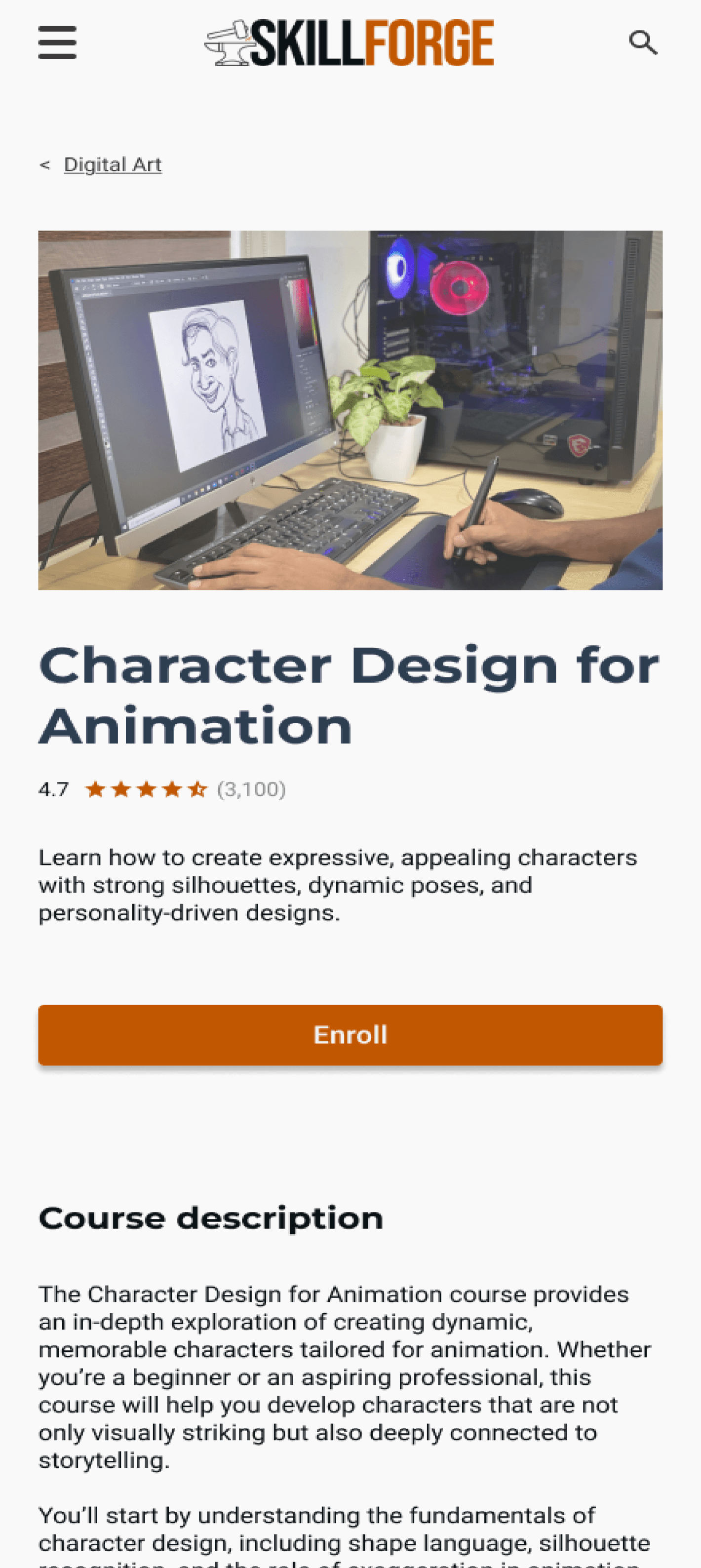
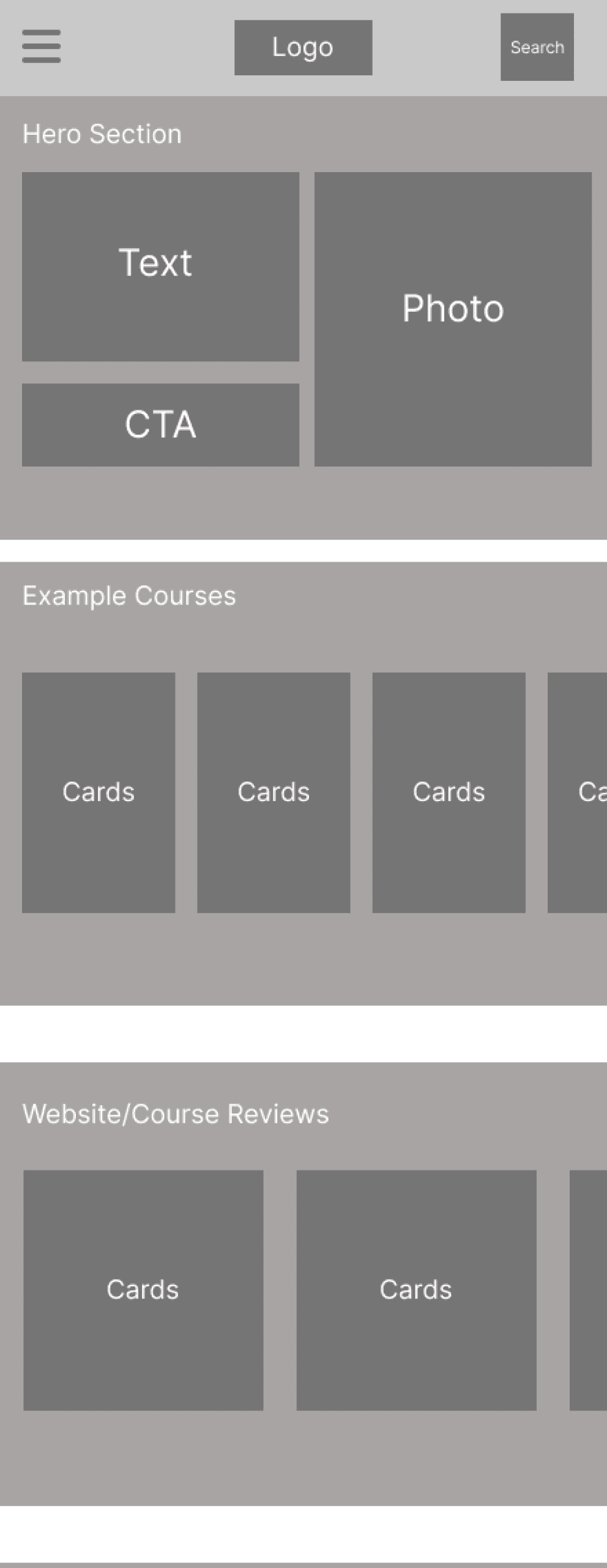
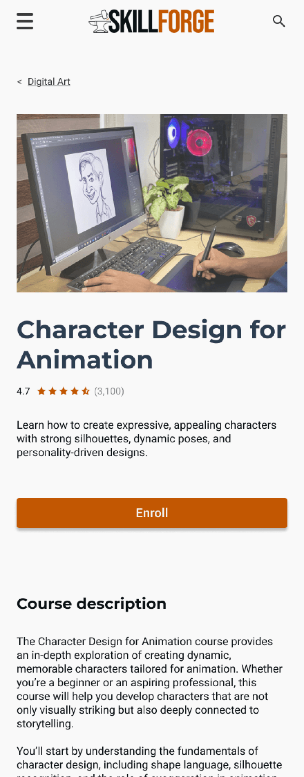
Mobile Wireframes
Low-Fidelity


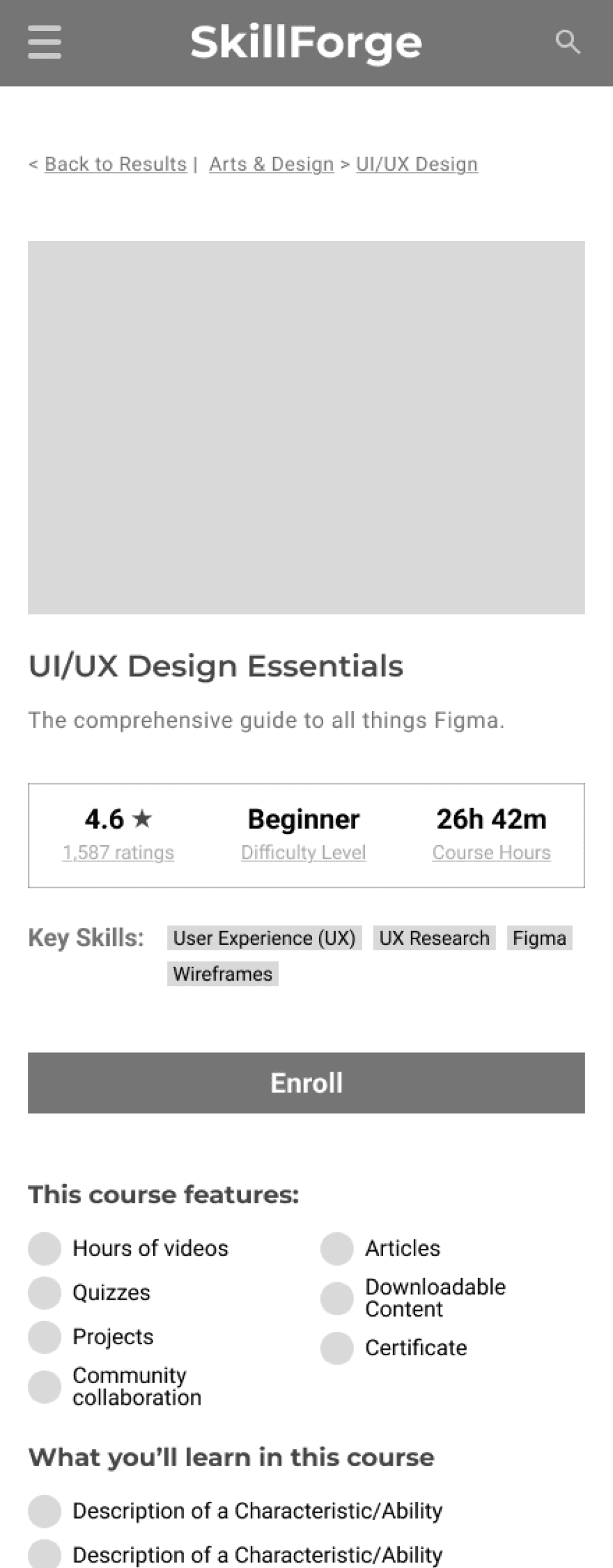
Mid-Fidelity


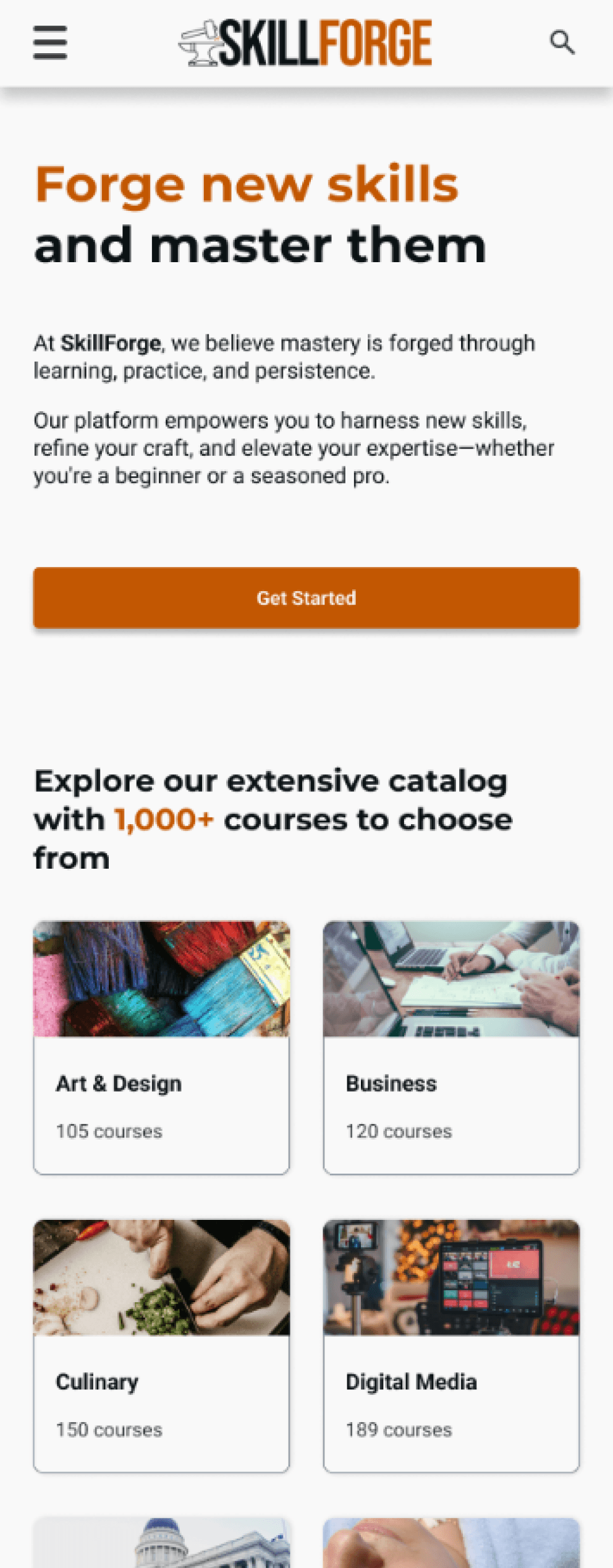
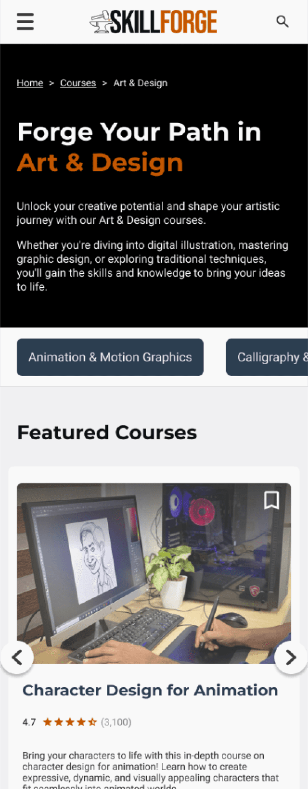
High-Fidelity


View Full Wireframes
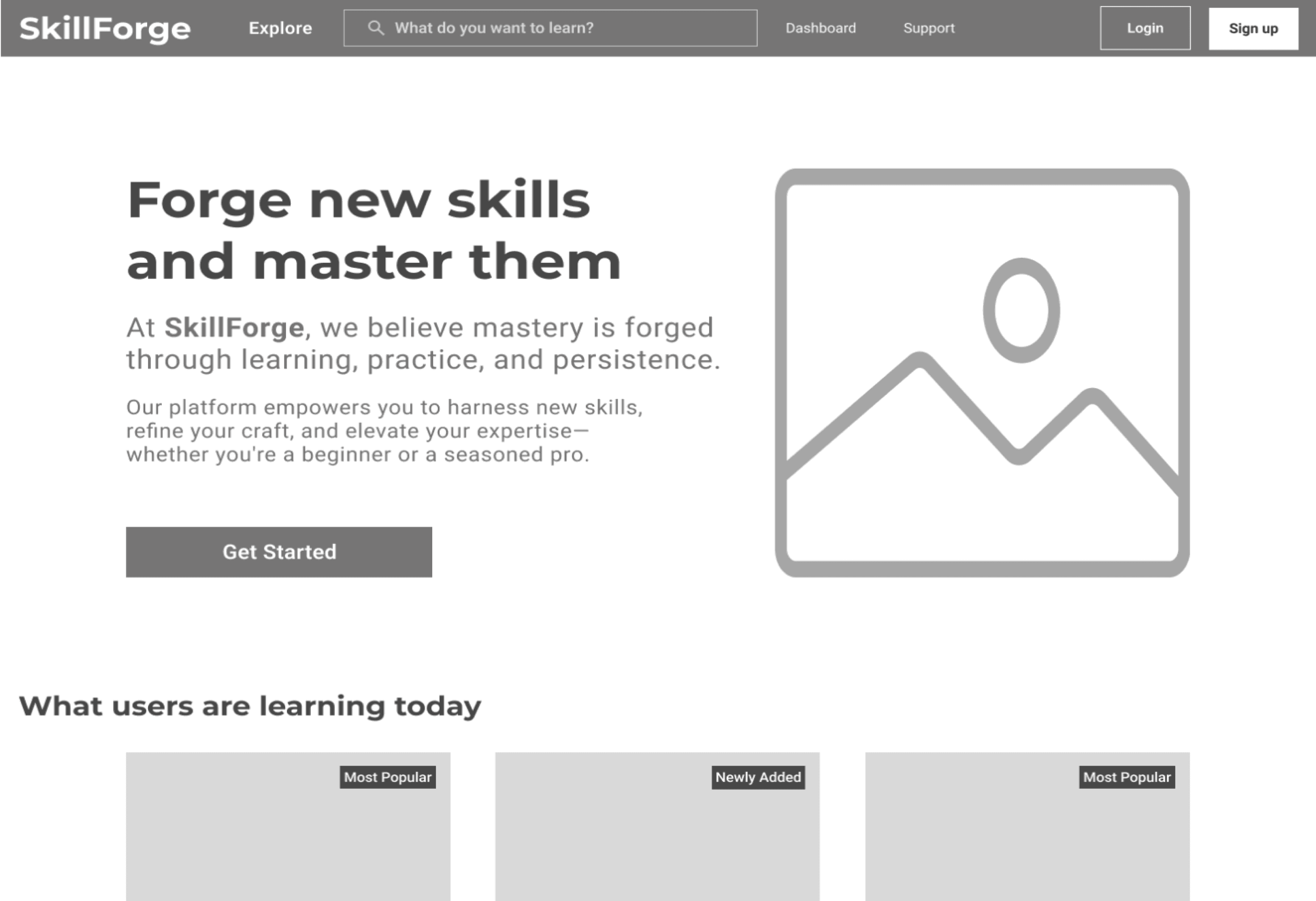
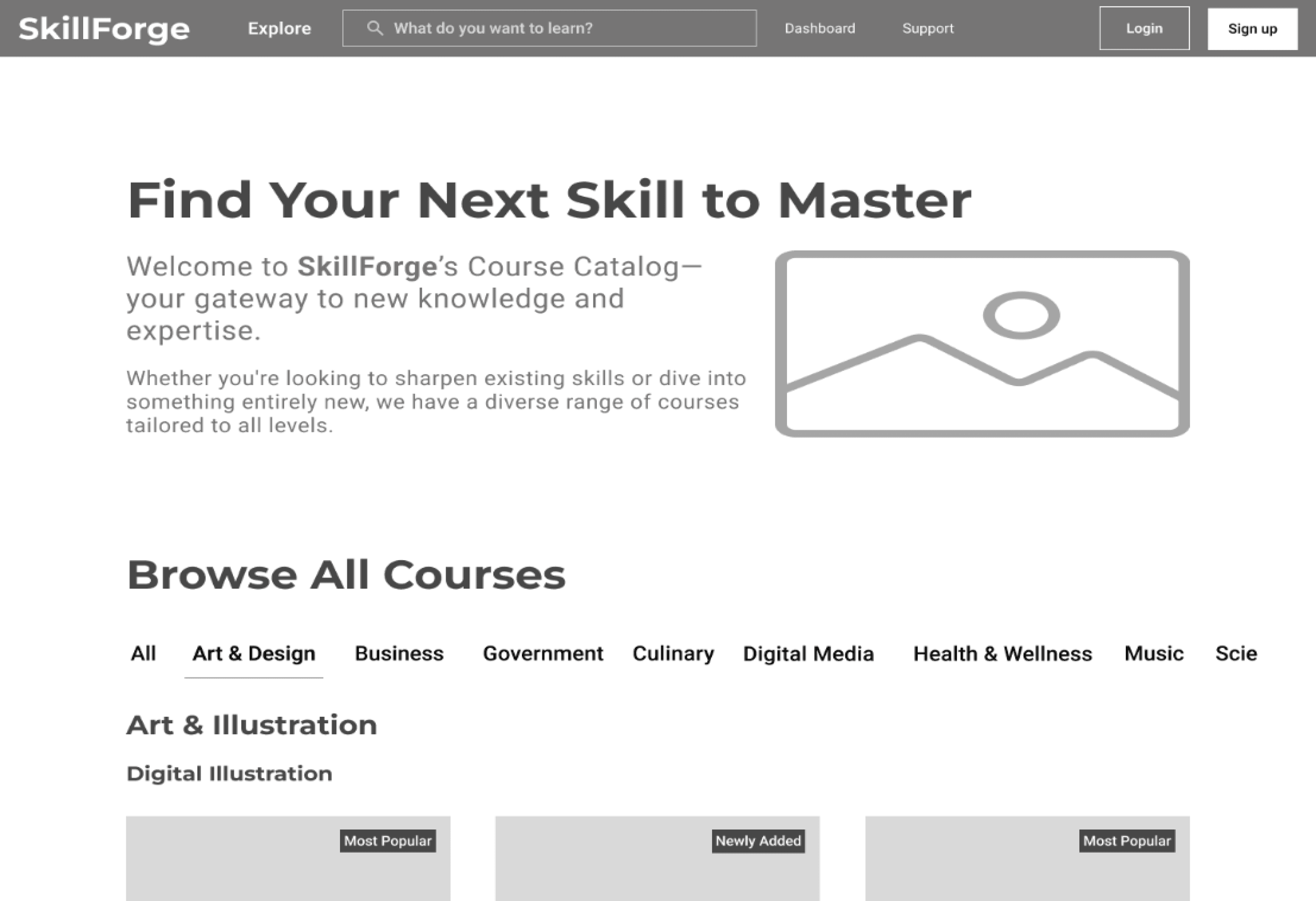
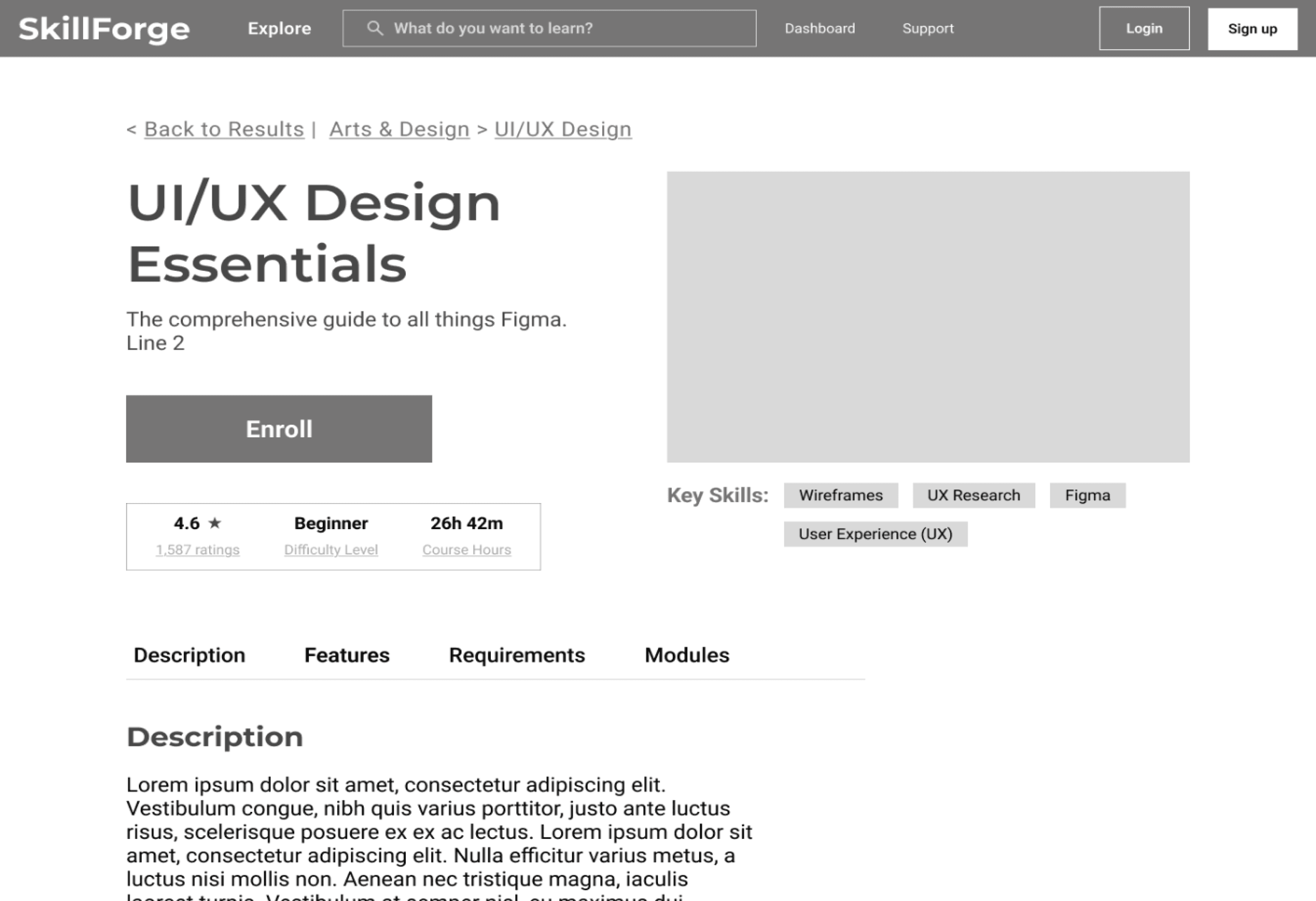
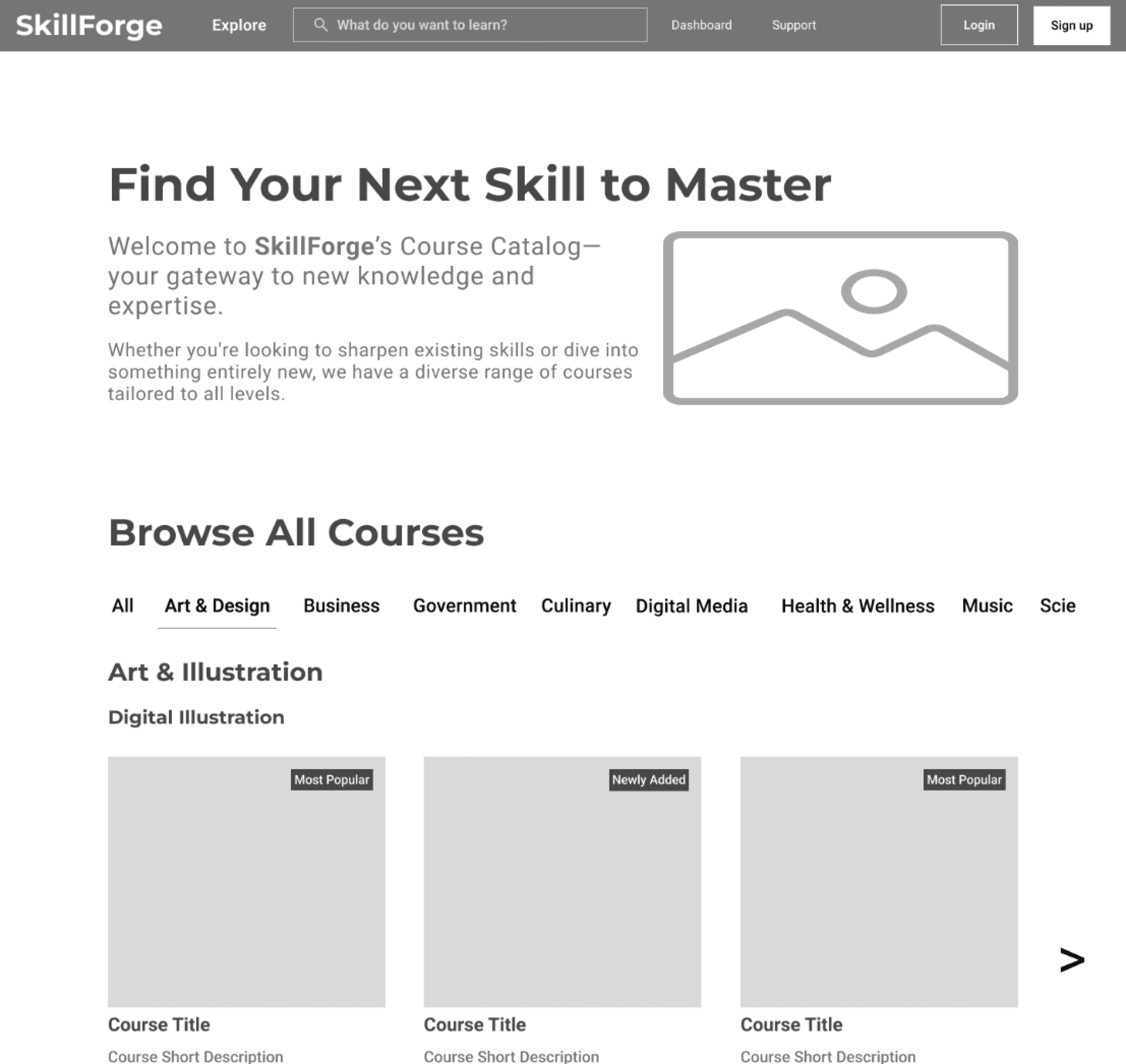
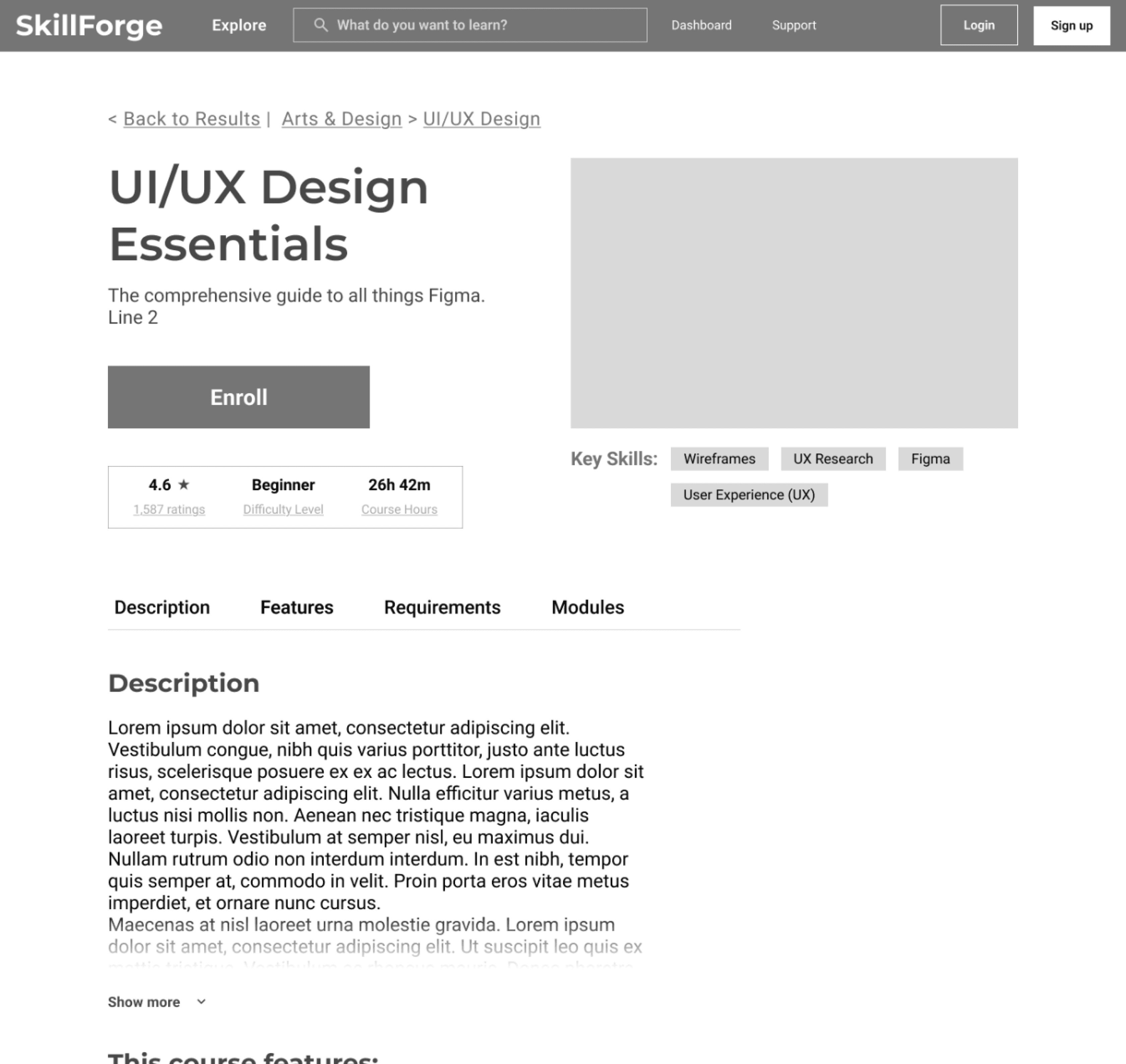
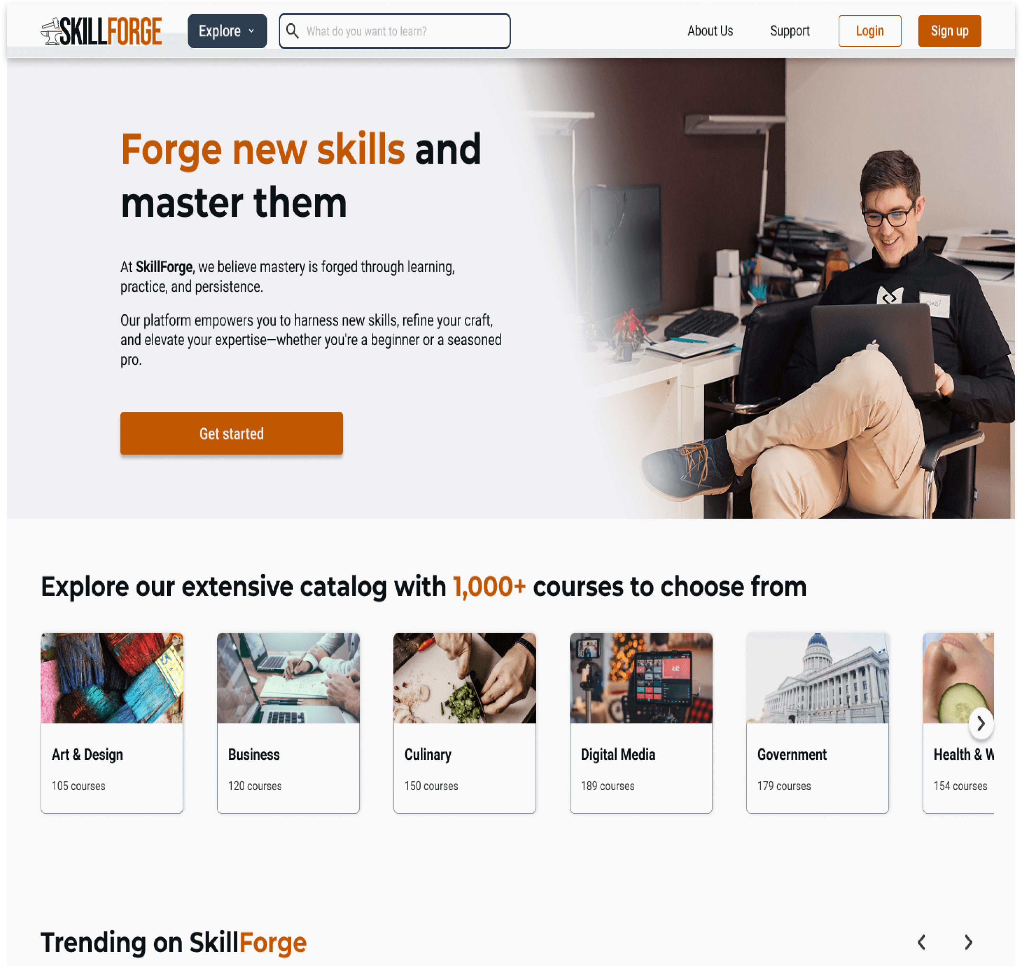
Desktop Wireframes
Mid-Fidelity




High-Fidelity




View Full Wireframes
Test
Usability Testing
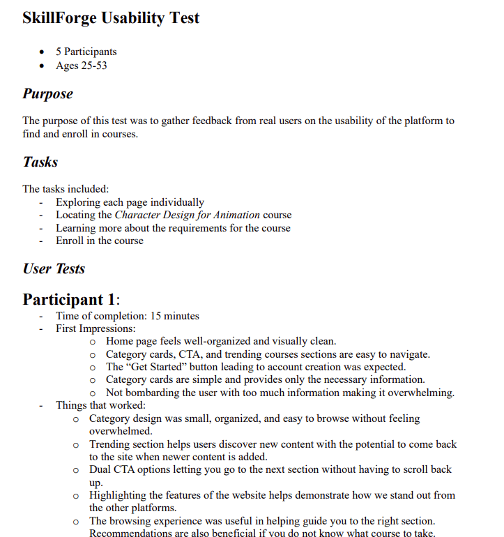
Following completion of my high-fidelity wireframes and prototyping, I conducted usability tests with 5 different participants. The purpose of this test was to gather feedback from real users on the usability of the platform to find and enroll in courses. The test included a set of tasks that the participants must complete while they interact with the screens. The results of these tests were recorded and analyzed.
Tasks
- Pick a course to enroll in through a user-preferred method
- Explore the course page
- Finish course enrollment by creating an account
Success Metrics
- Completion of tasks in a respectable amount of time
- Easily understand the task that is asked to complete
- Able to complete tasks without needing to ask for help
- Ability to complete tasks with minimal to no errors
Usability Test Results
Task 1
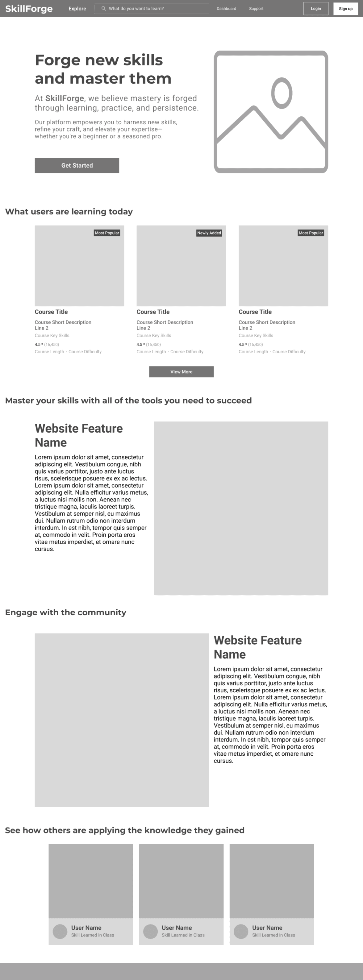
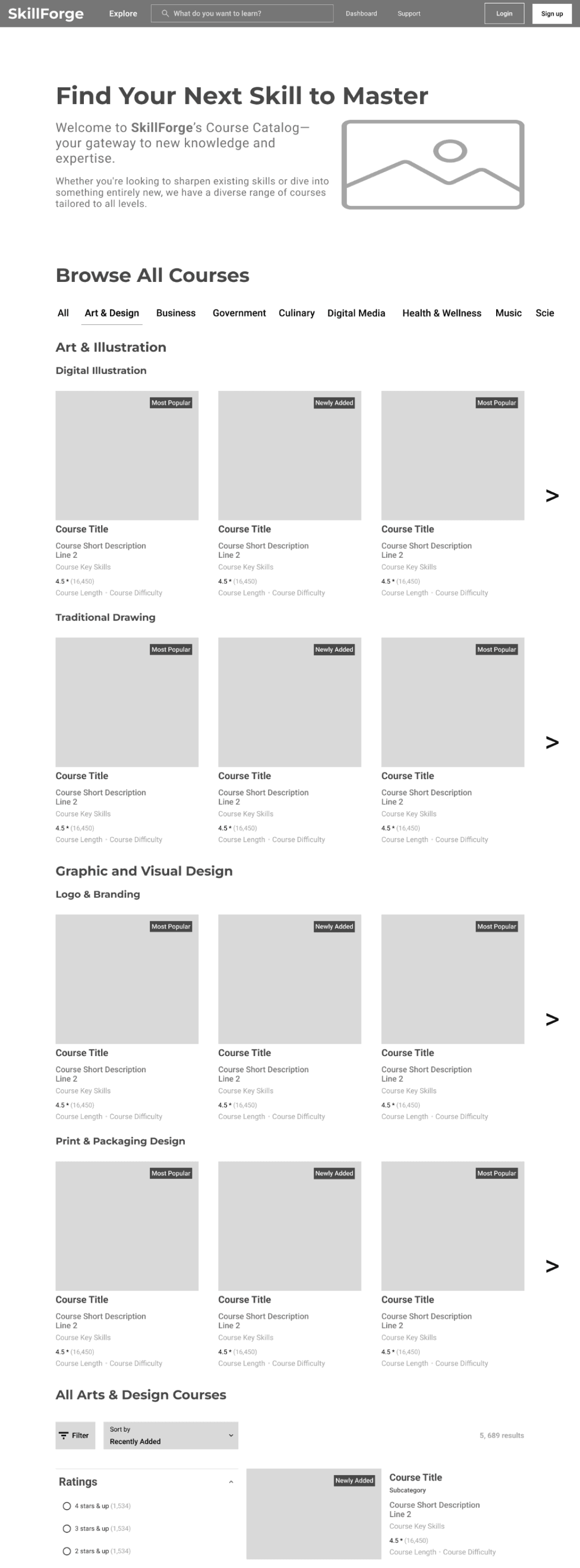
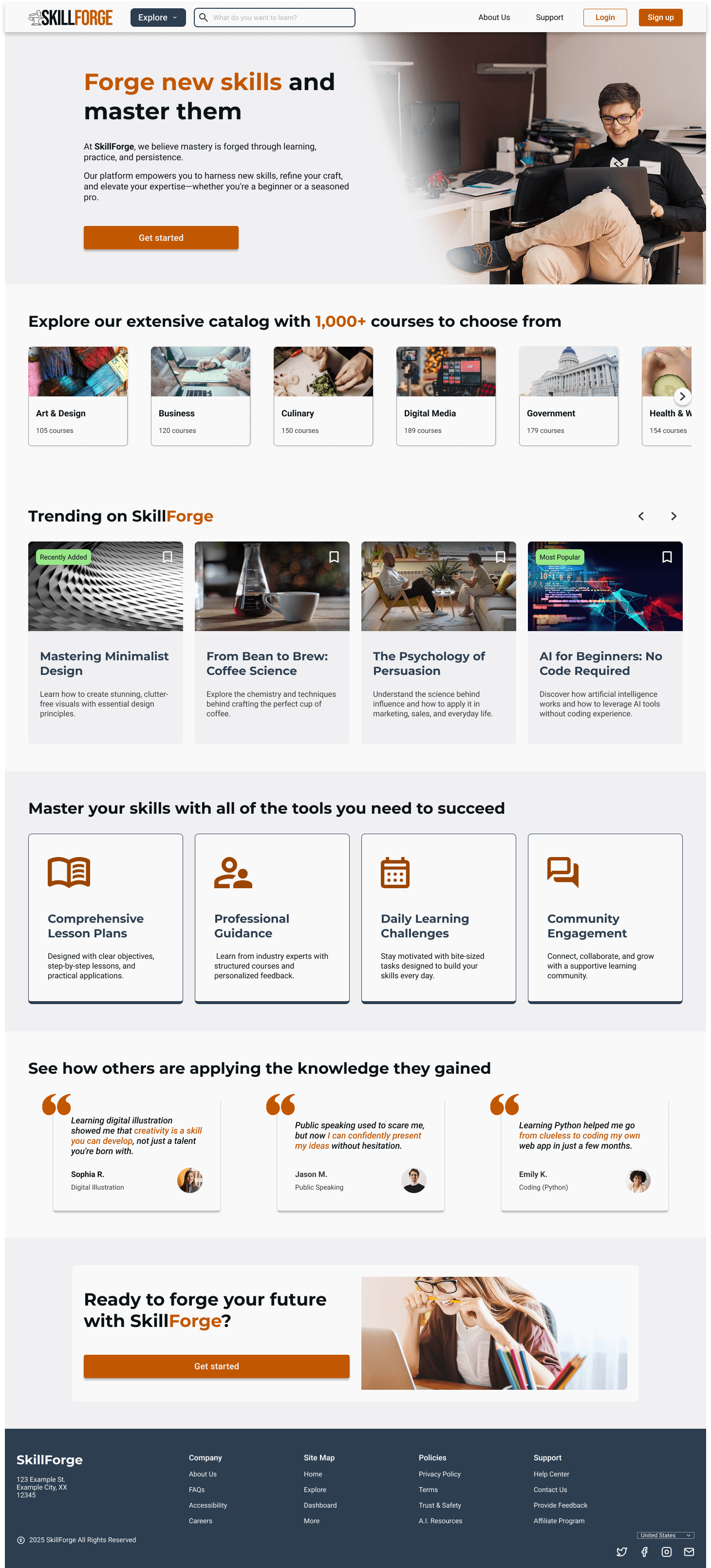
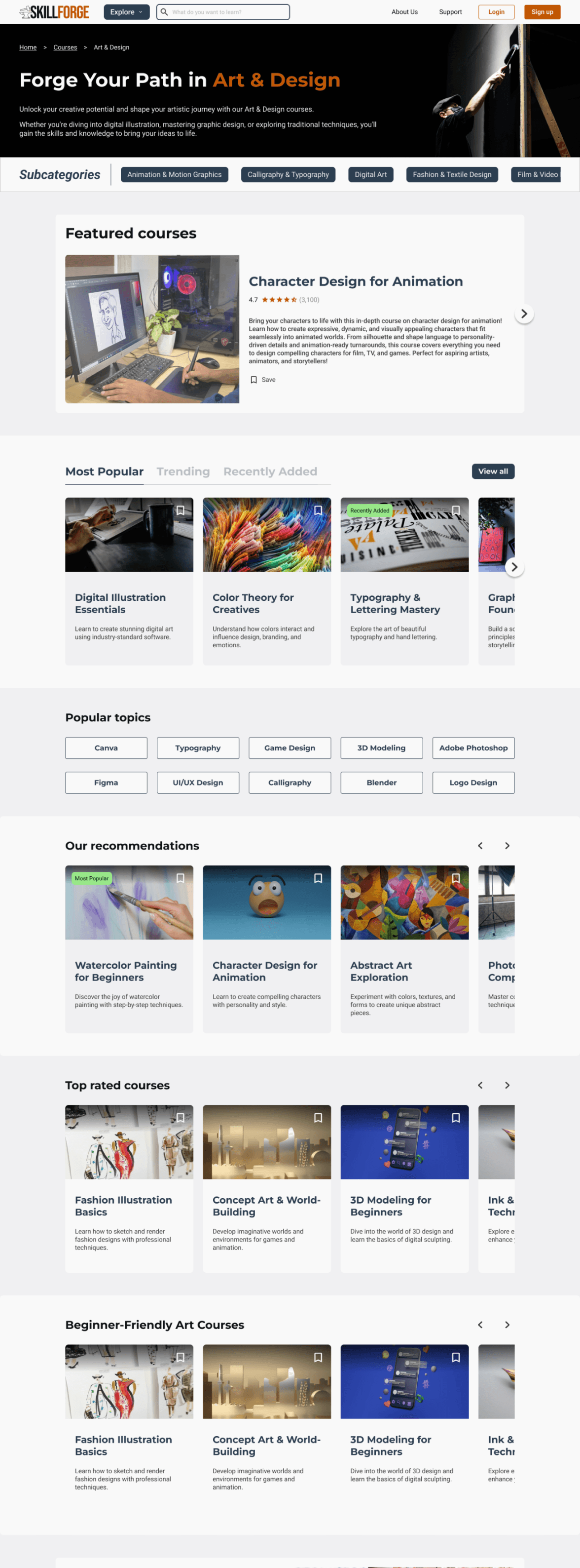
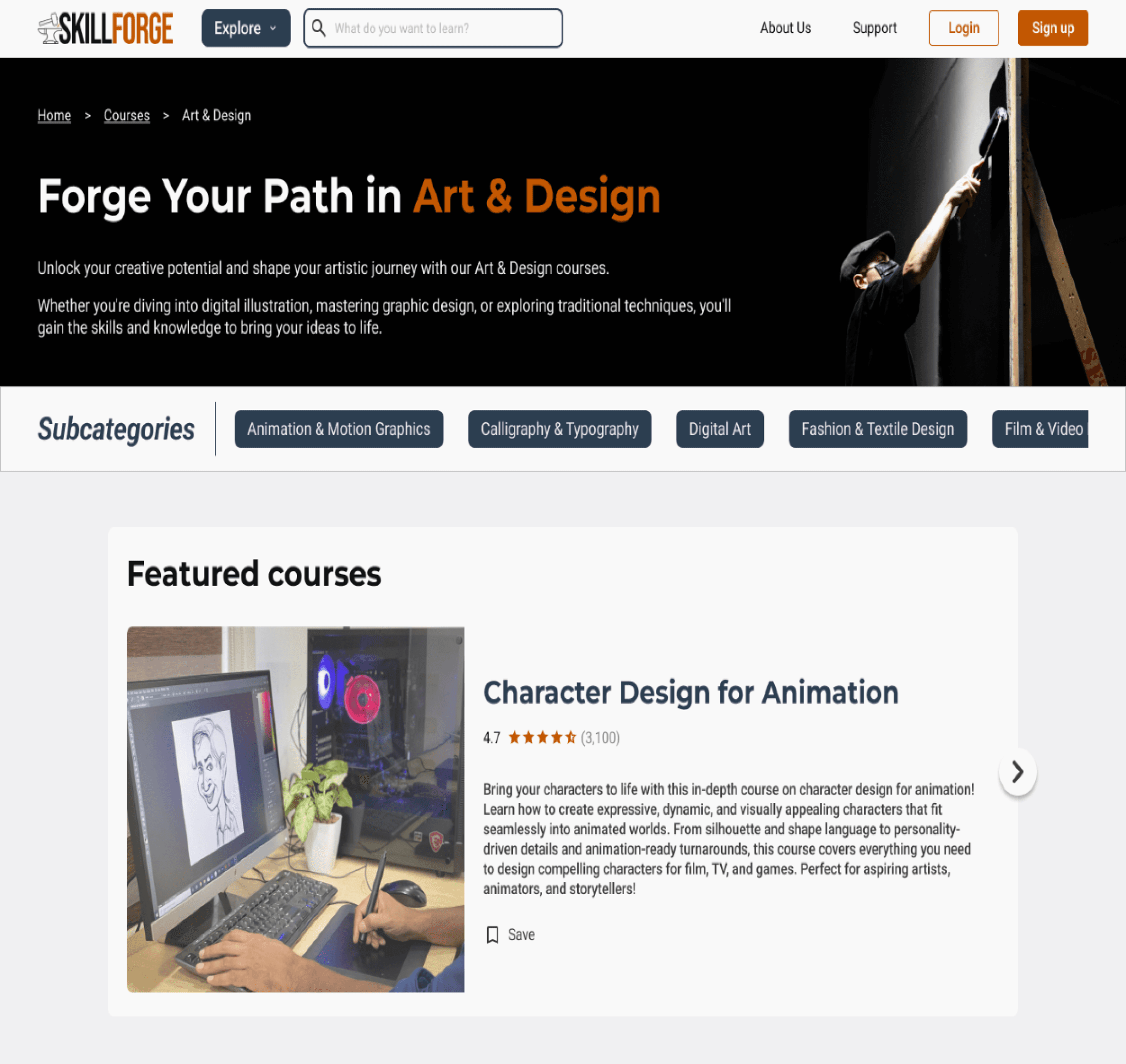
The design was visually appealing, easy to navigate, and effectively highlighted key features. However, course categories were confusing, imagery caused uncertainty, and opinions on testimonials were mixed. The “Get Started” CTA could lead to a questionnaire, subcategories weren’t clearly scrollable, and featured courses lacked a hover state for better identification.
Task 2
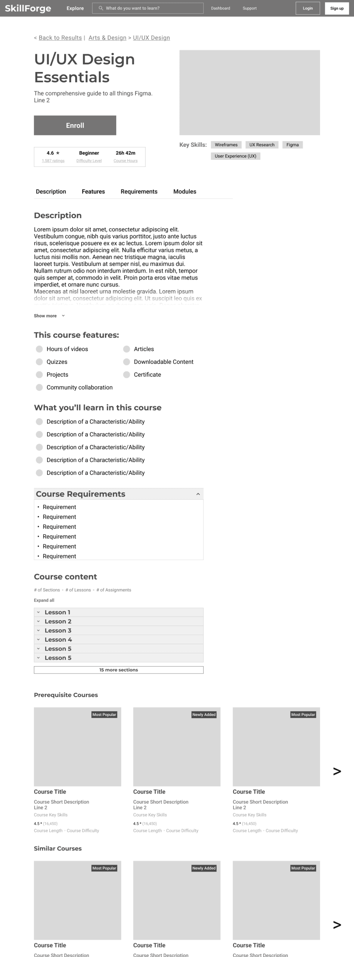
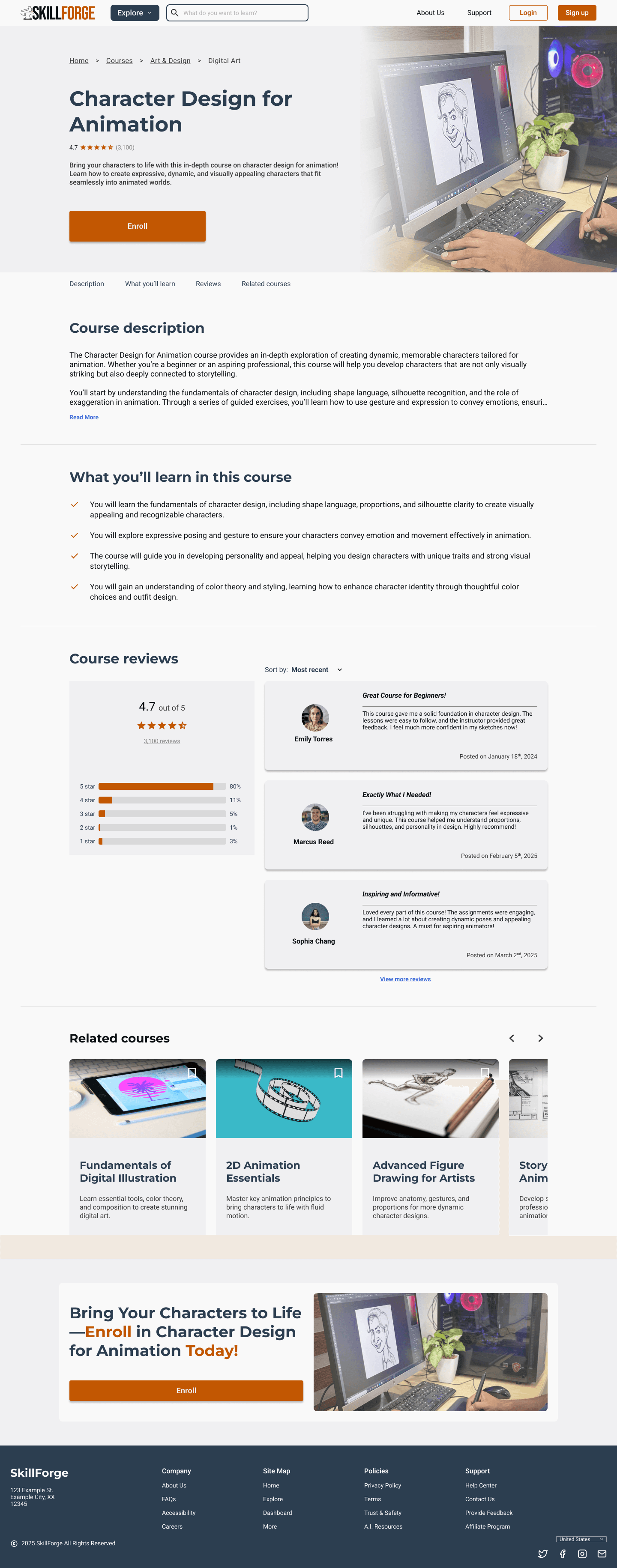
The page was visually appealing, intuitive, and well-organized, with helpful reviews and related course recommendations. However, users wanted more course details, such as a syllabus, multimedia content, a price breakdown, and review filters for better decision-making.
Task 3
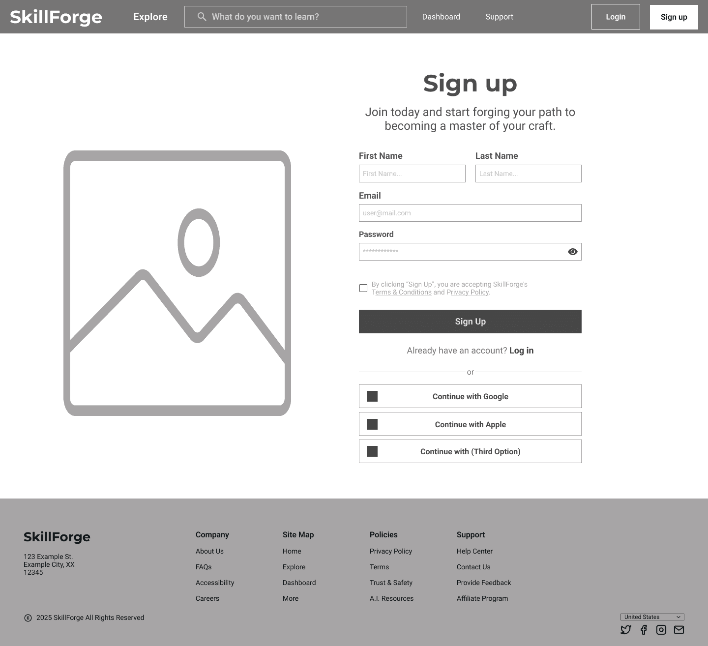
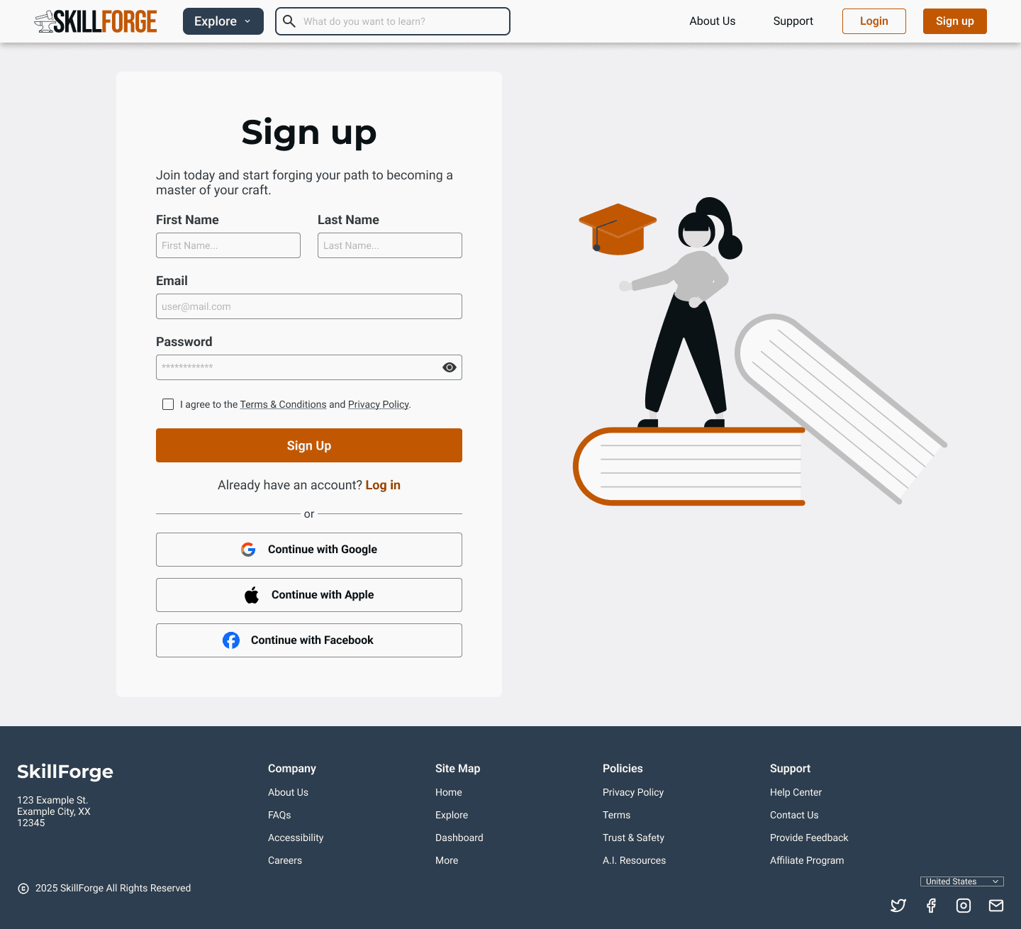
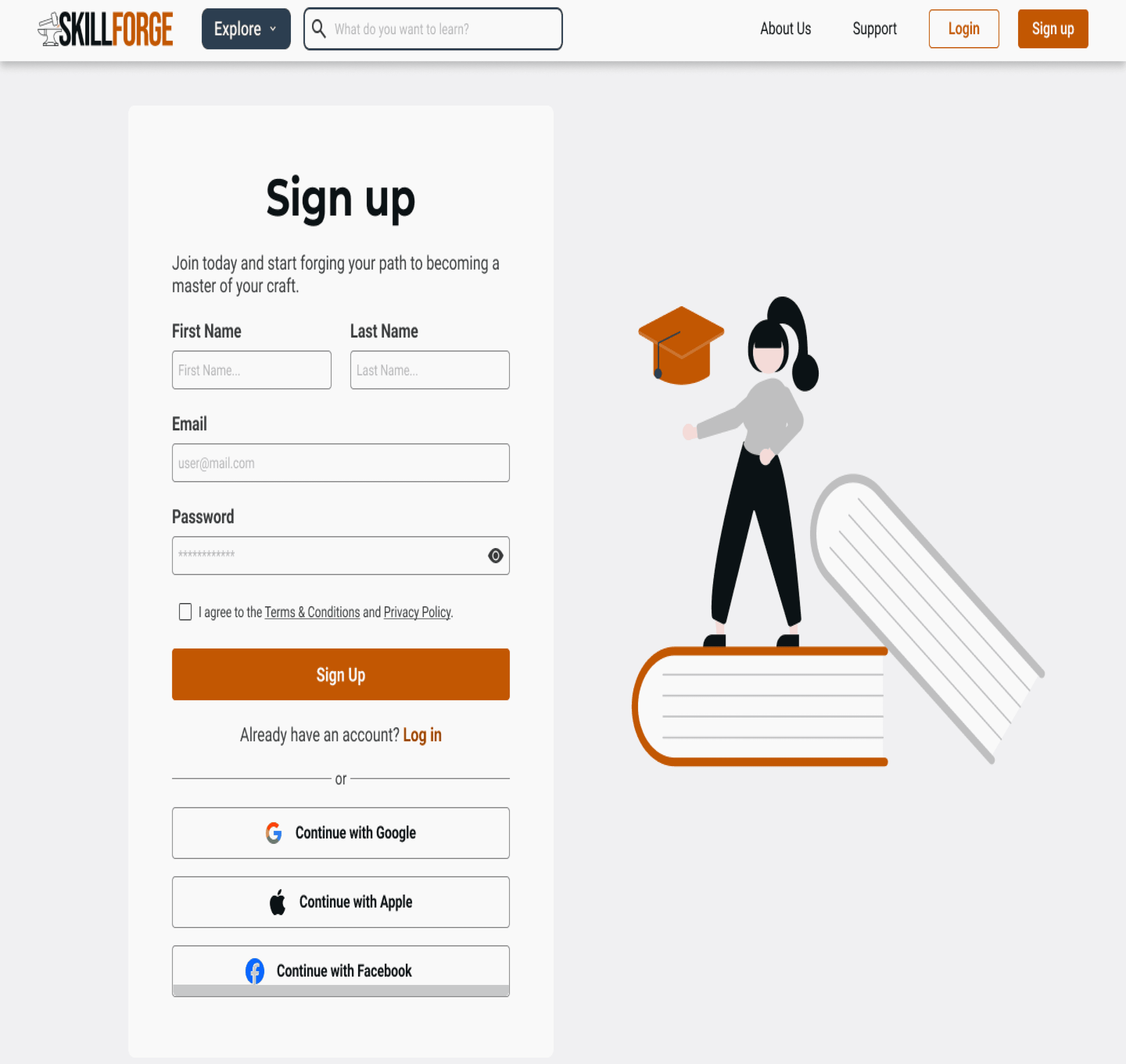
The sign-up process was smooth and well-timed after enrollment. However, users wanted a clearer purpose for signing up, a modal for bookmarking when not signed in, a pricing model after account creation, and a list of website features on the sign-up page.

View Full Results
Iterate
Feedback and Revisions
I took the feedback from the usability tests and improved on various aspects of the product to make the experience better for the users.


Clearer Category Labels & Visuals
To address confusion some participants had with unclear category names and images, I refined both the visuals and labels to better reflect the types of courses users can expect to find in each category.

Interactive Explore Menu
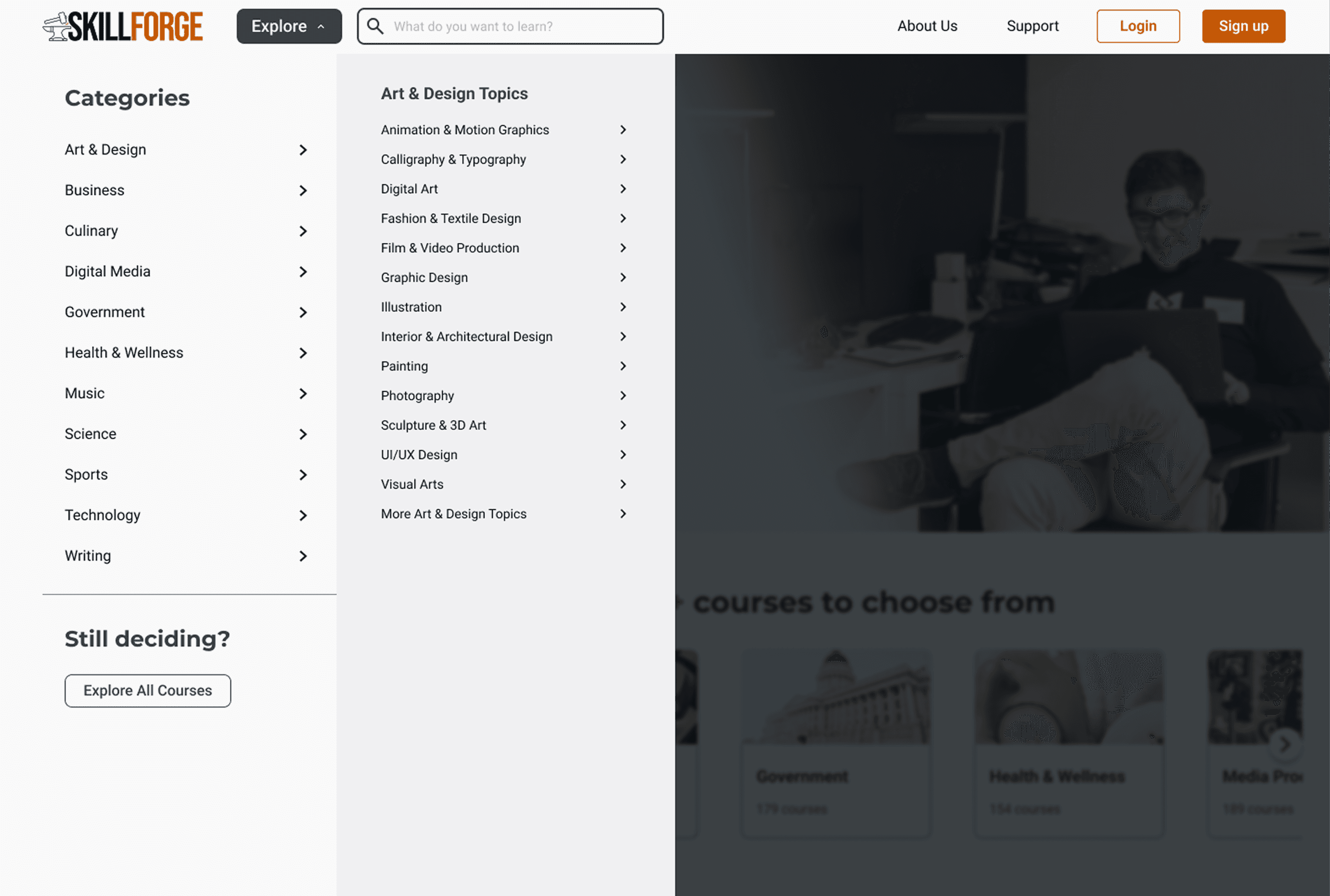
Some participants noted that the “Explore” button in the navigation bar lacked functionality, as they expected it to open a menu when clicked or hovered over. In response, I added interactive behavior to the button, allowing users to access categories and subcategories as expected.


Visible Course Ratings
Participants pointed out the absence of a course rating system, making it difficult to assess course quality at a glance. To improve clarity and decision-making, I added visible ratings to each course card preview across all screens.


Improved Carousel Interactivity
Some participants found the category carousel at the top of the page unclear in its purpose and didn’t realize it was interactive. I updated the visual design to better signal interactivity and scrolling, making it easier for users to discover and browse additional subcategories.
Conclusion
Key Takeaways
Working on SkillForge taught me how important it is to design with real user needs in mind, especially when it comes to staying motivated and building new habits. I found that clear goals, simple navigation, and consistent progress tracking can make a big difference in how people approach learning. Giving users a sense of structure and momentum was key to creating an experience that feels both approachable and rewarding.
Reflection
This project challenged me to step back and really think about how design decisions impact the learning experience as a whole. I gained a lot of confidence in leading the research process and turning insights into actionable design solutions. I also learned the value of testing early and often, even when things aren’t perfect. Getting honest feedback helped me iterate quickly and stay focused on what mattered most to users.
The Next Steps
I’d love to keep improving SkillForge by testing it with a wider range of users and exploring new ways to support different learning styles. One idea I’m excited about is adding social features, like community-based discussions or professional mentor support. I want to build the platform to include features that help users stay accountable. I also want to refine the experience for accessibility and personalize the learning paths even more. There’s a lot of potential to keep growing this tool into something truly useful.


A dynamic online platform helps users discover, learn, and track new skills or grow their existing skills through professionally guided courses and personalized progress tracking.

Project Duration
12 weeks
My Role
End-to-End UX/UI Designer
Tools
Figma, Adobe Photoshop
Introduction
Learning a new skill can be a difficult and daunting process. Whether it is finding what new skill you want to learn, the learning process itself, or even applying the newly learned skill in a social setting, there are many possible areas of frustration for individuals.
The Problem
The learning process can feel overwhelming and boring, often leading people to give up. I’ve experienced this myself and believe there’s a better way to make skill-building more engaging and accessible for everyone.
The Solution
Create an intuitive and engaging platform that simplifies the learning process, keeps users motivated, and adapts to different learning styles.
By making learning more enjoyable, structured, and accessible, users should stay committed and make real progress without feeling overwhelmed.
Research
Goal
Many users lose motivation when learning a new skill due to frustration or lack of clarity. I set out to understand these challenges to design a more supportive experience. Through research, I explored users' motivations, learning methods, prior experience, and emotional journey. These insights uncovered ways to boost motivation, tackle obstacles, and make skill-building more engaging and rewarding.
Objectives
Uncover user motivations and challenges in learning new skills.
Understand their learning journey, strategies, and emotional experiences.
Identify factors that support or hinder progress and motivation.
Research & Analysis Methods
Primary Research - User Interviews
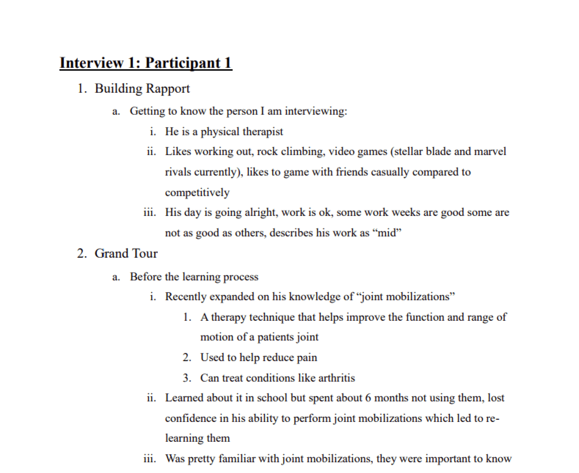
I was able to conduct an interview with 4 different participants
The interviews consisted of questions about their personal journeys related to the learning of their skill.
My goal was to be able to understand people’s experiences when learning a new skill to identify their challenges, needs, motivations, and opportunities for improvement.
Full Interview Report
Secondary Research - Competitive Analysis
I conducted a competitive analysis of 4 different platforms (consisting of 3 direct and 1 indirect competitors) to understand their strengths, weaknesses, and strategies for their services.
I looked at MasterClass, Coursera, Udemy, and YouTube to understand what they offered as direct and indirect competitors to my skill learning platform.
View Analysis
Research Analysis - Interview Debrief
Observation 1
All participants agreed that regular practice is essential for maintaining and applying a skill effectively, whether used daily or infrequently, as it ensures consistency.
Observation 2
Participants commonly experienced frustration but found that taking a break and trying again later was the best way to overcome it. No one felt the need to give up entirely, making this approach effective for continuing with the skill.
Observation 3
Participants agreed that anyone starting something new should take the leap without fear of failure. Trying and failing doesn’t make you a failure—what matters is persevering, practicing, and improving.
Full Debrief
Define
Affinity Mapping
Some common themes I uncovered include:
Motivation: Driven by helping others, personal growth, and career advancement.
Learning Methods: Includes videos, note-taking, and hands-on experience.
End Goals: Career growth, student improvement, and personal hobbies.
Beliefs: Emphasizes open-mindedness, lifelong learning, and taking initiative.
Purposes: Learning is essential for career success and practical application.
Self-Reflections: Gains confidence through progress, learning from mistakes, and wishing for an earlier start.
Overcoming Frustrations: Tackles setbacks with persistence, breaks, and practice.

View Affinity Map
POV Statements & HMW Questions
Using the data I compiled in my affinity map, I created some point-of-view (POV) statements and “how might we” questions.
POV Statements
1.
I’d like to explore ways to help users who are learning a new skill work on retaining their knowledge by practicing frequently.
2.
I’d like to explore ways to help users who are learning a new skill set defined goals for themselves before learning so that they can work towards achieving those goals.
3.
I’d like to explore ways to help users who are learning a new skill organize all of the tools they need to effectively learn the skill.
4.
I’d like to explore ways to help users who are learning new skills stay motivated.
5.
I’d like to explore ways to help users who are learning a new skill accurately measure their progress so that they can see the progression throughout the process.
6.
I’d like to explore ways to help users who are learning a new skill with help from professionals or experts.
HMW Questions
1.
How might we help users learning a new skill practice their skill to help retain what they have learned?
2.
How might we help users define goals they can work towards for the skill that they are learning?
3.
How might we gather and provide the user with all of the needed tools to succeed?
4.
How might we keep users motivated while learning their new skill?
5.
How might we complement the learning process with rewards or positive feedback?
6.
How might we help users learning a new skill keep track of their progress towards mastering the skill?
7.
How might we provide users with access to professional support and feedback for their skill?
User Personas
Based on my research, I created 3 user personas that best reflect my findings and help me understand my user's goals, motivations, needs, and frustrations. Here is one of the personas:
User Flows
Liam wants to improve his golf skills by learning from professionals. After careful consideration, he decides to enroll in golf learning classes.

Task Flows
Task: Find a specific course page


Task: Enroll in a course

Task: Submit a new forum post

Card Sorting & Site Map
User Story: John, a paralegal enrolled in professional law courses, is learning more to advance his career. He hopes that the feedback he receives on his assignments will help him understand the content more.
Card Sorting
View Card Sorts
Sitemap

Design
Storyboards


Color Palette
The colors I chose for the website are colors that are based on psychological associations with the name SkillForge and the idea of “forging new skills” on the platform.
Primary Color:
#C25702
#C27502
The primary color, orange, represents energy and motivation, which are key elements for learning.
Orange symbolizes the heat you experience in a real forge with fire, emphasizing the brands goal of helping you “forge” new skills.
Secondary Color:
#2C3E50
#255584
For the secondary color, I chose a shade of blue that is almost metallic, symbolizing the metal being heated in a forge. Blue as a color also represents feelings of trustworthiness and caring, which are two things that are important to the brand.
Tertiary Color:
#A30000
#98E788
#436DD7
My tertiary colors are reserved for different states and elements throughout the designs. Such as the green color for labels, the red color for error states, and the blue for link hover states.
Neutral Color:
#F9F9F9
#F0F0F2
#E0E0E0
#BFBFBF
#888888
#3B3B3B
#0B1215
Lastly, for my neutral colors, I wanted to include colors other than true white (#FFFFFF) and true black (#000000) as a way to stand out more from the typical colors used. I wanted similar colors to help provide balance, contrast, and readability to the platform.
Typefaces
Desktop
Level
Size
Weight
H1
48px
Bold
Montserrat
H2
44px
Bold
Montserrat
H3
36px
SemiBold
Montserrat
H4
32px
SemiBold
Montserrat
H5
24px
Bold
Montserrat
Level
Size
Weight
B1
24px
Regular
Roboto
B2
20px
Regular
Roboto
B3
18px
Regular
Roboto
B4
16px
Regular
Roboto
Level
Size
Weight
Button 1
24px
SemiBold
Roboto
Button 2
16px
SemiBold
Roboto
Label 1
14px
SemiBold
Roboto
Tablet/Mobile
Level
Size
Weight
H1
36px
Bold
Montserrat
H2
22px
Bold
Montserrat
H3
18px
SemiBold
Montserrat
Level
Size
Weight
B1
20px
Regular
Roboto
B2
18px
Regular
Roboto
B3
16px
Regular
Roboto
B4
14px
Regular
Roboto
Level
Size
Weight
Button 1
20px
Bold
Roboto
Button 2
14px
Bold
Roboto
Label 1
16px
Bold
Roboto
Brand Identity

The design process for my logo started off with brainstorming elements related to a “forge” to match the name of the brand.
I decided on an anvil with a hammer as the main focus piece of the logo. I wanted to incorporate the colors I picked in my color palette exercise. Since a hammer typically produces sparks when hitting the anvil, I figured I could use the orange color I picked to represent the sparks.
The hammer and anvil are symbols for users forging their new skills on the platform similarly to a blacksmith forging new tools. The sword is another representation of something that is forged and refined like a potential skill.
Prototype
Mobile Wireframes
Low-Fidelity

Mid-Fidelity

High-Fidelity

View Full Wireframes
Desktop Wireframes
Mid-Fidelity
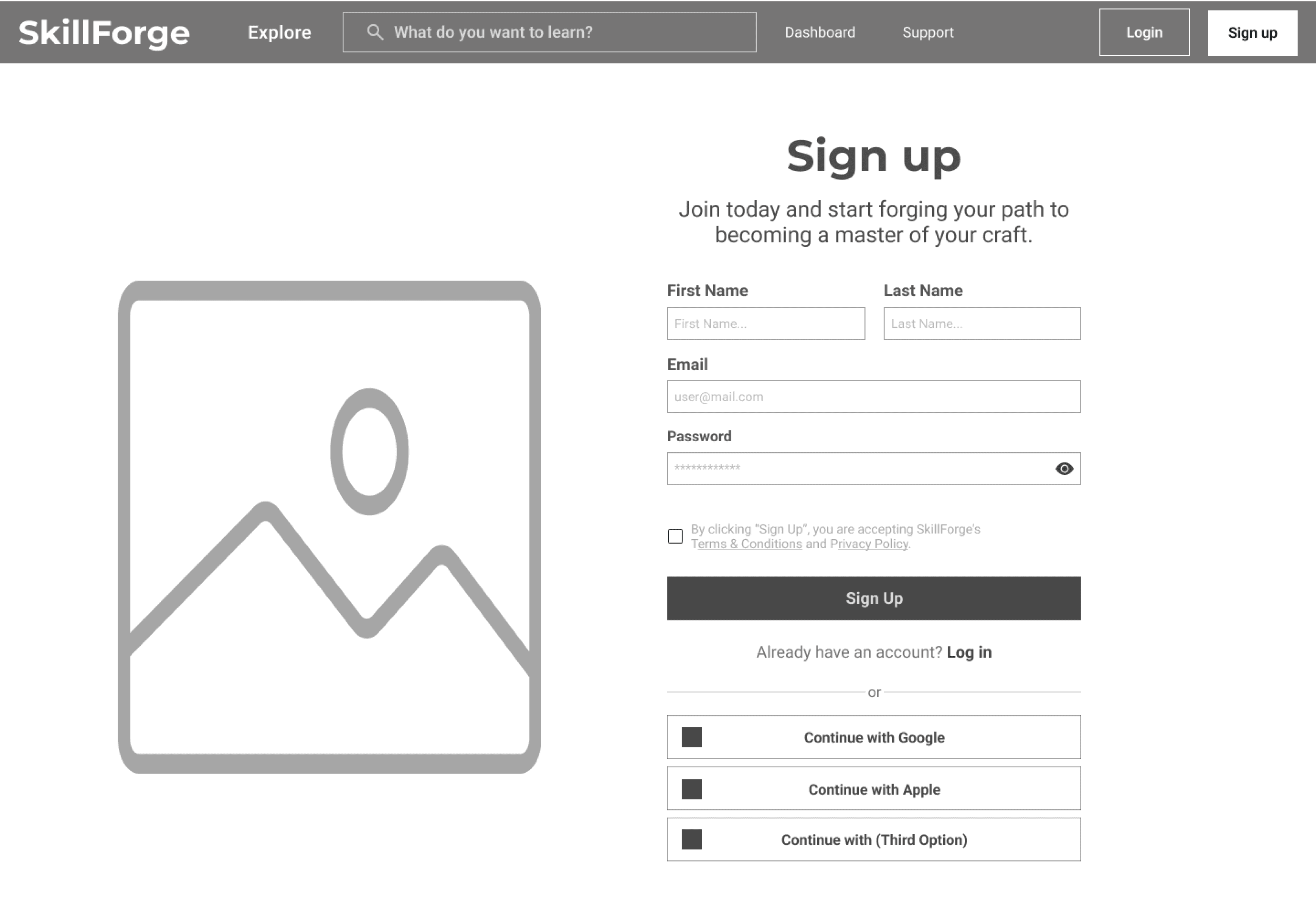
High-Fidelity

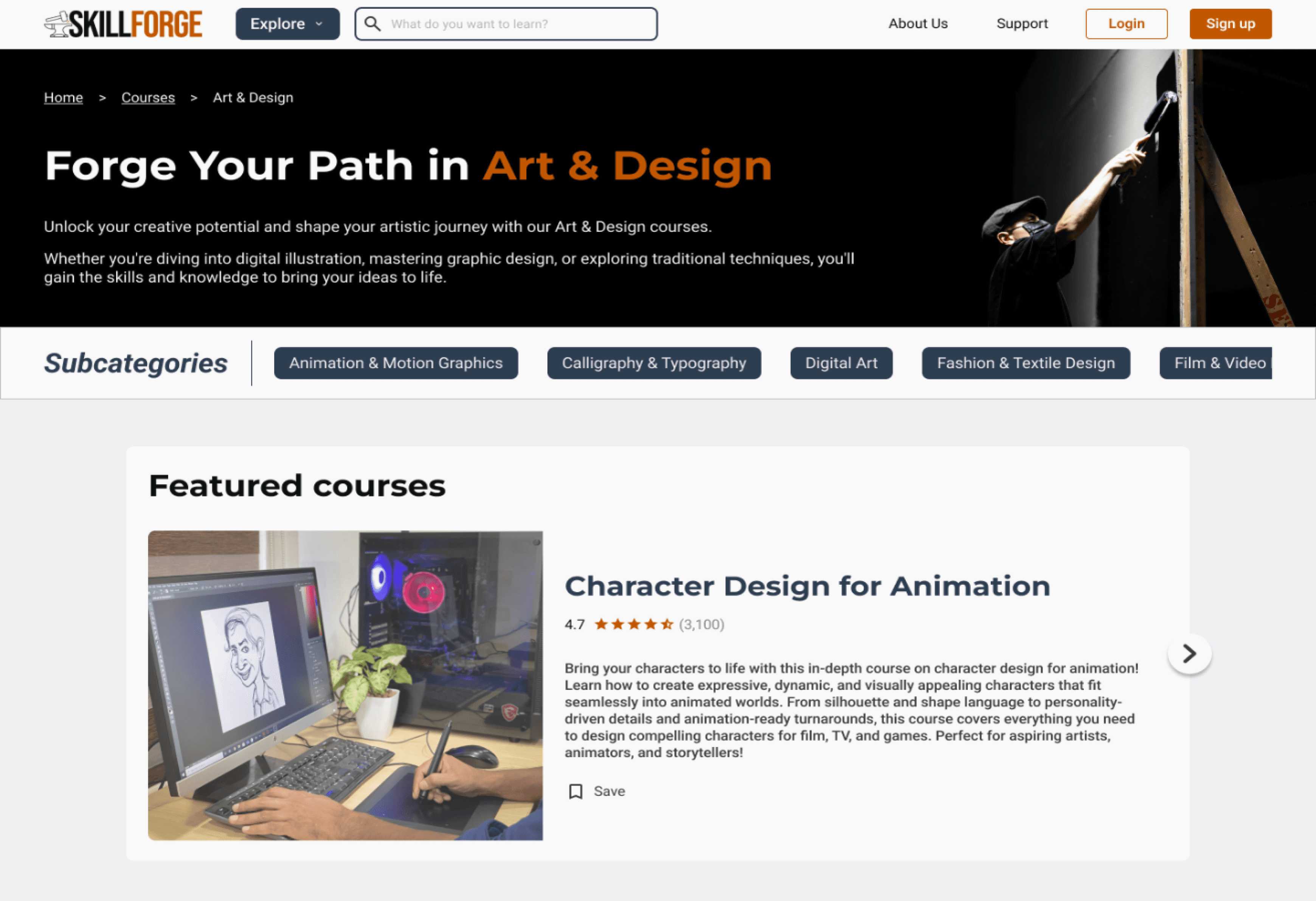
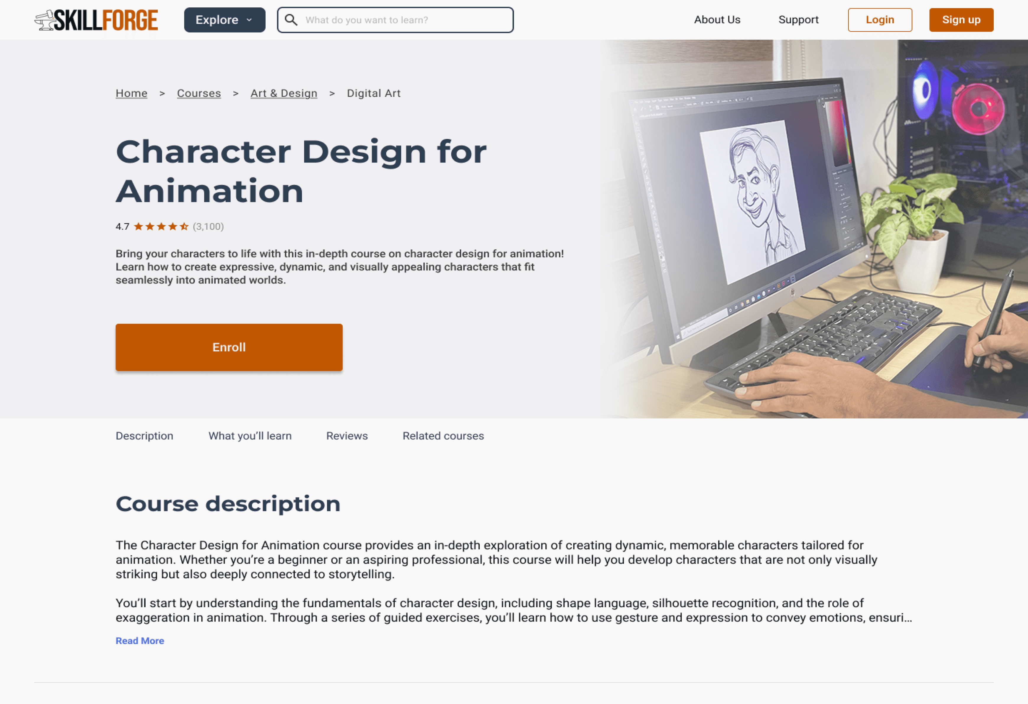

View Full Wireframes
Test
Usability Testing
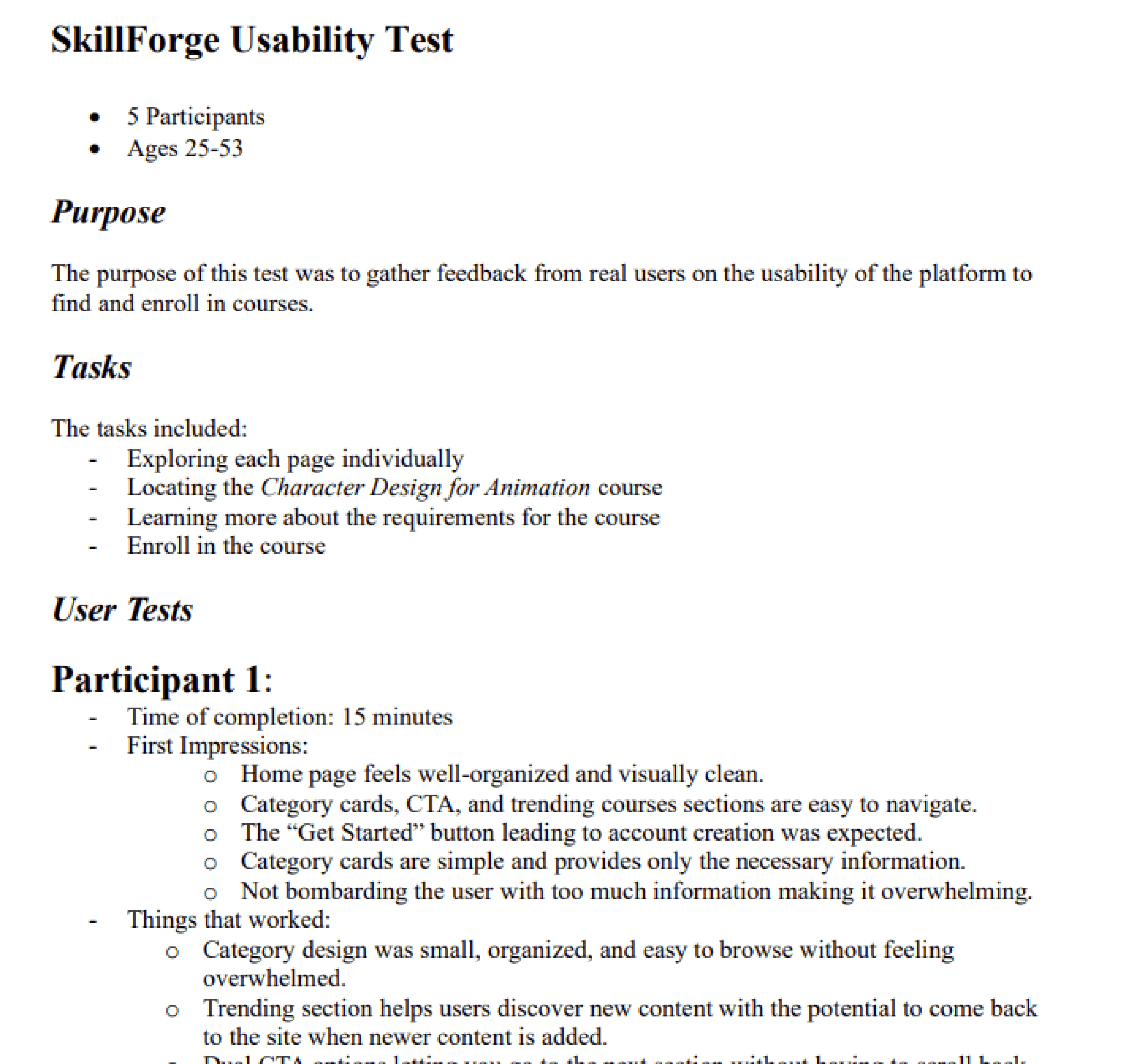
Following completion of my high-fidelity wireframes and prototyping, I conducted usability tests with 5 different participants. The purpose of this test was to gather feedback from real users on the usability of the platform to find and enroll in courses. The test included a set of tasks that the participants must complete while they interact with the screens. The results of these tests were recorded and analyzed.
Tasks
- Pick a course to enroll in through a user-preferred method
- Explore the course page
- Finish course enrollment by creating an account
Success Metrics
- Completion of tasks in a respectable amount of time
- Easily understand the task that is asked to complete
- Able to complete tasks without needing to ask for help
- Ability to complete tasks with minimal to no errors
Usability Test Results
Task 1
The design was visually appealing, easy to navigate, and effectively highlighted key features. However, course categories were confusing, imagery caused uncertainty, and opinions on testimonials were mixed. The “Get Started” CTA could lead to a questionnaire, subcategories weren’t clearly scrollable, and featured courses lacked a hover state for better identification.
Task 2
The page was visually appealing, intuitive, and well-organized, with helpful reviews and related course recommendations. However, users wanted more course details, such as a syllabus, multimedia content, a price breakdown, and review filters for better decision-making.
Task 3
The sign-up process was smooth and well-timed after enrollment. However, users wanted a clearer purpose for signing up, a modal for bookmarking when not signed in, a pricing model after account creation, and a list of website features on the sign-up page.
View Full Results
Iterate
Feedback and Revisions
I took the feedback from the usability tests and improved on various aspects of the product to make the experience better for the users.

Clearer Category Labels & Visuals
To address confusion some participants had with unclear category names and images, I refined both the visuals and labels to better reflect the types of courses users can expect to find in each category.

Interactive Explore Menu
Some participants noted that the “Explore” button in the navigation bar lacked functionality, as they expected it to open a menu when clicked or hovered over. In response, I added interactive behavior to the button, allowing users to access categories and subcategories as expected.
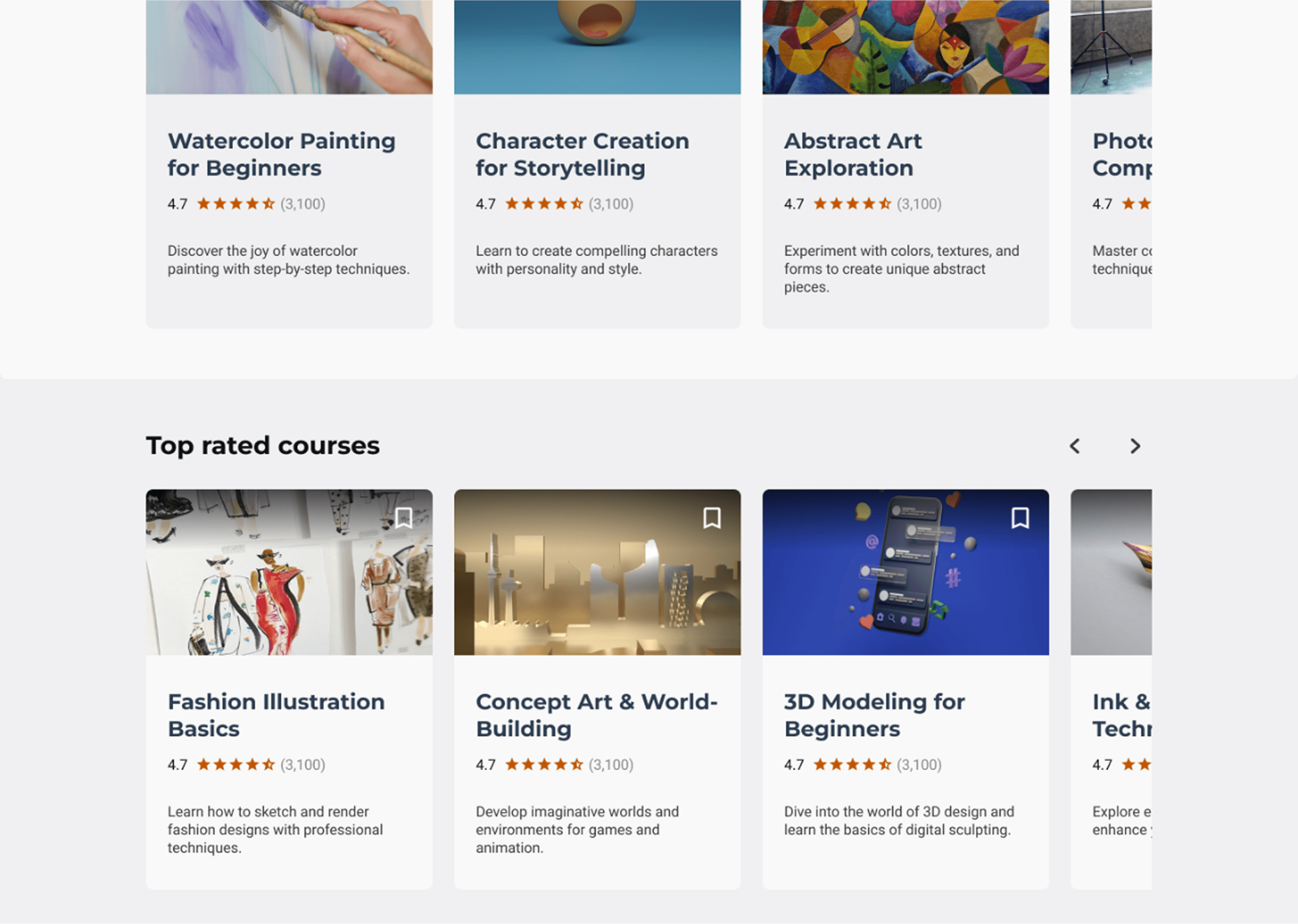
Visible Course Ratings
Participants pointed out the absence of a course rating system, making it difficult to assess course quality at a glance. To improve clarity and decision-making, I added visible ratings to each course card preview across all screens.
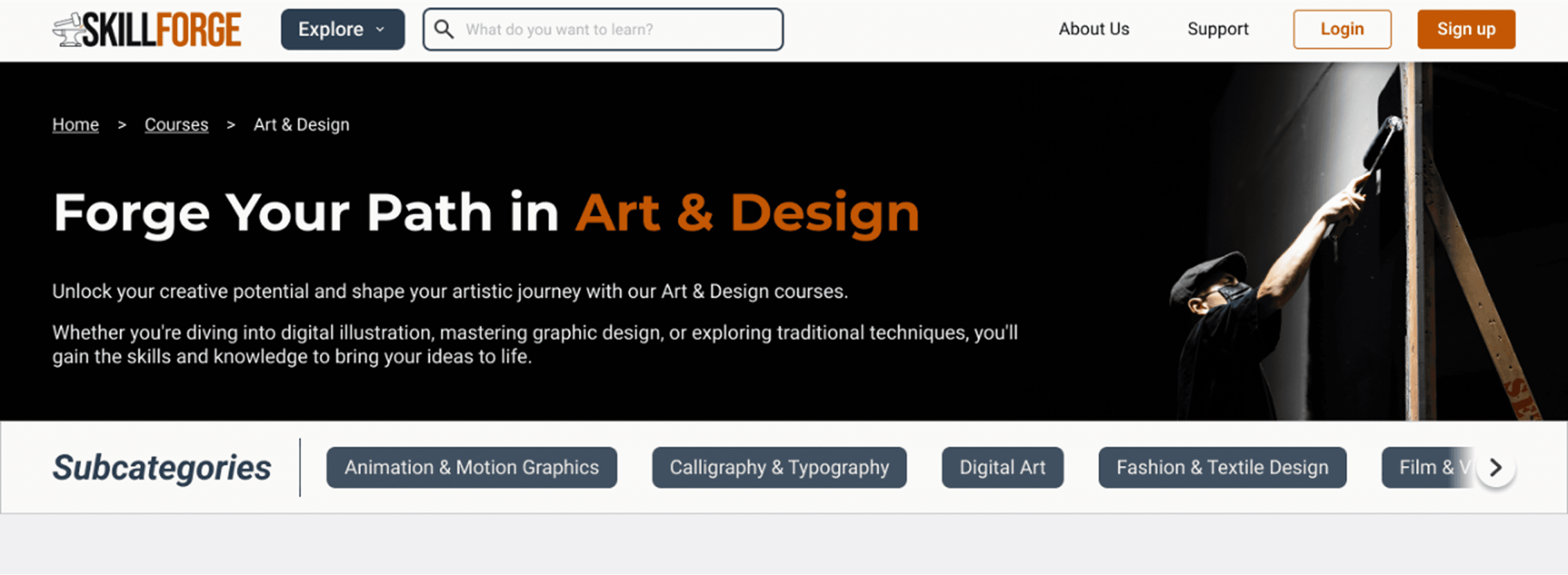
Improved Carousel Interactivity
Some participants found the category carousel at the top of the page unclear in its purpose and didn’t realize it was interactive. I updated the visual design to better signal interactivity and scrolling, making it easier for users to discover and browse additional subcategories.
Conclusion
Key Takeaways
Working on SkillForge taught me how important it is to design with real user needs in mind, especially when it comes to staying motivated and building new habits. I found that clear goals, simple navigation, and consistent progress tracking can make a big difference in how people approach learning. Giving users a sense of structure and momentum was key to creating an experience that feels both approachable and rewarding.
Reflection
This project challenged me to step back and really think about how design decisions impact the learning experience as a whole. I gained a lot of confidence in leading the research process and turning insights into actionable design solutions. I also learned the value of testing early and often, even when things aren’t perfect. Getting honest feedback helped me iterate quickly and stay focused on what mattered most to users.
The Next Steps
I’d love to keep improving SkillForge by testing it with a wider range of users and exploring new ways to support different learning styles. One idea I’m excited about is adding social features, like community-based discussions or professional mentor support. I want to build the platform to include features that help users stay accountable. I also want to refine the experience for accessibility and personalize the learning paths even more. There’s a lot of potential to keep growing this tool into something truly useful.

Brendan Stern
Designed & engineered by me


A dynamic online platform helps users discover, learn, and track new skills or grow their existing skills through professionally guided courses and personalized progress tracking.


Project Duration
12 weeks
My Role
End-to-End UX/UI Designer
Tools
Figma, Adobe Photoshop


A dynamic online platform helps users discover, learn, and track new skills or grow their existing skills through professionally guided courses and personalized progress tracking.


Project Duration
12 weeks
My Role
End-to-End UX/UI Designer
Tools
Figma, Adobe Photoshop
Introduction
Learning a new skill can be a difficult and daunting process. Whether it is finding what new skill you want to learn, the learning process itself, or even applying the newly learned skill in a social setting, there are many possible areas of frustration for individuals.
The Problem
The learning process can feel overwhelming and boring, often leading people to give up. I’ve experienced this myself and believe there’s a better way to make skill-building more engaging and accessible for everyone.
The Solution
Create an intuitive and engaging platform that simplifies the learning process, keeps users motivated, and adapts to different learning styles.
By making learning more enjoyable, structured, and accessible, users should stay committed and make real progress without feeling overwhelmed.
Research
Goal
Many users lose motivation when learning a new skill due to frustration or lack of clarity. I set out to understand these challenges to design a more supportive experience. Through research, I explored users' motivations, learning methods, prior experience, and emotional journey. These insights uncovered ways to boost motivation, tackle obstacles, and make skill-building more engaging and rewarding.
Objectives
Uncover user motivations and challenges in learning new skills.
Understand their learning journey, strategies, and emotional experiences.
Identify factors that support or hinder progress and motivation.
Research & Analysis Methods
Primary Research - User Interviews
I was able to conduct an interview with 4 different participants
The interviews consisted of questions about their personal journeys related to the learning of their skill.
My goal was to be able to understand people’s experiences when learning a new skill to identify their challenges, needs, motivations, and opportunities for improvement.
Full Interview Report

Secondary Research - Competitive Analysis
I conducted a competitive analysis of 4 different platforms (consisting of 3 direct and 1 indirect competitors) to understand their strengths, weaknesses, and strategies for their services.
I looked at MasterClass, Coursera, Udemy, and YouTube to understand what they offered as direct and indirect competitors to my skill learning platform.

View Analysis
Research Analysis - Interview Debrief
Observation 1
All participants agreed that regular practice is essential for maintaining and applying a skill effectively, whether used daily or infrequently, as it ensures consistency.
Observation 2
Participants commonly experienced frustration but found that taking a break and trying again later was the best way to overcome it. No one felt the need to give up entirely, making this approach effective for continuing with the skill.
Observation 3
Participants agreed that anyone starting something new should take the leap without fear of failure. Trying and failing doesn’t make you a failure—what matters is persevering, practicing, and improving.


Full Debrief
Define
Affinity Mapping
Some common themes I uncovered include:
Motivation: Driven by helping others, personal growth, and career advancement.
Learning Methods: Includes videos, note-taking, and hands-on experience.
End Goals: Career growth, student improvement, and personal hobbies.
Beliefs: Emphasizes open-mindedness, lifelong learning, and taking initiative.
Purposes: Learning is essential for career success and practical application.
Self-Reflections: Gains confidence through progress, learning from mistakes, and wishing for an earlier start.
Overcoming Frustrations: Tackles setbacks with persistence, breaks, and practice.


View Affinity Map
POV Statements & HMW Questions
Using the data I compiled in my affinity map, I created some point-of-view (POV) statements and “how might we” questions.
POV Statements
1.
I’d like to explore ways to help users who are learning a new skill work on retaining their knowledge by practicing frequently.
2.
I’d like to explore ways to help users who are learning a new skill set defined goals for themselves before learning so that they can work towards achieving those goals.
3.
I’d like to explore ways to help users who are learning a new skill organize all of the tools they need to effectively learn the skill.
4.
I’d like to explore ways to help users who are learning new skills stay motivated.
5.
I’d like to explore ways to help users who are learning a new skill accurately measure their progress so that they can see the progression throughout the process.
6.
I’d like to explore ways to help users who are learning a new skill with help from professionals or experts.
HMW Questions
1.
How might we help users learning a new skill practice their skill to help retain what they have learned?
2.
How might we help users define goals they can work towards for the skill that they are learning?
3.
How might we gather and provide the user with all of the needed tools to succeed?
4.
How might we keep users motivated while learning their new skill?
5.
How might we complement the learning process with rewards or positive feedback?
6.
How might we help users learning a new skill keep track of their progress towards mastering the skill?
7.
How might we provide users with access to professional support and feedback for their skill?
User Personas
Based on my research, I created 3 user personas that best reflect my findings and help me understand my user's goals, motivations, needs, and frustrations. Here is one of the personas:
User Flows
Liam wants to improve his golf skills by learning from professionals. After careful consideration, he decides to enroll in golf learning classes.


Task Flows
Task: Find a specific course page


Task: Enroll in a course


Task: Submit a new forum post


Card Sorting & Site Map
User Story: John, a paralegal enrolled in professional law courses, is learning more to advance his career. He hopes that the feedback he receives on his assignments will help him understand the content more.
Card Sorting


View Card Sorts
Sitemap


Design
Storyboards


Color Palette
The colors I chose for the website are colors that are based on psychological associations with the name SkillForge and the idea of “forging new skills” on the platform.
Primary Color:
#C25702
#C27502
The primary color, orange, represents energy and motivation, which are key elements for learning.
Orange symbolizes the heat you experience in a real forge with fire, emphasizing the brands goal of helping you “forge” new skills.
Secondary Color:
#2C3E50
#255584
For the secondary color, I chose a shade of blue that is almost metallic, symbolizing the metal being heated in a forge. Blue as a color also represents feelings of trustworthiness and caring, which are two things that are important to the brand.
Tertiary Color:
#A30000
#98E788
#436DD7
My tertiary colors are reserved for different states and elements throughout the designs. Such as the green color for labels, the red color for error states, and the blue for link hover states.
Neutral Color:
#F9F9F9
#F0F0F2
#E0E0E0
#BFBFBF
#888888
#3B3B3B
#0B1215
Lastly, for my neutral colors, I wanted to include colors other than true white (#FFFFFF) and true black (#000000) as a way to stand out more from the typical colors used. I wanted similar colors to help provide balance, contrast, and readability to the platform.
Typefaces
Desktop
Level
Size
Weight
H1
48px
Bold
Montserrat
H2
44px
Bold
Montserrat
H3
36px
SemiBold
Montserrat
H4
32px
SemiBold
Montserrat
H5
24px
Bold
Montserrat
Level
Size
Weight
B1
24px
Regular
Roboto
B2
20px
Regular
Roboto
B3
18px
Regular
Roboto
B4
16px
Regular
Roboto
Level
Size
Weight
Button 1
24px
SemiBold
Roboto
Button 2
16px
SemiBold
Roboto
Label 1
14px
SemiBold
Roboto
Tablet/Mobile
Level
Size
Weight
H1
36px
Bold
Montserrat
H2
22px
Bold
Montserrat
H3
18px
SemiBold
Montserrat
Level
Size
Weight
B1
20px
Regular
Roboto
B2
18px
Regular
Roboto
B3
16px
Regular
Roboto
B4
14px
Regular
Roboto
Level
Size
Weight
Button 1
20px
Bold
Roboto
Button 2
14px
Bold
Roboto
Label 1
16px
Bold
Roboto
Brand Identity


The design process for my logo started off with brainstorming elements related to a “forge” to match the name of the brand.
I decided on an anvil with a hammer as the main focus piece of the logo. I wanted to incorporate the colors I picked in my color palette exercise. Since a hammer typically produces sparks when hitting the anvil, I figured I could use the orange color I picked to represent the sparks.
The hammer and anvil are symbols for users forging their new skills on the platform similarly to a blacksmith forging new tools. The sword is another representation of something that is forged and refined like a potential skill.
Prototype
Mobile Wireframes
Low-Fidelity


Mid-Fidelity



High-Fidelity



View Full Wireframes
Desktop Wireframes
Mid-Fidelity





High-Fidelity




View Full Wireframes
Test
Usability Testing
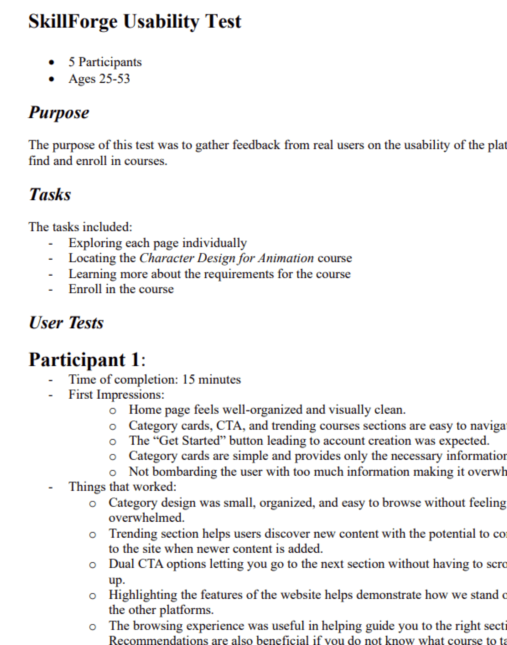
Following completion of my high-fidelity wireframes and prototyping, I conducted usability tests with 5 different participants. The purpose of this test was to gather feedback from real users on the usability of the platform to find and enroll in courses. The test included a set of tasks that the participants must complete while they interact with the screens. The results of these tests were recorded and analyzed.
Tasks
- Pick a course to enroll in through a user-preferred method
- Explore the course page
- Finish course enrollment by creating an account
Success Metrics
- Completion of tasks in a respectable amount of time
- Easily understand the task that is asked to complete
- Able to complete tasks without needing to ask for help
- Ability to complete tasks with minimal to no errors
Usability Test Results
Task 1
The design was visually appealing, easy to navigate, and effectively highlighted key features. However, course categories were confusing, imagery caused uncertainty, and opinions on testimonials were mixed. The “Get Started” CTA could lead to a questionnaire, subcategories weren’t clearly scrollable, and featured courses lacked a hover state for better identification.
Task 2
The page was visually appealing, intuitive, and well-organized, with helpful reviews and related course recommendations. However, users wanted more course details, such as a syllabus, multimedia content, a price breakdown, and review filters for better decision-making.
Task 3
The sign-up process was smooth and well-timed after enrollment. However, users wanted a clearer purpose for signing up, a modal for bookmarking when not signed in, a pricing model after account creation, and a list of website features on the sign-up page.

View Full Results
Iterate
Feedback and Revisions
I took the feedback from the usability tests and improved on various aspects of the product to make the experience better for the users.


Clearer Category Labels & Visuals
To address confusion some participants had with unclear category names and images, I refined both the visuals and labels to better reflect the types of courses users can expect to find in each category.


Interactive Explore Menu
Some participants noted that the “Explore” button in the navigation bar lacked functionality, as they expected it to open a menu when clicked or hovered over. In response, I added interactive behavior to the button, allowing users to access categories and subcategories as expected.


Visible Course Ratings
Participants pointed out the absence of a course rating system, making it difficult to assess course quality at a glance. To improve clarity and decision-making, I added visible ratings to each course card preview across all screens.


Improved Carousel Interactivity
Some participants found the category carousel at the top of the page unclear in its purpose and didn’t realize it was interactive. I updated the visual design to better signal interactivity and scrolling, making it easier for users to discover and browse additional subcategories.
Conclusion
Key Takeaways
Working on SkillForge taught me how important it is to design with real user needs in mind, especially when it comes to staying motivated and building new habits. I found that clear goals, simple navigation, and consistent progress tracking can make a big difference in how people approach learning. Giving users a sense of structure and momentum was key to creating an experience that feels both approachable and rewarding.
Reflection
This project challenged me to step back and really think about how design decisions impact the learning experience as a whole. I gained a lot of confidence in leading the research process and turning insights into actionable design solutions. I also learned the value of testing early and often, even when things aren’t perfect. Getting honest feedback helped me iterate quickly and stay focused on what mattered most to users.
The Next Steps
I’d love to keep improving SkillForge by testing it with a wider range of users and exploring new ways to support different learning styles. One idea I’m excited about is adding social features, like community-based discussions or professional mentor support. I want to build the platform to include features that help users stay accountable. I also want to refine the experience for accessibility and personalize the learning paths even more. There’s a lot of potential to keep growing this tool into something truly useful.