

Carnival Cruise Line is a leading cruise company offering affordable, family-oriented vacations with a focus on fun, comfort, and memorable travel experiences.
Project Duration
6 weeks
My Role
UX/UI Designer
Tools
Figma, Adobe Photoshop
Introduction
The Carnival Cruise Line website redesign project focused on improving the overall booking experience for travelers. The goal was to modernize the interface, reduce confusion in the booking flow, and make cruise planning more enjoyable and efficient. Through user research and testing, the redesign aimed to create a more intuitive experience that reflects Carnival’s fun, family-friendly brand while simplifying how users search for and book cruises.
The Problem
Users found the original Carnival website overwhelming and difficult to navigate. Key information about destinations, pricing, and room options was scattered across multiple pages, leading to confusion and frustration during the booking process. The layout and visual design also felt outdated, making it harder for users to trust the platform and complete their bookings confidently.
The Solution
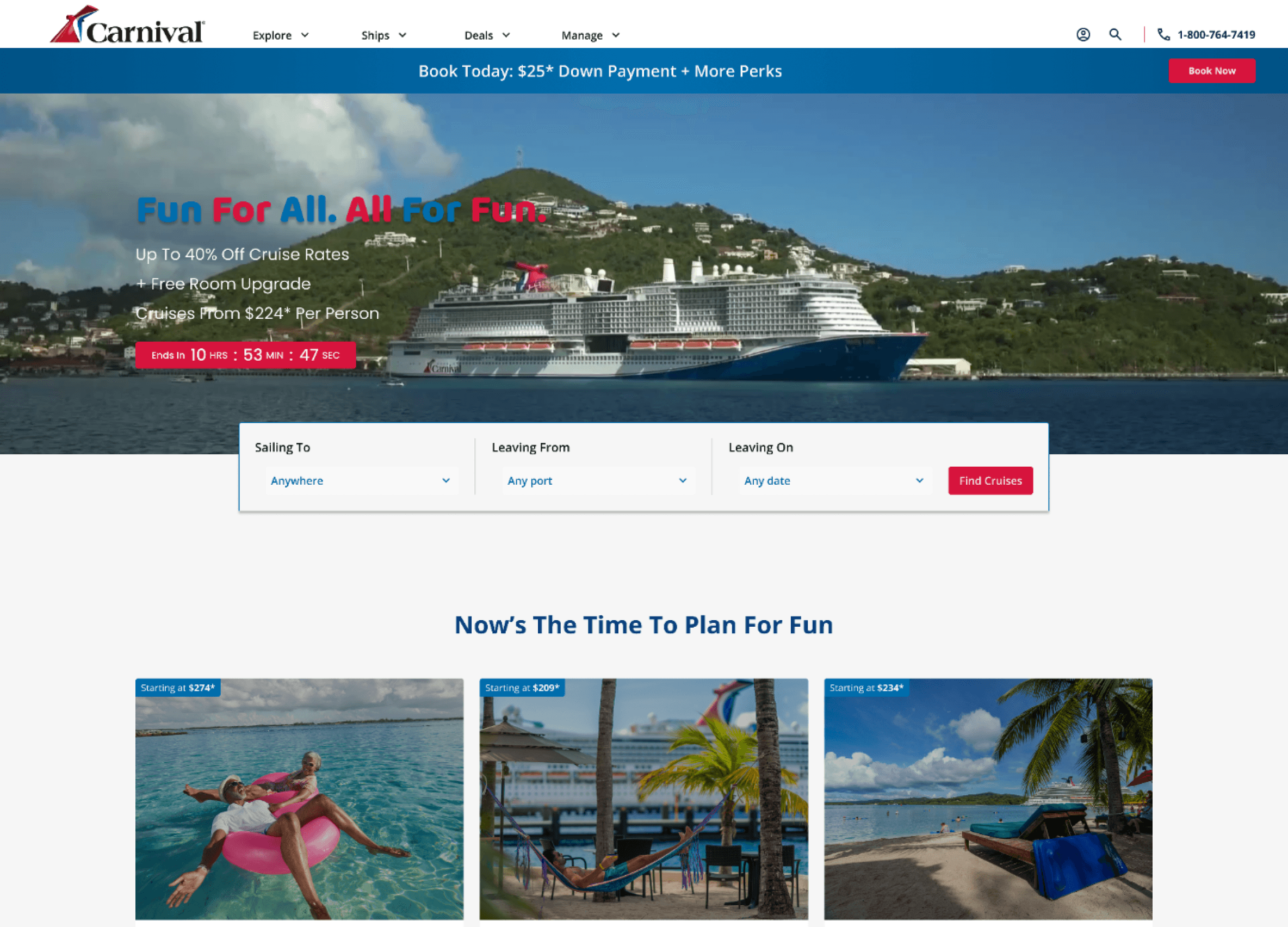
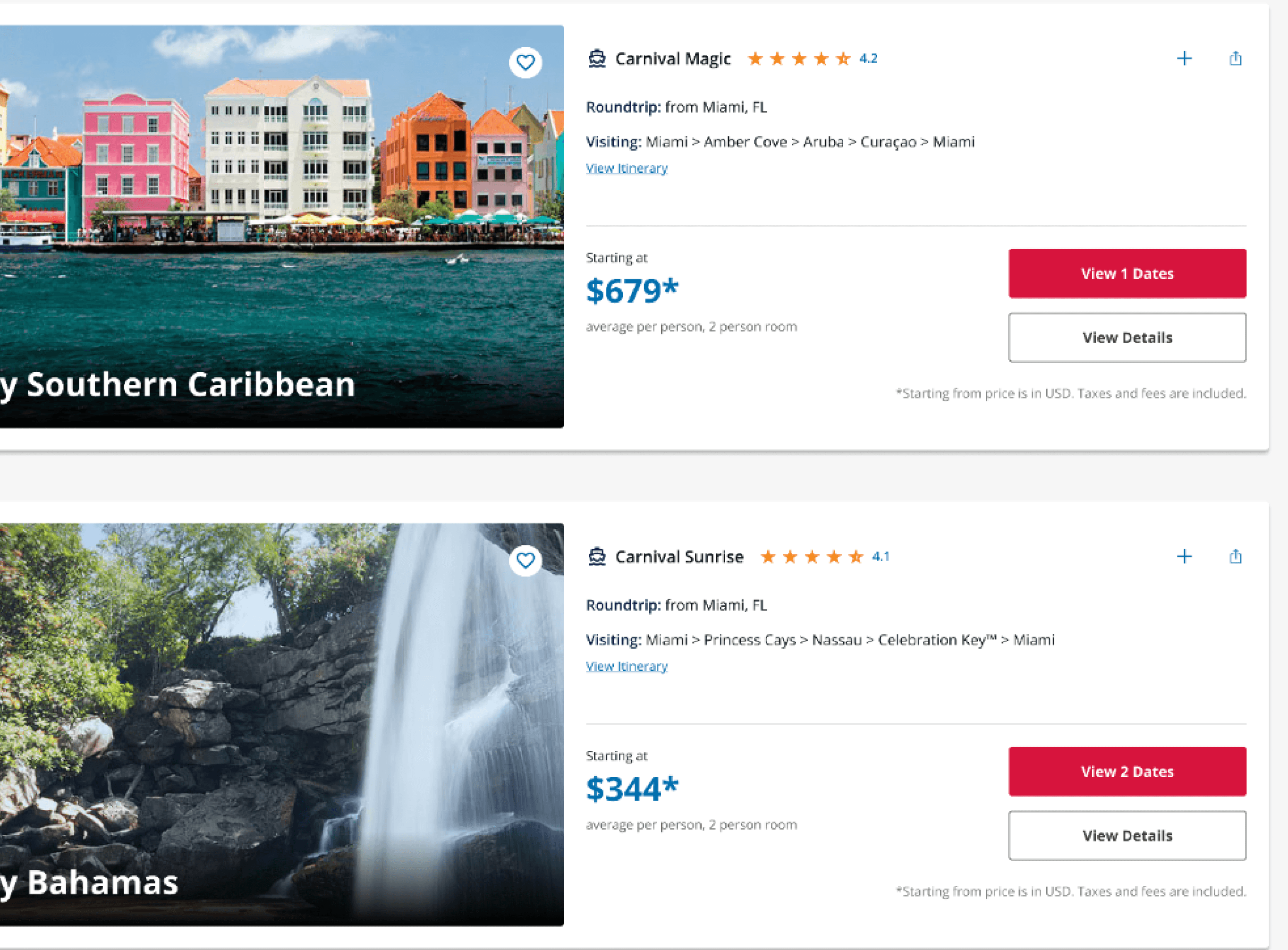
The redesign introduced a streamlined booking flow with a clear structure, simplified navigation, and modern visuals that highlight Carnival’s brand personality. Key improvements included an updated homepage, more organized search results, and an easier way to compare cruise options and finalize bookings. The result is a cleaner, more cohesive experience that helps users find the right cruise faster and feel confident in their purchase decisions.
The Process
Research
Goal
The goal of this research was to understand how users currently search for and book cruises on the Carnival website, identify key pain points in the booking flow, and uncover opportunities to make the process more intuitive, efficient, and enjoyable.
Research Objectives
My research objectives for Carnival included:
Identify user frustrations with the existing Carnival website, particularly during the cruise selection and booking stages.
Understand user expectations for browsing, comparing, and purchasing travel experiences online.
Evaluate usability issues related to navigation, content organization, and visual hierarchy.
Discover what motivates users to complete or abandon a booking.
Gather insights to guide design decisions that improve clarity, reduce confusion, and enhance the overall booking experience.
Research & Analysis Methods
Primary Research - User Interviews
I conducted user interviews with both experienced cruise travelers and individuals who had never booked a cruise before. This mix provided a well-rounded perspective on how different users approach the booking process. Participants were asked about their expectations, challenges, and overall impressions when using cruise or travel websites. The interviews revealed that new users often felt overwhelmed by the amount of information and unclear steps, while experienced users wanted faster, more streamlined ways to compare options and complete bookings. These insights guided key design decisions for simplifying navigation and improving clarity throughout the booking flow.
Secondary Research - Competitive Analysis
I analyzed the websites of Royal Caribbean, Norwegian Cruise Line, Virgin Voyages, and Expedia to understand how leading cruise and travel platforms structure their booking experiences. The analysis focused on navigation, search and filtering options, visual hierarchy, and presentation of pricing and package details. Key findings revealed opportunities for Carnival to simplify its booking flow, make comparisons easier, and highlight essential information more clearly. Insights from this analysis directly informed design decisions around layout, information architecture, and the overall user experience.
Define
Affinity Mapping
I organized insights from user interviews and competitor analysis into an affinity map to identify patterns, pain points, and opportunities. Each note represented a specific observation, quote, or insight, which I grouped into categories such as booking frustrations, navigation challenges, information clarity, and user expectations. This process helped reveal key themes that guided design decisions and ensured the redesign addressed real user needs.
User Personas
Based on insights from interviews and research, I created user personas to represent the different types of people who use the Carnival website. These personas capture varying levels of cruise experience, goals, motivations, and pain points. They helped guide design decisions by keeping real user needs at the center of the redesign, ensuring that the booking flow, navigation, and content addressed both new and experienced cruise travelers effectively.
Problem Statements, POV Statements & HMW Questions
From the research insights, I defined key problem statements to capture the main challenges users faced with the Carnival website. Using these statements, I crafted Point of View (POV) statements to frame the problems from the user’s perspective and highlight their goals and frustrations. Finally, I developed How Might We (HMW) questions to translate these insights into actionable design opportunities. This process ensured that the redesign addressed real user needs and guided creative solutions for a clearer, more intuitive booking experience.
1.
Overwhelming Search Experience
Problem Statement
First-time and casual travelers often feel overwhelmed when searching for cruises due to the high number of options, inconsistent filtering, and lack of guided support, leading to confusion and decision paralysis.
POV Statement
Rami, a first-time cruiser, needs an easy and intuitive way to find cruises that match his interests and budget because the current experience overwhelms him with too many options and not enough clarity.
HMW Questions
How might we guide users like Rami to the right cruise without overwhelming them?
• How might we help new users filter cruises based on preferences or lifestyle?
How might we reduce cognitive load during the discovery phase?
2.
Lack of Transparent Pricing and Comparison Tools
Problem Statement
Users often abandon the booking process when they can’t compare sailings or see the full cost breakdown upfront, which undermines trust and delays decision-making.
POV Statement
Karen, a seasoned cruiser, needs clear and upfront pricing as well as an easy way to compare cruises side-by-side because she wants to make fast, informed decisions without surprises.
HMW Questions
How might we make cruise pricing more transparent earlier in the booking flow?
How might we enable users to visually compare multiple sailings, ships, and prices?
How might we reduce surprises by showing total costs before checkout?
3.
Unoptimized Mobile Booking Flow
Problem Statement
Many users rely on mobile devices to browse and book cruises, but current booking flows are not optimized for small screens. This results in frustration, long load times, and increased drop-off rates.
POV Statement
Vanessa, a spontaneous traveler who plans on her phone, needs a fast, simplified mobile experience because she wants to browse and book cruises without delay or confusion.
HMW Questions
How might we create a mobile-first cruise booking flow that is seamless and intuitive?
How might we reduce the number of taps and screens needed to complete a booking?
How might we optimize mobile UI for visibility, speed, and responsiveness?
User Flows
Prototype
Low-Fidelity Wireframes
High-Fidelity Mockups
View Full Wireframes
Figma Prototype
Test
Usability Testing
After creating high-fidelity prototypes of the redesigned Carnival website, I conducted usability testing with participants representing both new and experienced cruise travelers. The goal was to evaluate how easily users could navigate the site, search for cruises, compare options, and complete bookings. Feedback highlighted areas for improvement, such as simplifying filters, clarifying pricing information, and improving the visibility of key actions. These insights informed revisions that enhanced the overall usability, ensuring a smoother, more intuitive booking experience.
Tasks
Search for a 7-day Caribbean cruise under $1,000 per person departing in January.
Explore a sailing details page to determine if it has the information you’d want before booking.
Book a cruise for two adults using the cheapest cabin option.
Success Metrics
- Ability to complete tasks fully in a respectable amount of time
- Ability to complete tasks without requiring help
- Ability to easily understand what is being asked
- Ability to complete tasks without errors
- Confidence and satisfaction expressed in post-test feedback
Test Methodology
Usability testing was conducted with five participants, including both new and experienced cruise travelers. Sessions took place remotely or in person using an interactive Figma prototype of the redesigned Carnival website. Each participant was asked to complete three main tasks: search for a cruise, explore a sailing details page, and book a cruise. During the sessions, participants were encouraged to think aloud as they navigated the prototype, while observations focused on their interactions, navigation paths, and task completion processes. This approach provided qualitative insights into how users interacted with the design in realistic scenarios.
Usability Test Results
Task 1
The website's search and filtering functionality is likely effective and easy to use. Participants generally expect and find it helpful to filter by dates, departure ports, cruise length, and destination. Participants who are familiar with Carnival's website or other cruise line sites are comfortable with the search process and find it similar to what they've experienced before.
Task 2
The sailing details page likely provides the most important information, such as the itinerary, dates, and pricing, which helps users decide if a cruise is right for them. The users agreed that the page provides "all of the details up front" and clearly states the next steps in the booking process, which gives them and other users confidence to move forward.
Task 3
The step-by-step booking flow is generally well-received, as it prevents users from feeling overwhelmed. The ability to go back and change information is important and helps users feel confident during the process. A one-step-at-a-time booking flow was preferred by most participants as it makes the process feel less overwhelming.
Iterate
Feedback and Revisions
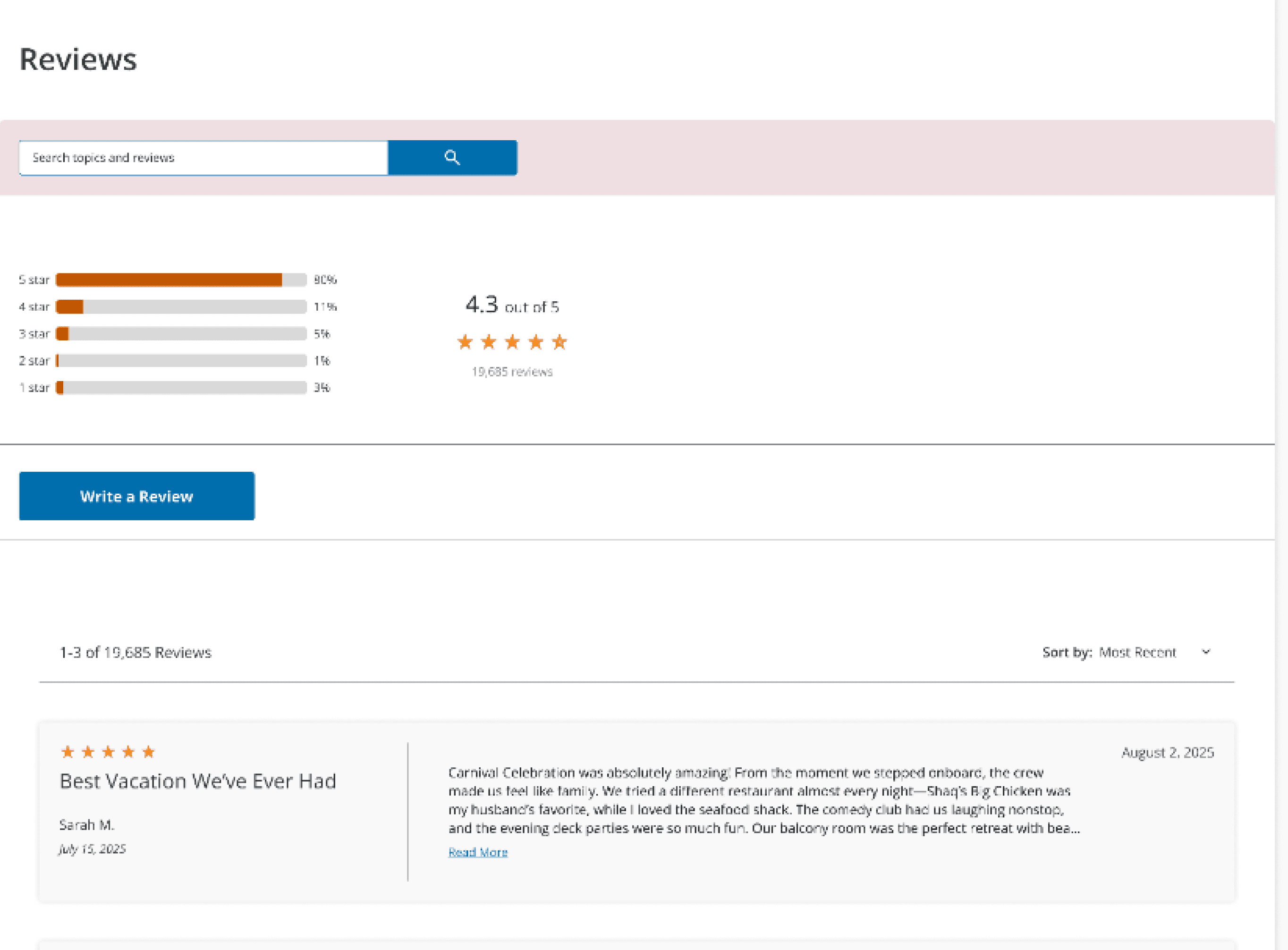
Based on usability testing with participants, several key refinements were made to the redesign. Iterations included adding “Add to Compare” and “Share” buttons to cruise listings, allowing users to evaluate and share options more easily. A review section was also added to the cruise details page to help users make informed decisions. These updates improved usability and enhanced the overall booking experience.
“Add to Compare” + Share Buttons
Based on feedback, I added the ability to share sailing details as well as the ability to compare sailings on the site.
Review Section
Based on feedback, I added a review section to the cruise details page so that users can read about other people’s past experiences.
Conclusion
Key Takeaways
The redesign highlighted the importance of clear navigation, organized information, and features that support decision-making, such as comparing options and viewing reviews. Both new and experienced users benefited from a streamlined booking flow and quick access to key actions like sharing and comparing cruises, improving confidence and satisfaction throughout the booking process.
Reflection
This project reinforced the value of user-centered design and iterative problem-solving. Conducting interviews, competitor analysis, and usability testing provided critical insights into how users approach cruise booking, while the design iterations demonstrated how targeted improvements can meaningfully enhance usability and the overall experience.
The Next Steps
Future work could include further usability testing with a larger, more diverse group of participants to validate design decisions and uncover additional opportunities. Additional features, such as personalized recommendations, saved searches, and refined visual details, could further improve engagement and strengthen the Carnival brand experience online.